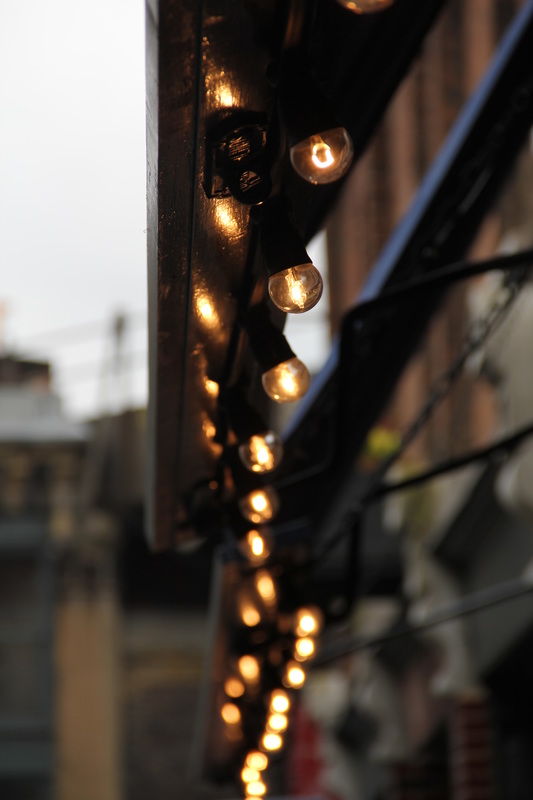
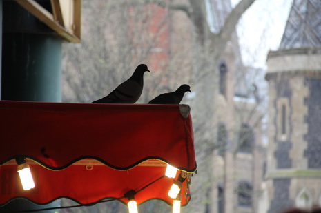
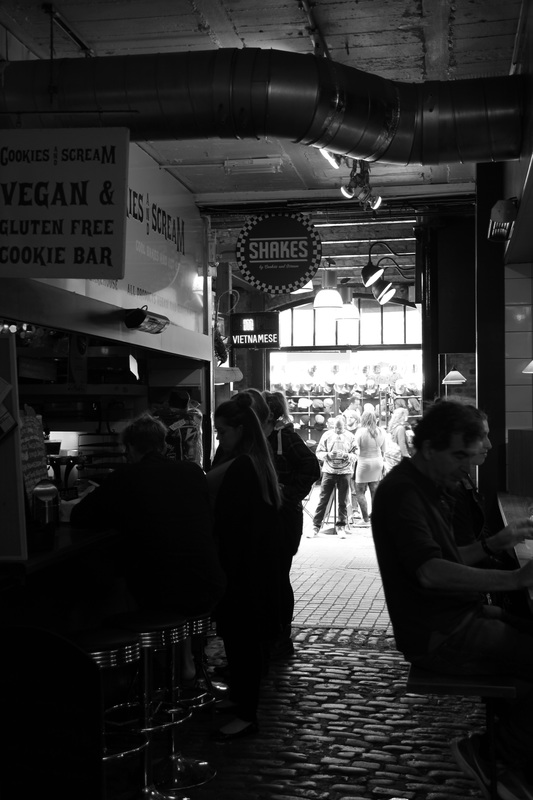
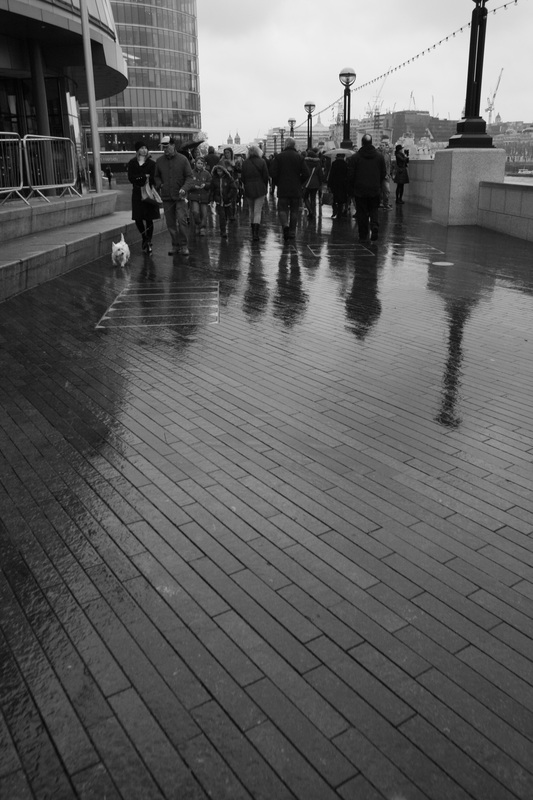
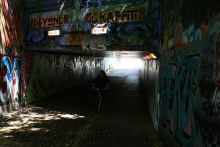
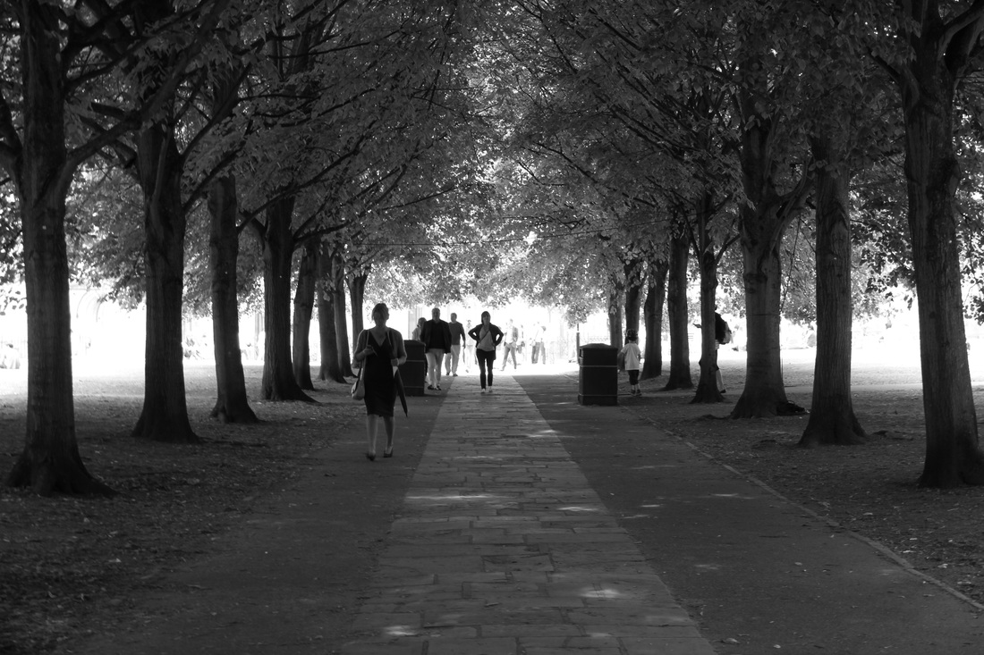
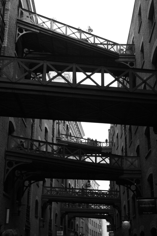
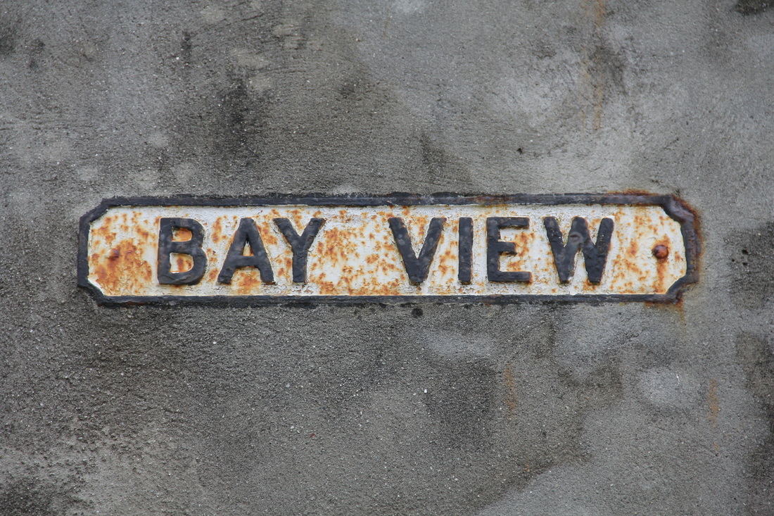
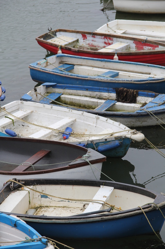
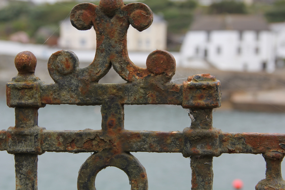
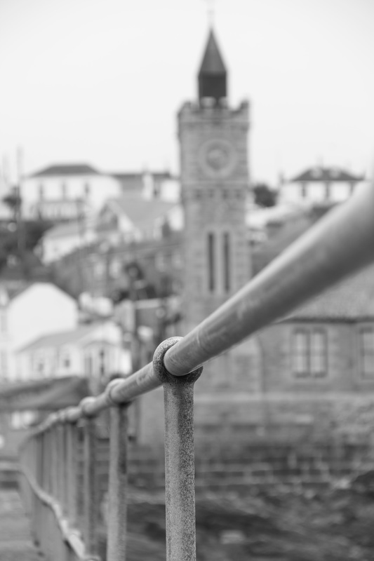
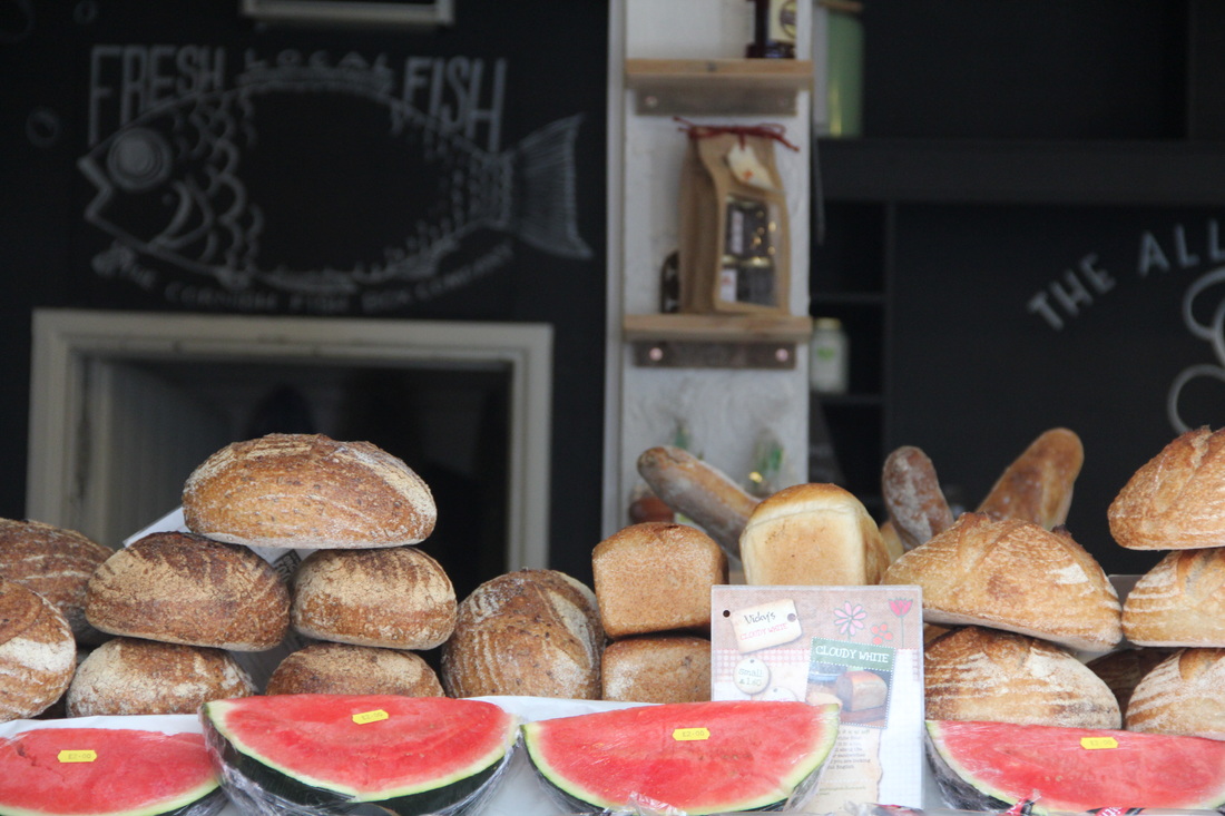
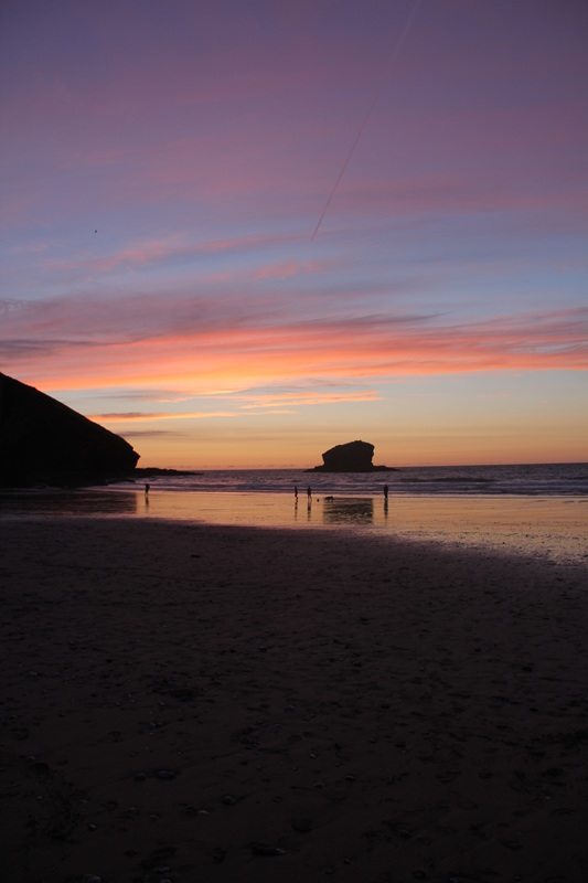
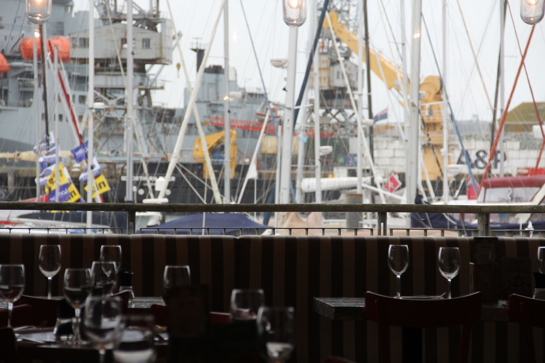
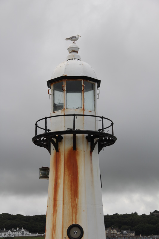
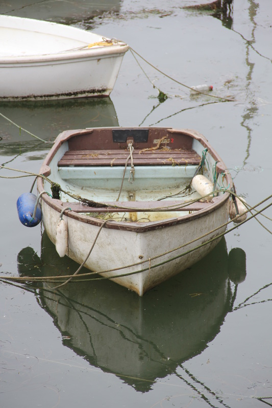
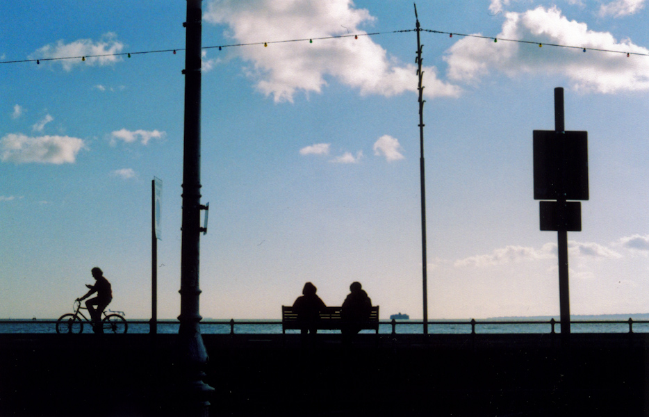
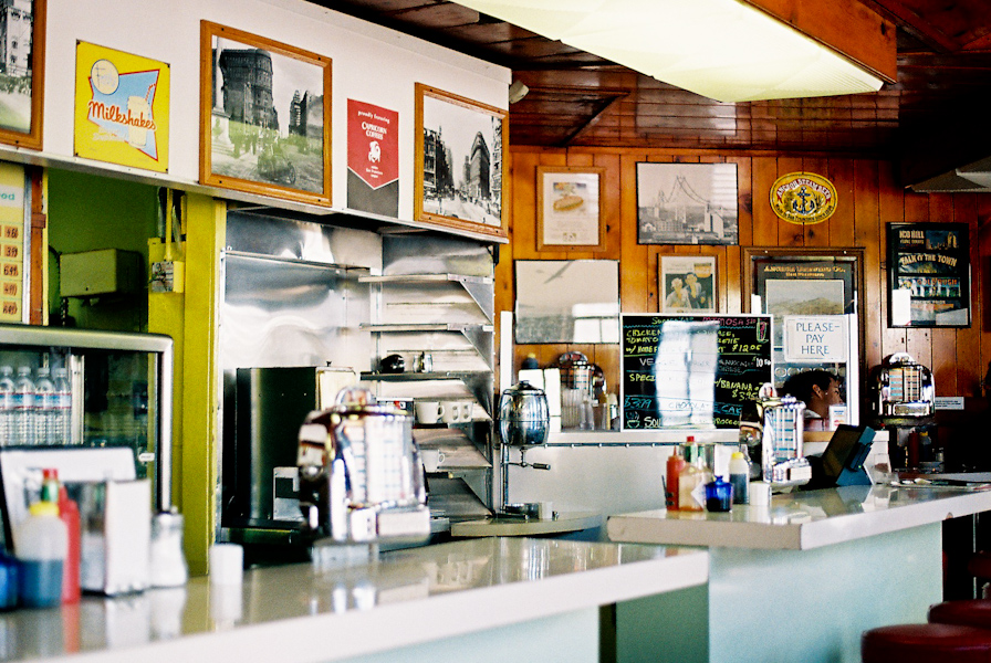
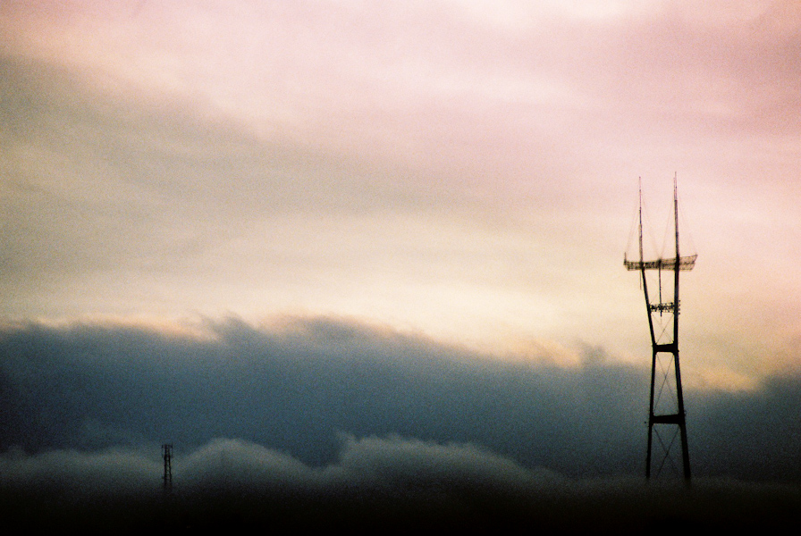
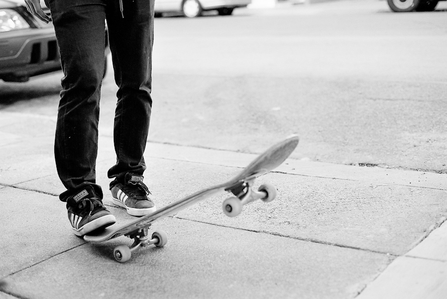
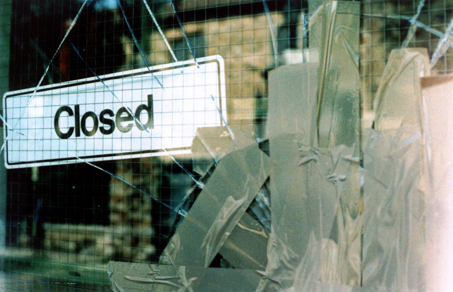
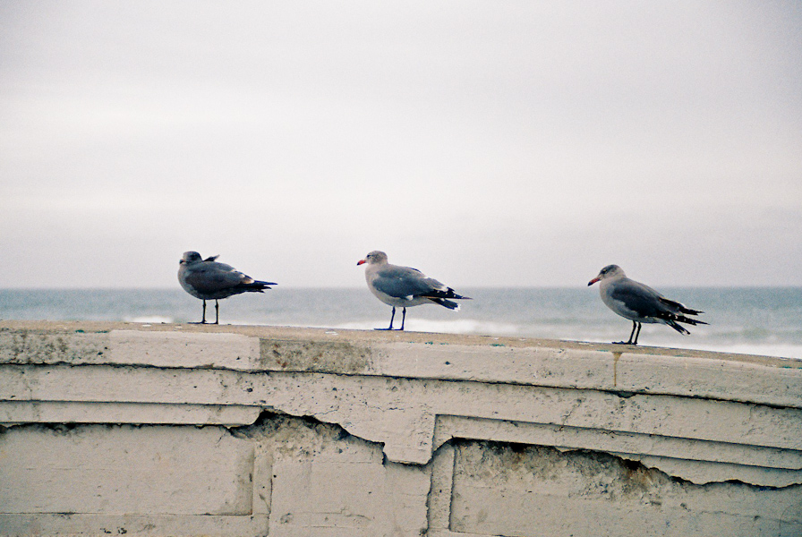
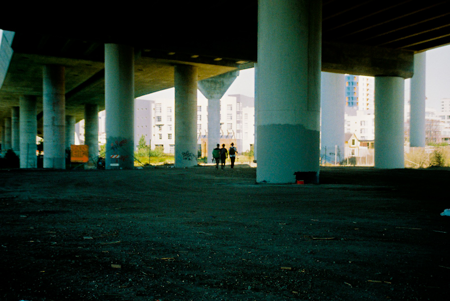
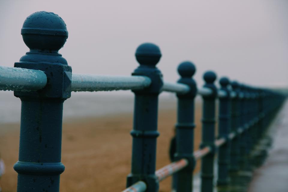
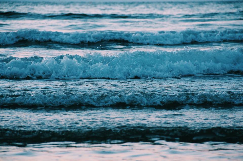
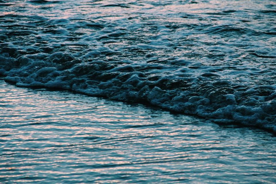
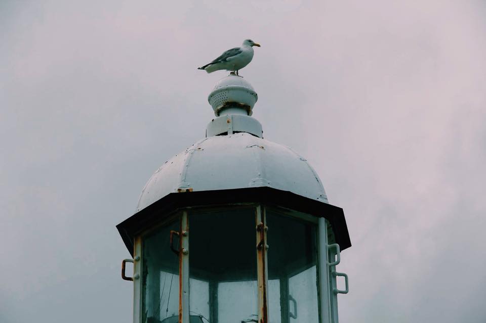
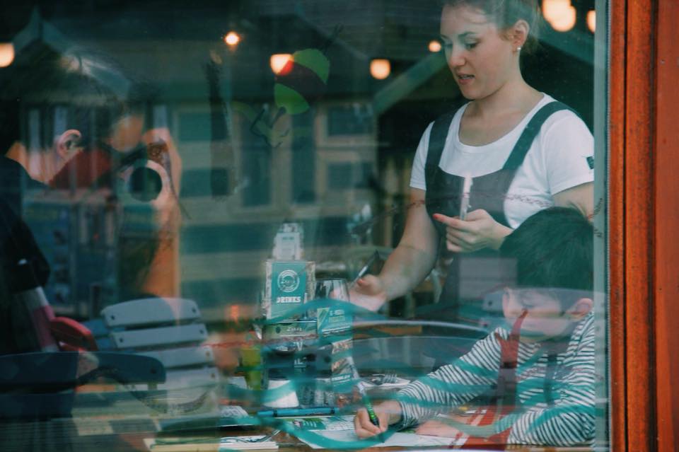
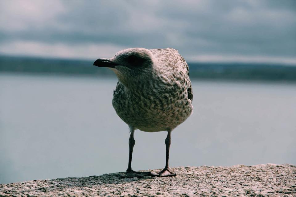
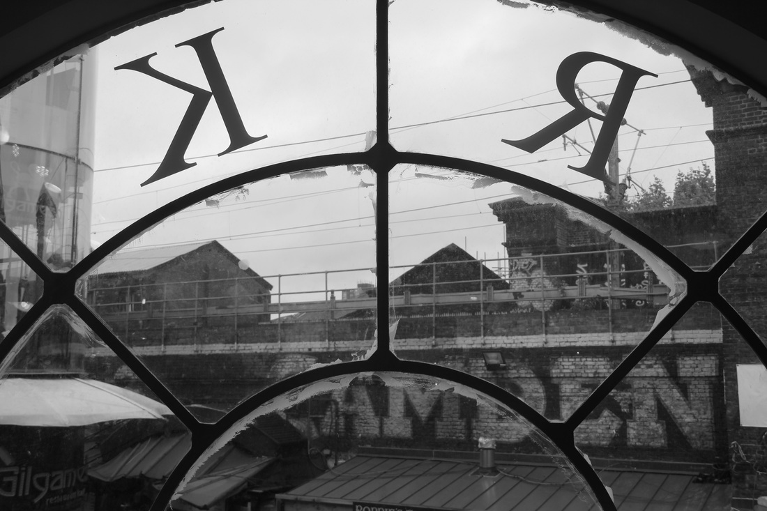
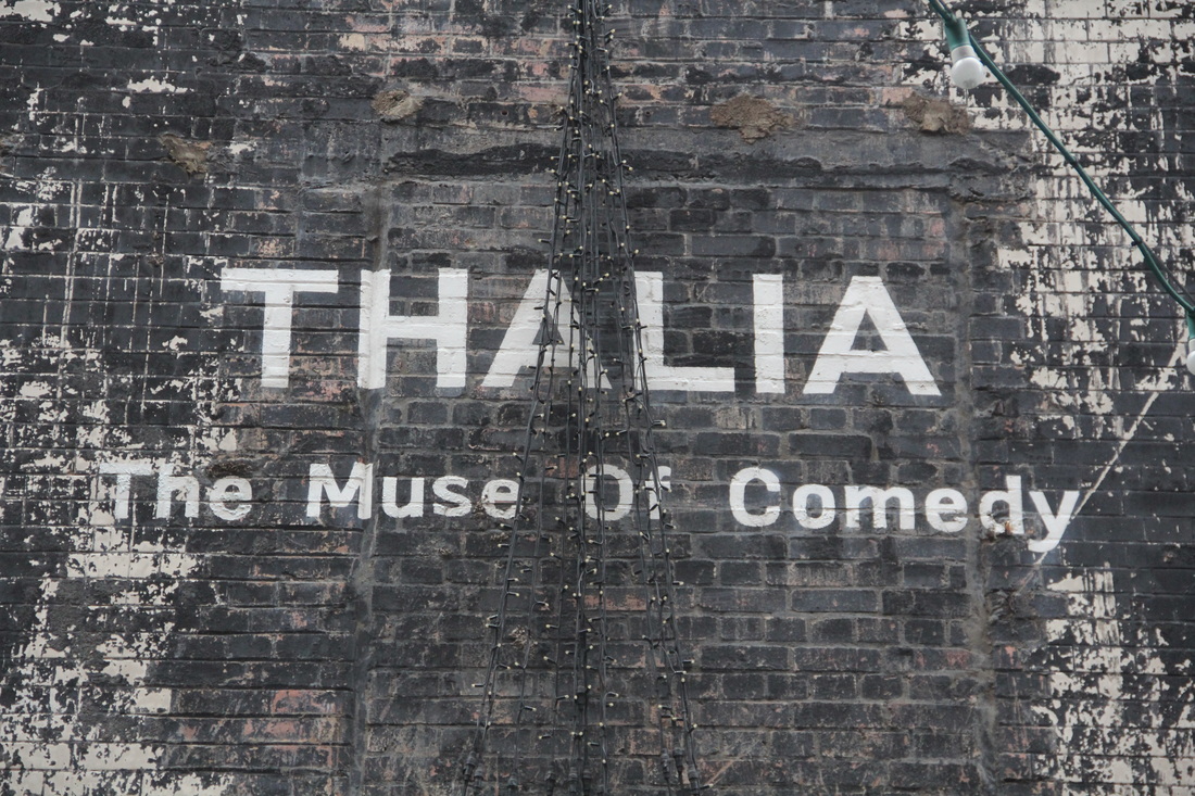
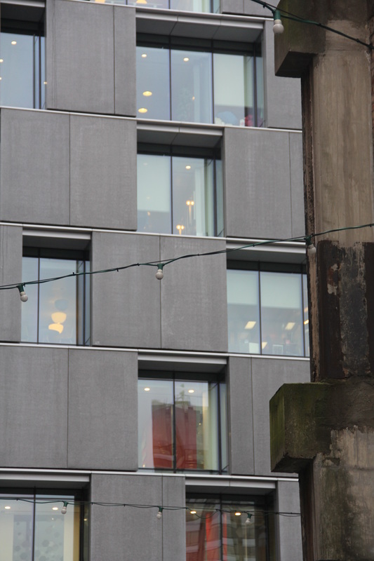
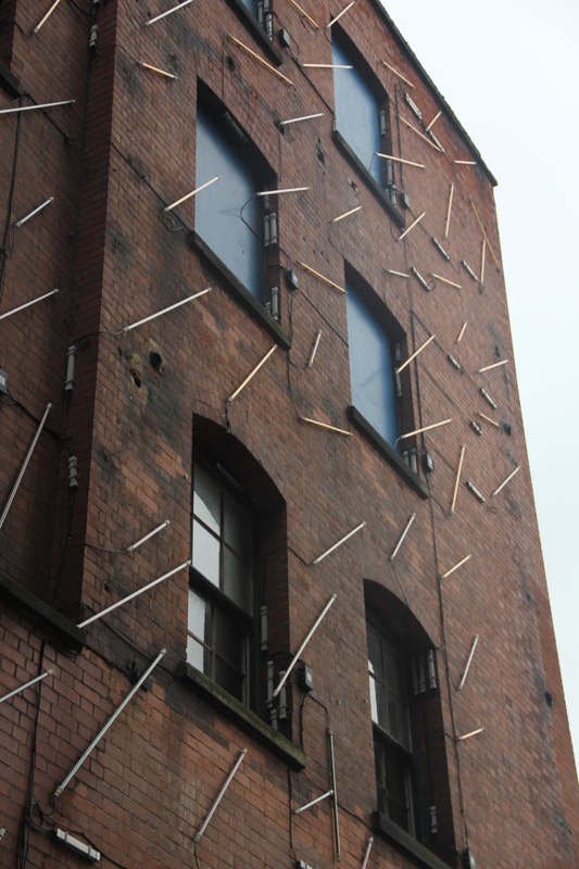
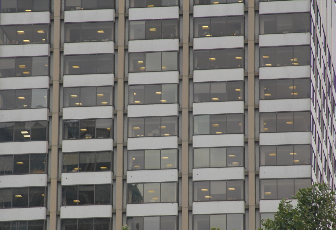
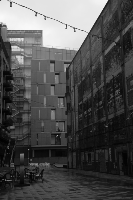
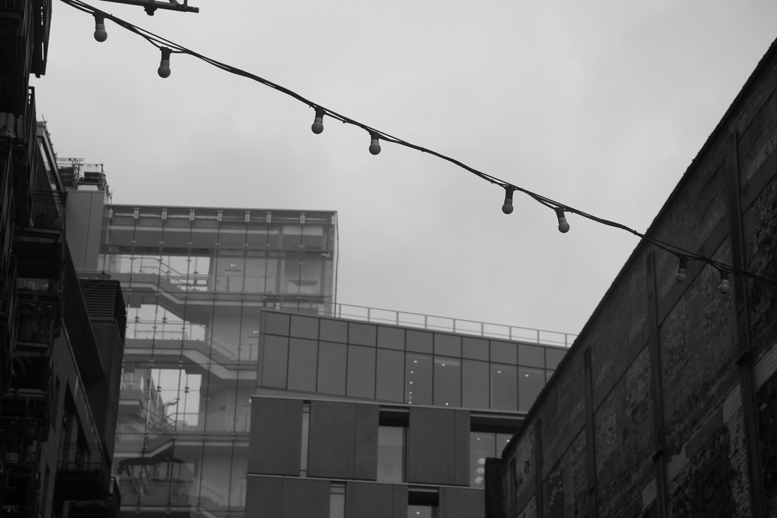
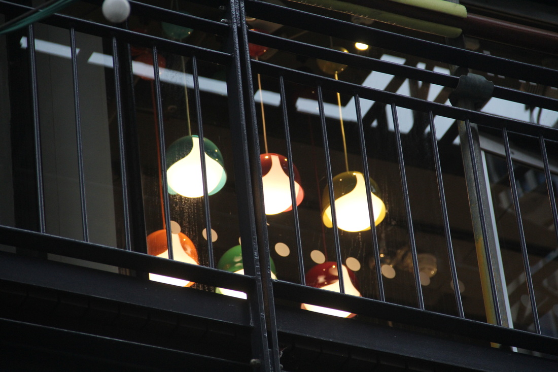
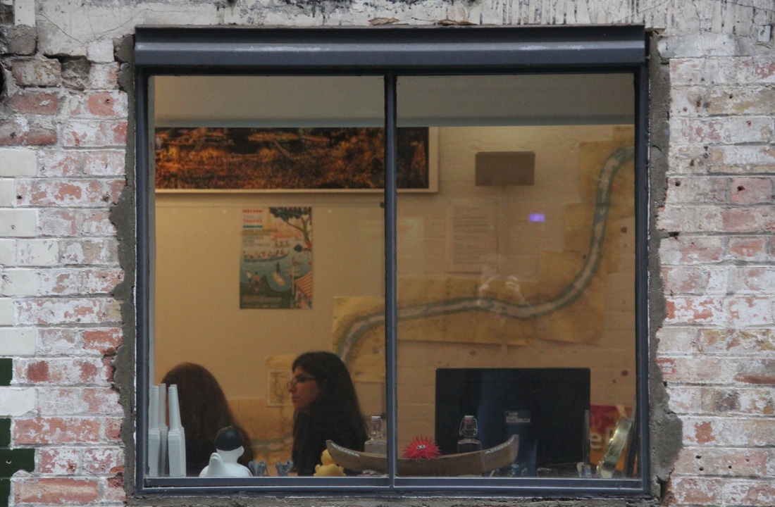
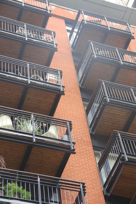
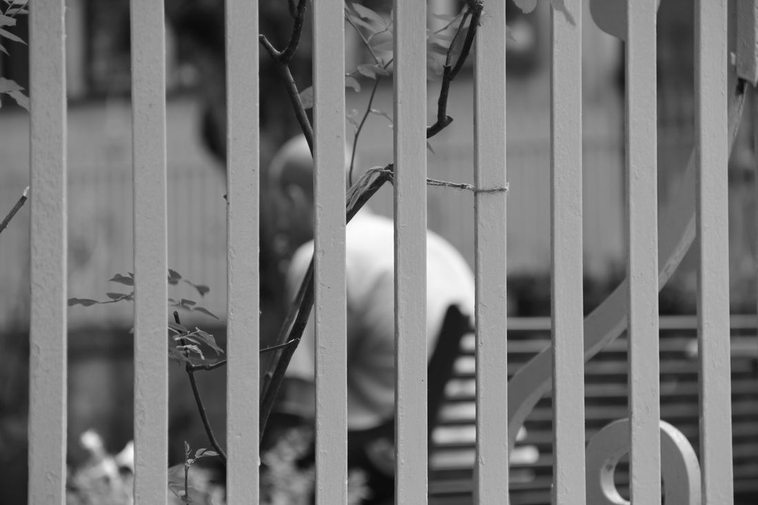
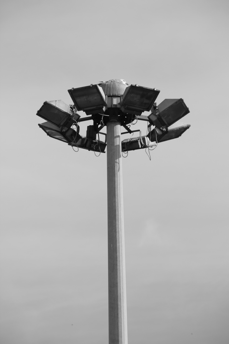
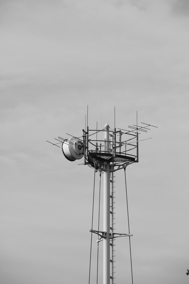
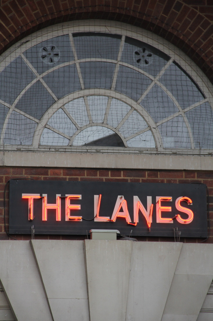
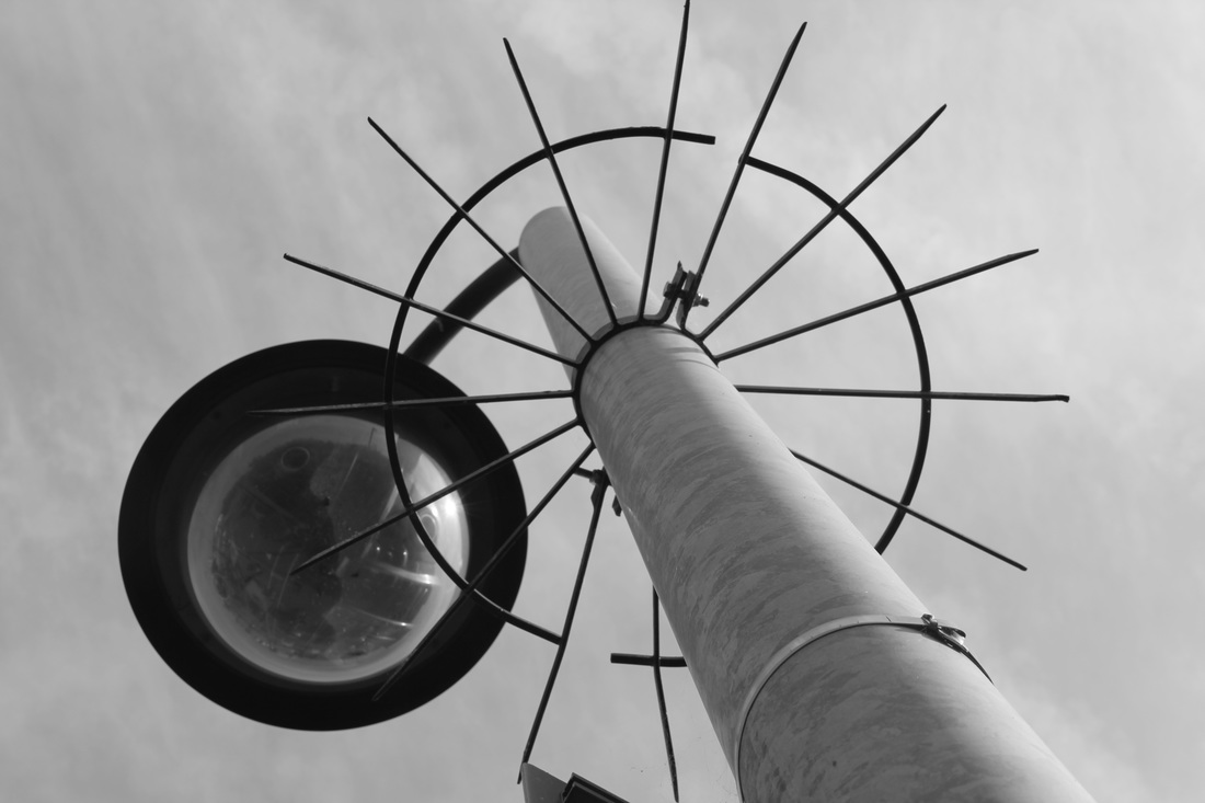
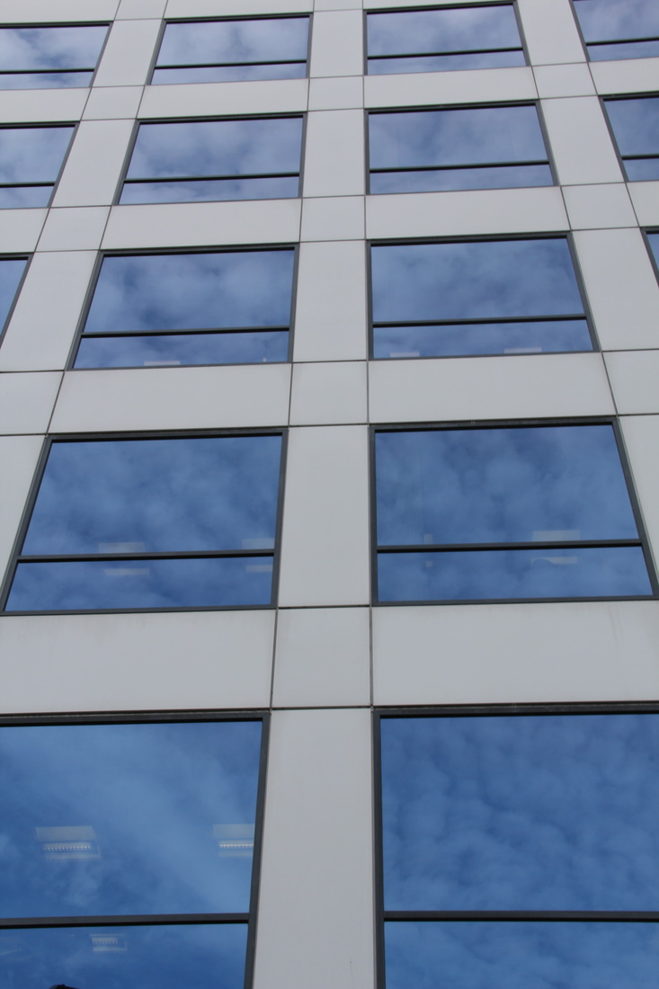
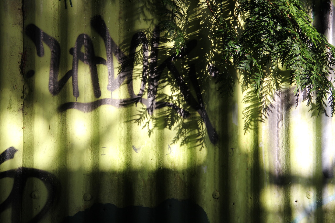
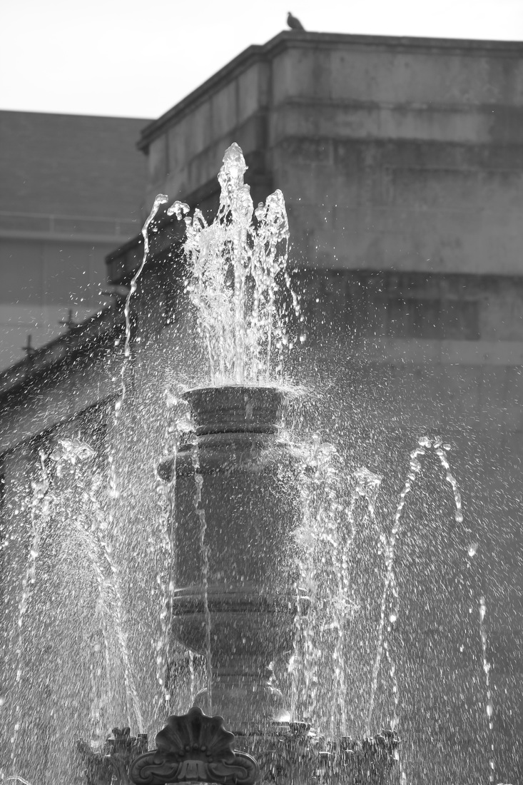
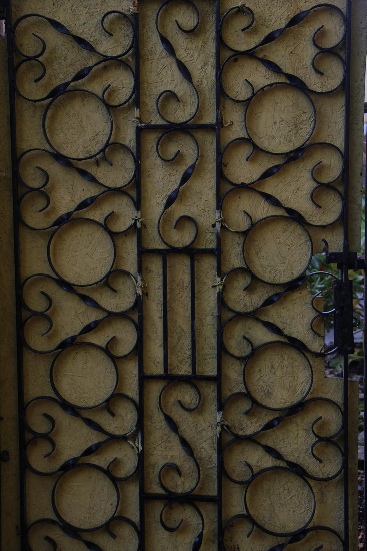
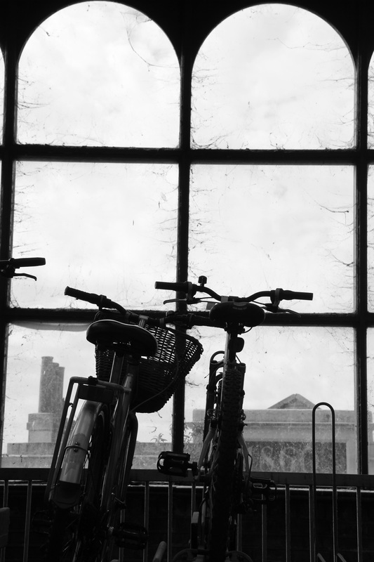
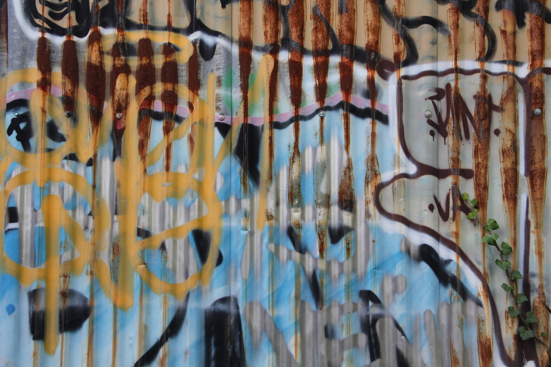
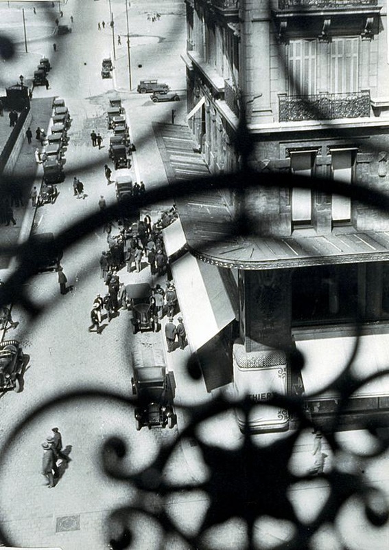
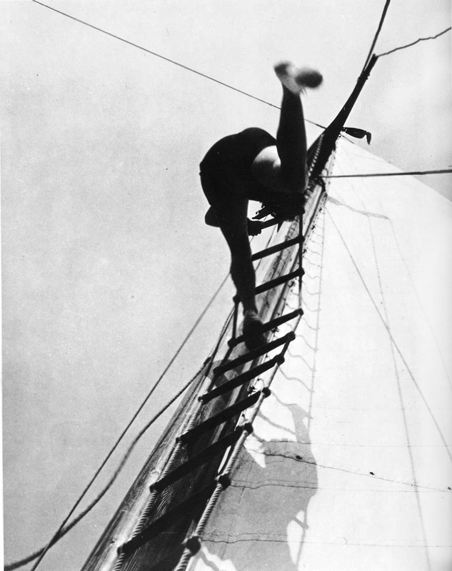
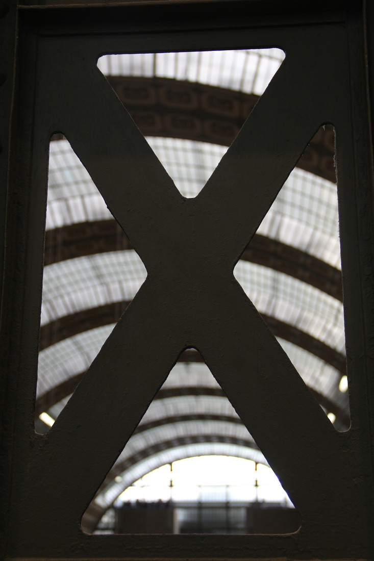
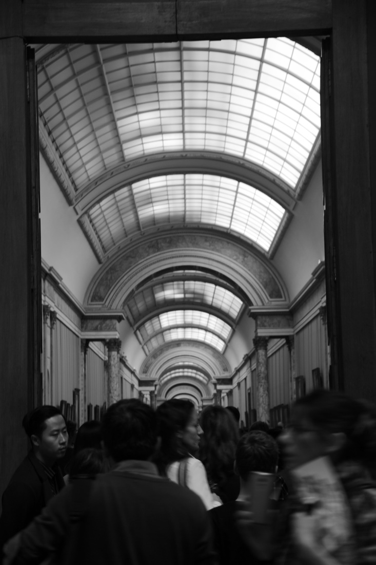
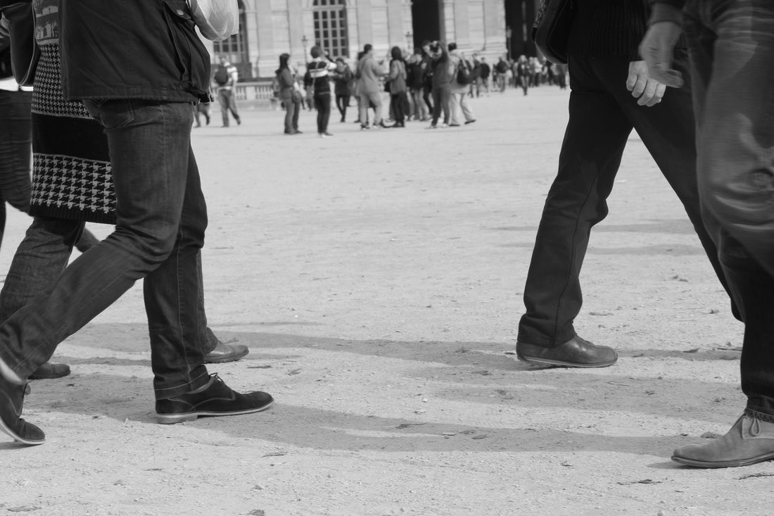
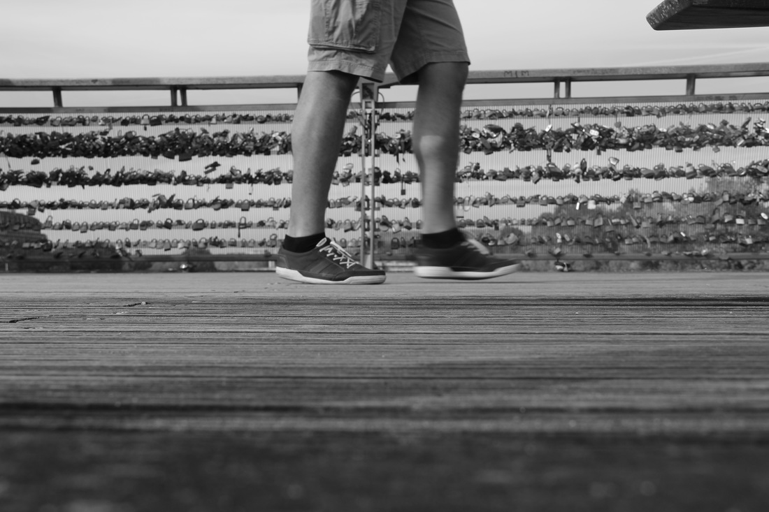
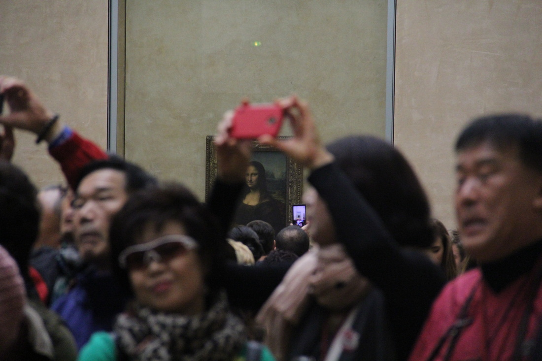
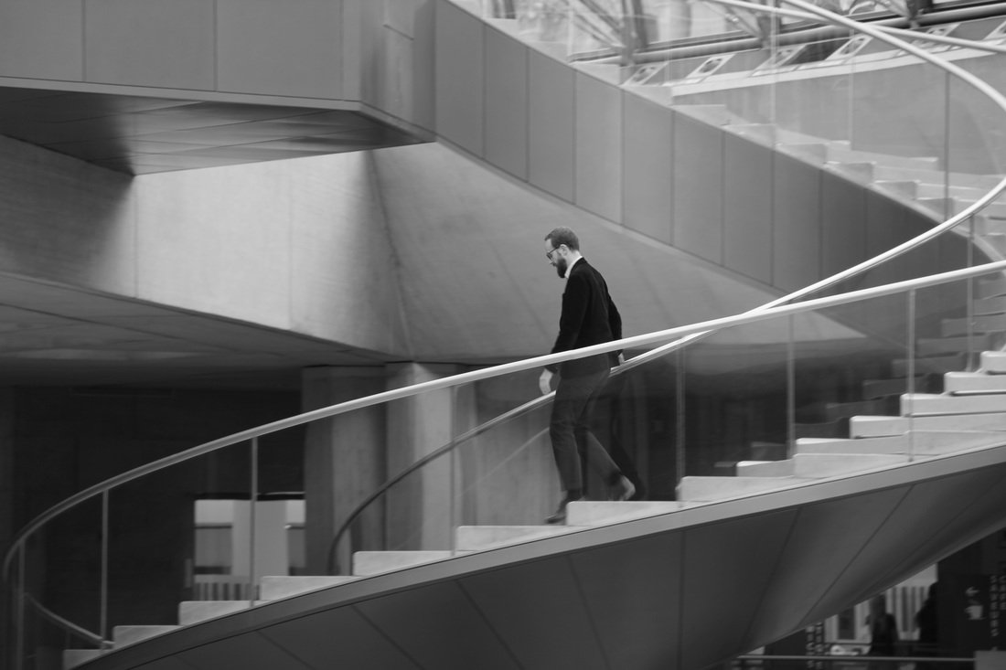
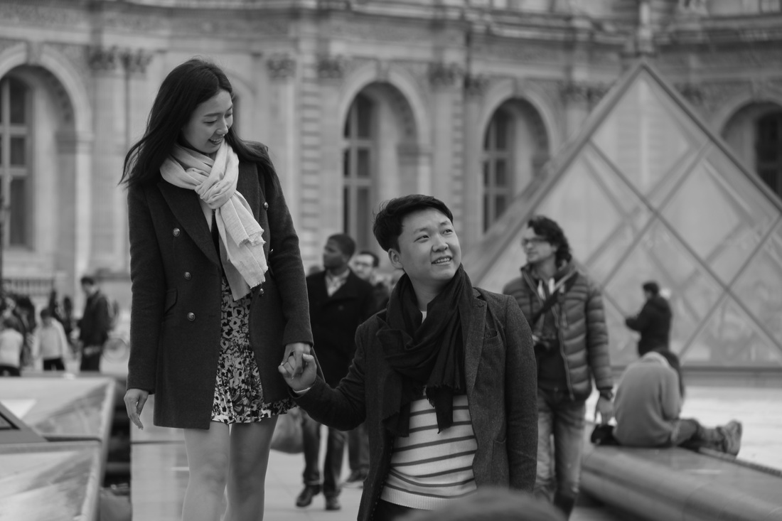
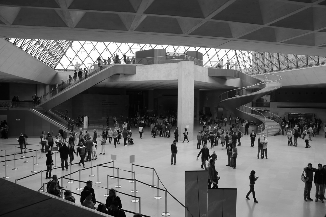
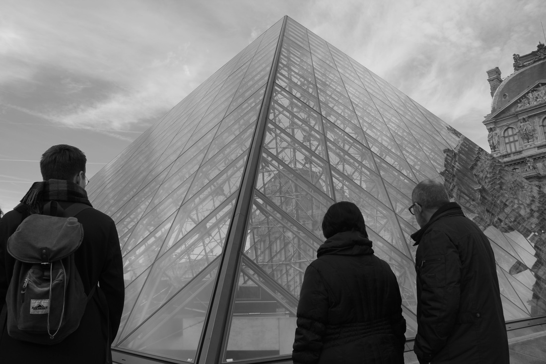
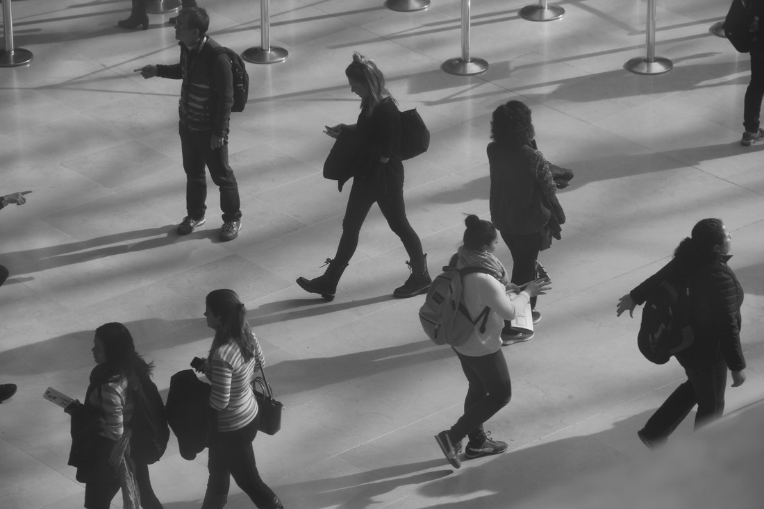
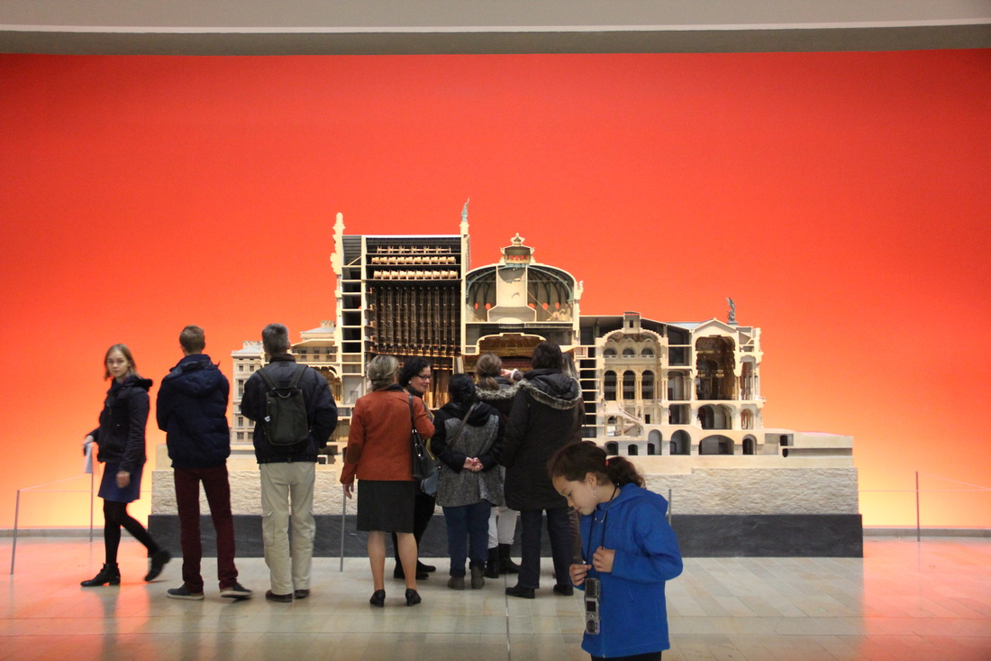
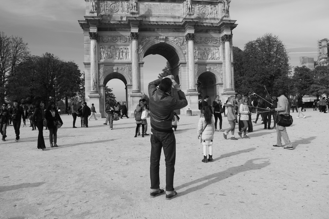
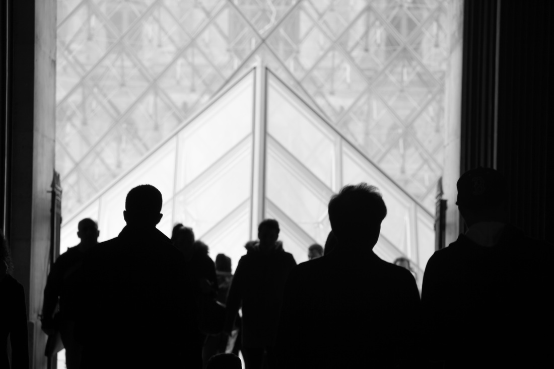
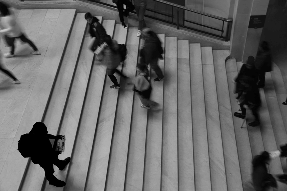
street photography // urban
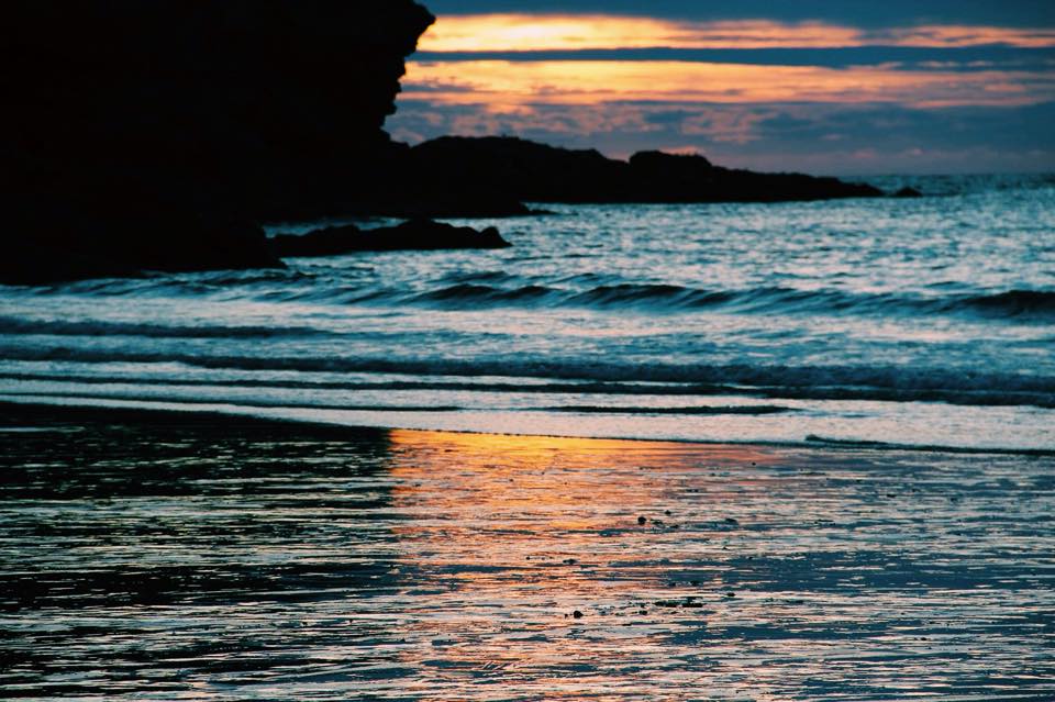
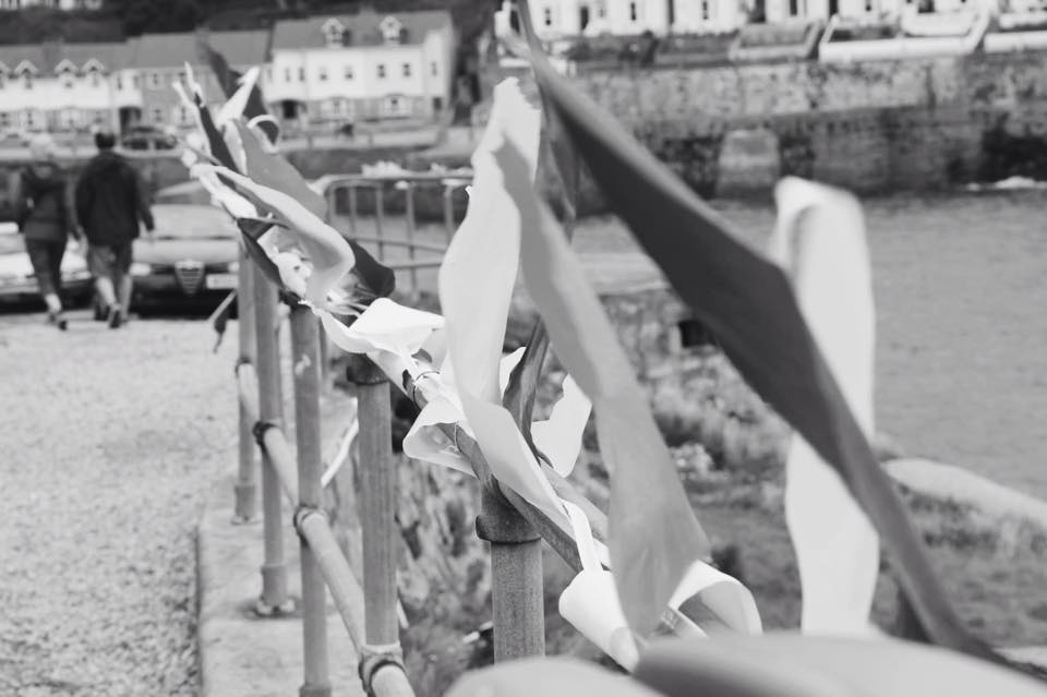
my photos

|
|
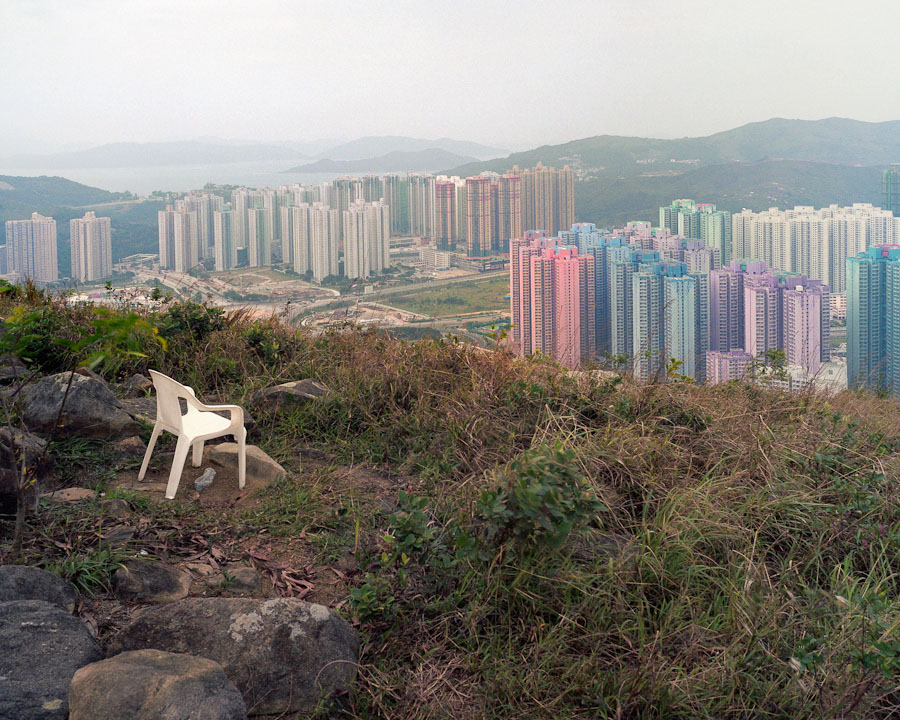
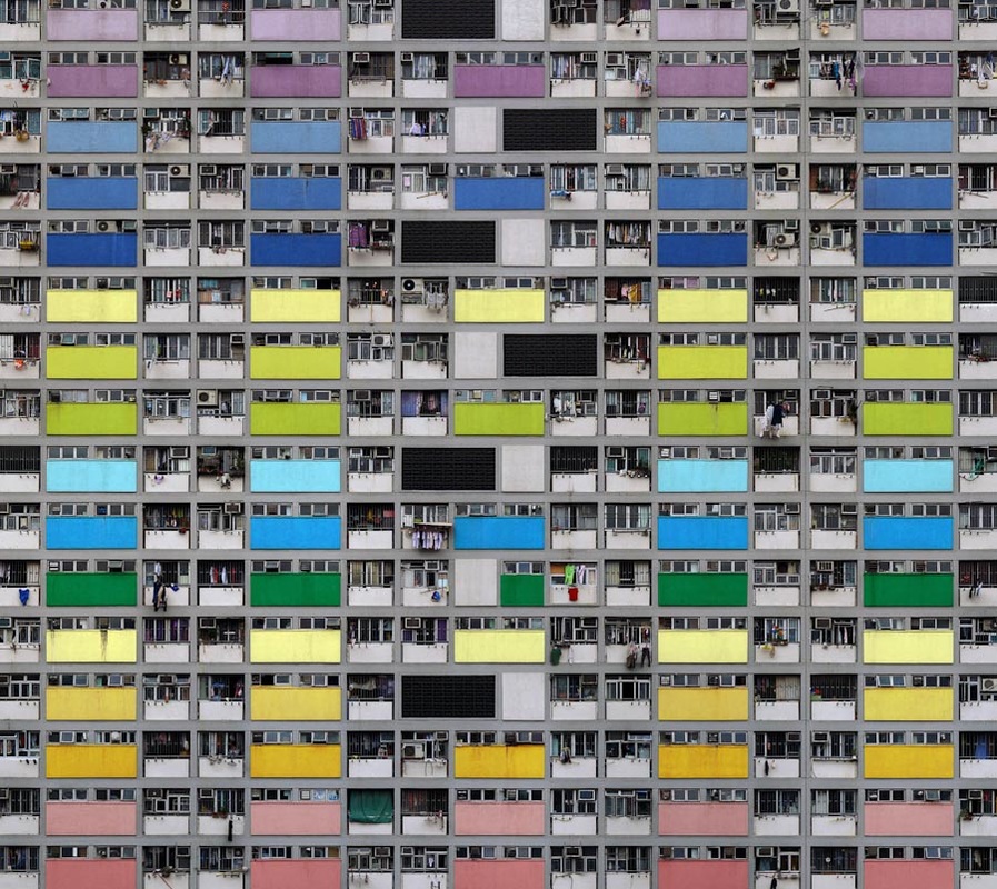
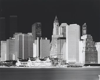
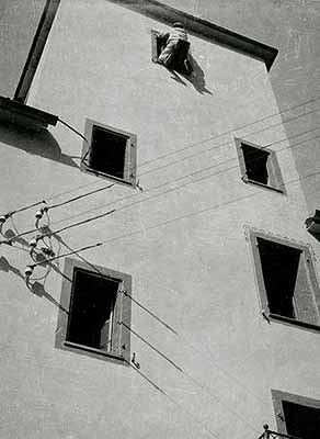
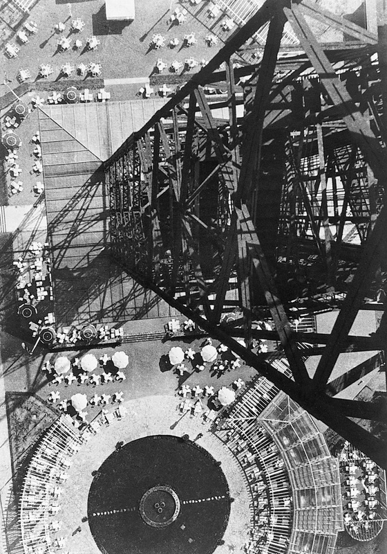
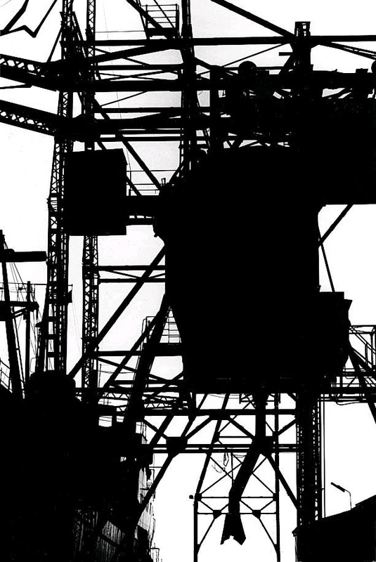
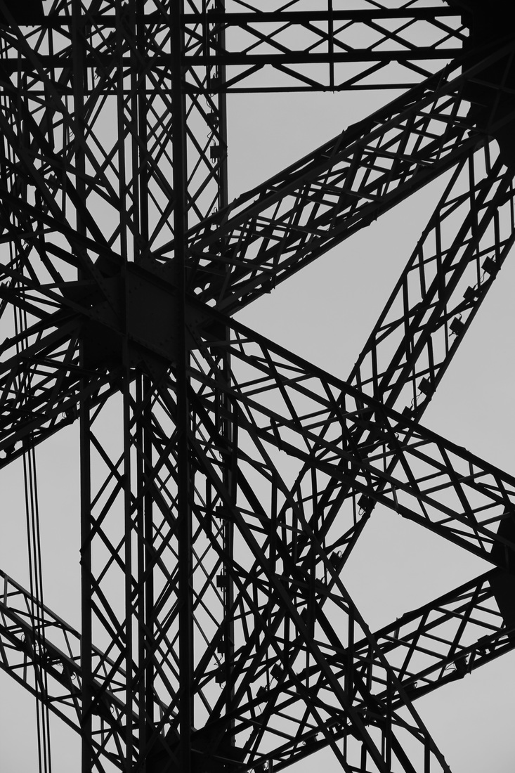
Michael Wolf
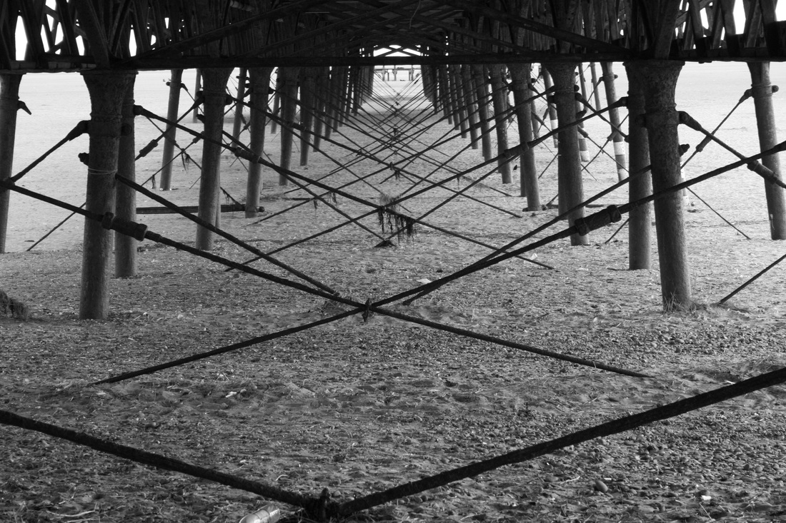
aspects of Michael Wolf's photography focus on complex, repeated structured which links well to the urban theme. here are some examples of his urban photography.
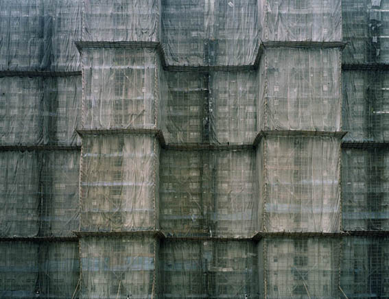
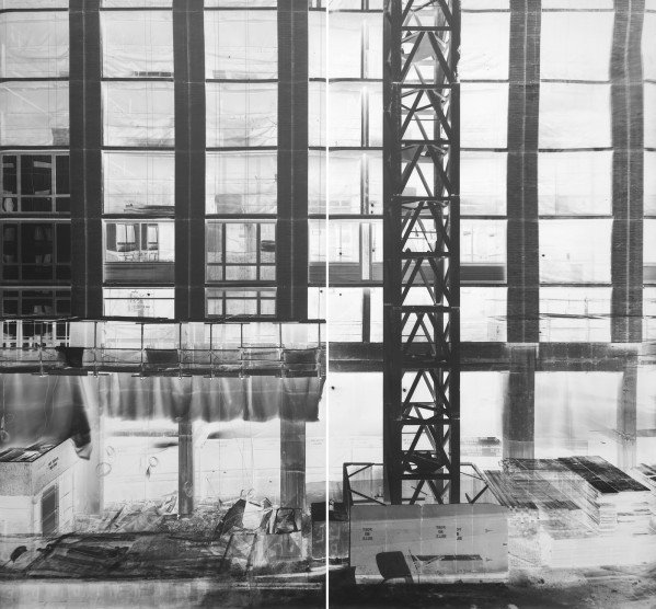
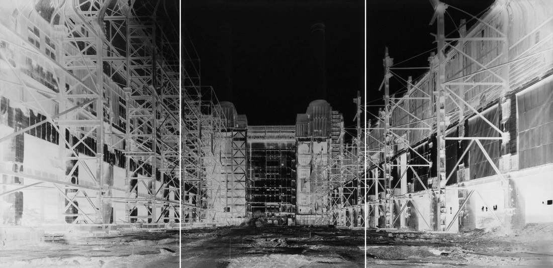
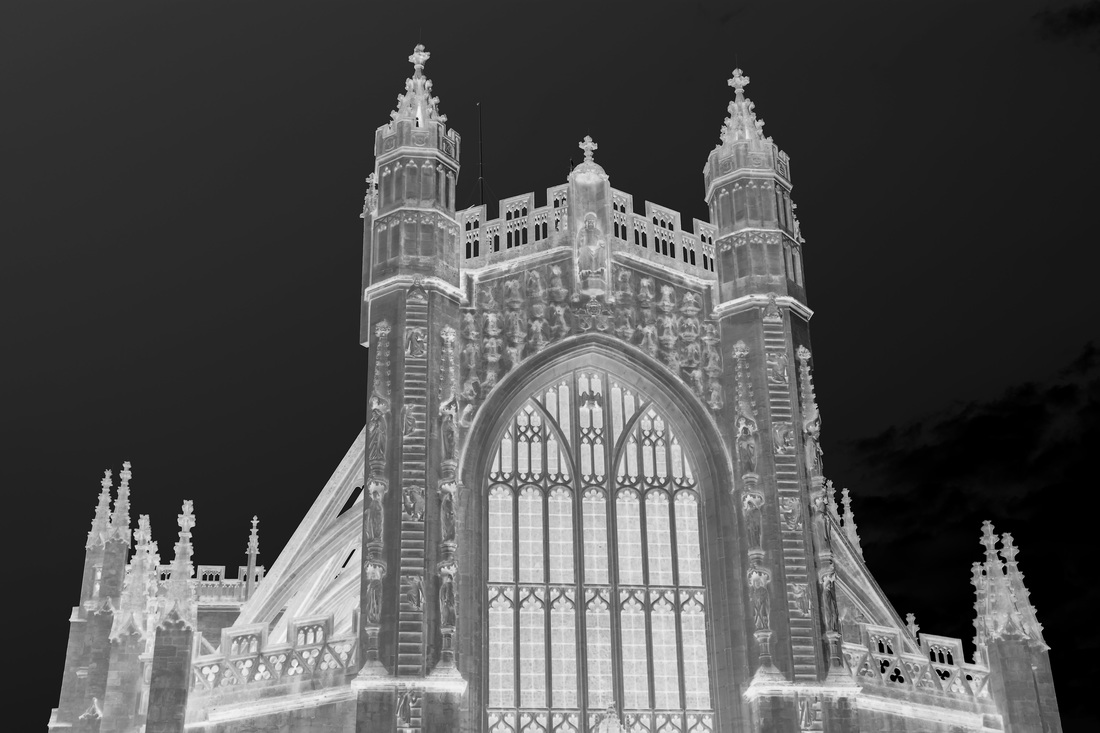
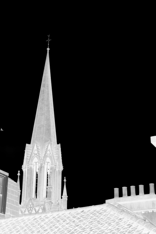
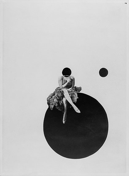
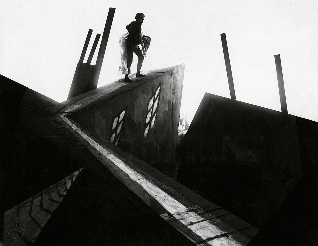
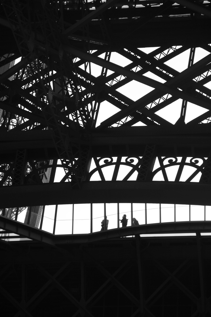
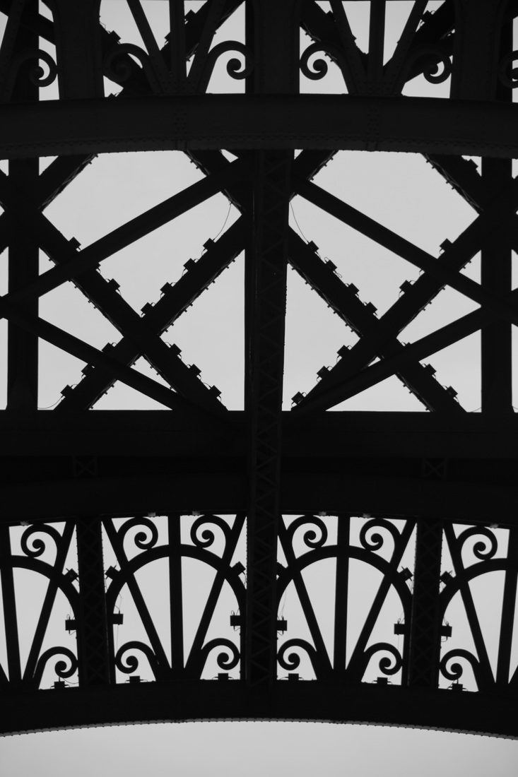
Vera Lutter
these images appear to be almost inverted, this style of photography also focuses on complex structures however with a clear contrast which defines the individual structures.
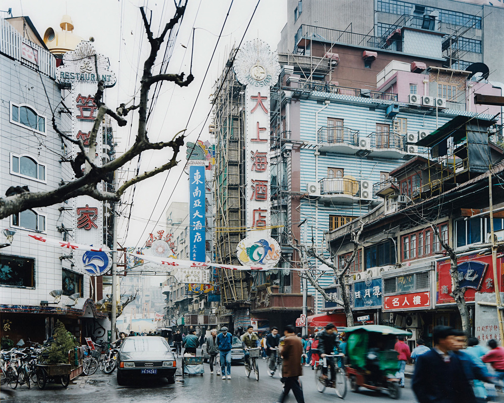
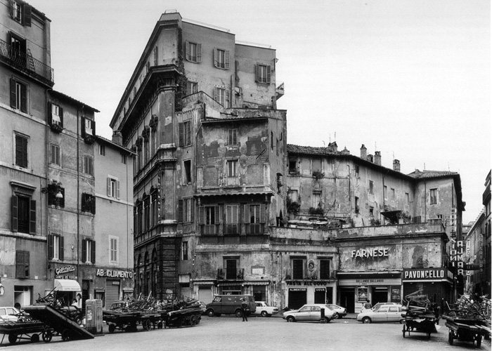
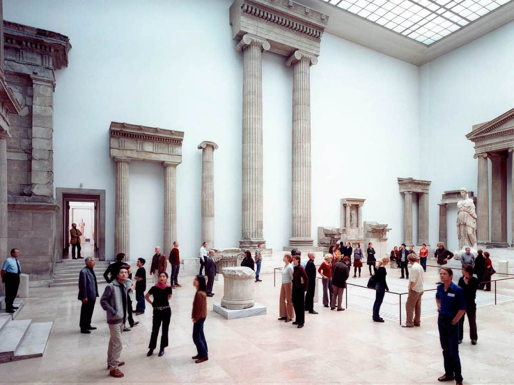
Thomas Struth
Thomas Struth photographs busy and also derelict areas. these types of photographs contrast well with each other and clearly link to the urban theme.
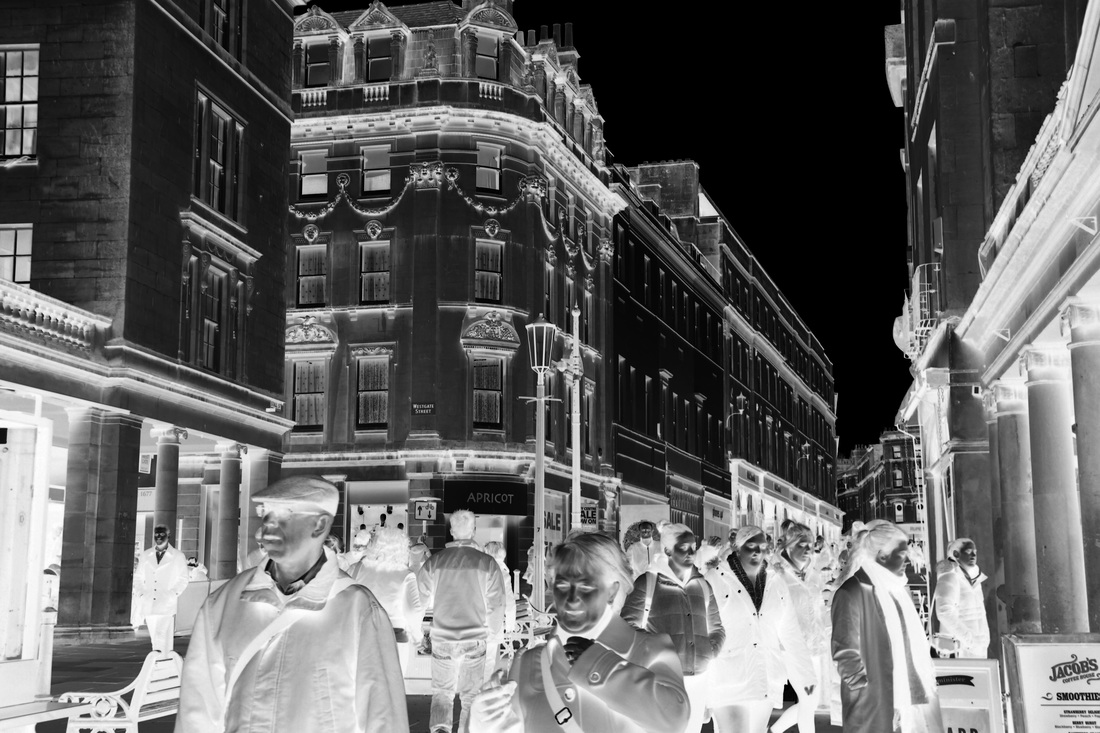
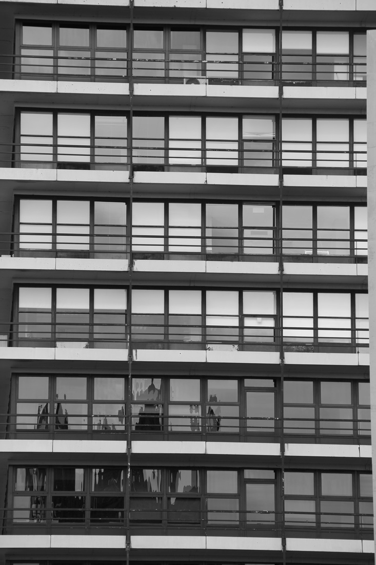
my photos in the style of Vera Lutter
original
|
edited image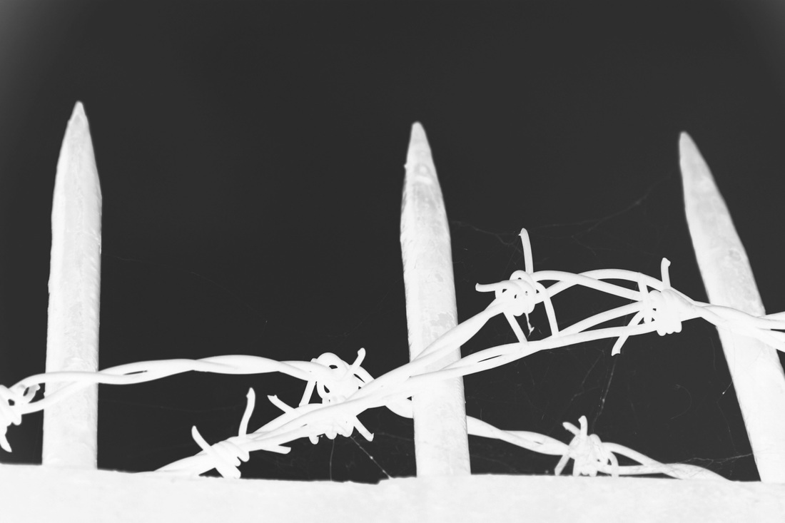
|
to create this image in the style of Vera Lutter I inverted the image and altered the curves to define the edges and show a clear structure. this links to her style of photography. I will be repeating this process in the images below.
|
|
Paul Gonella
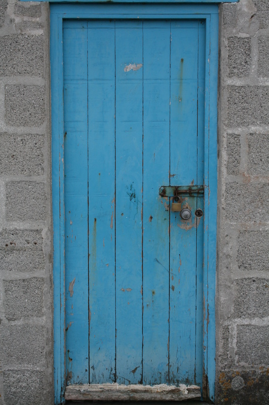
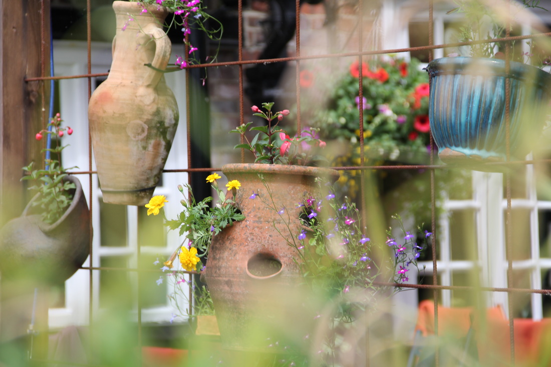
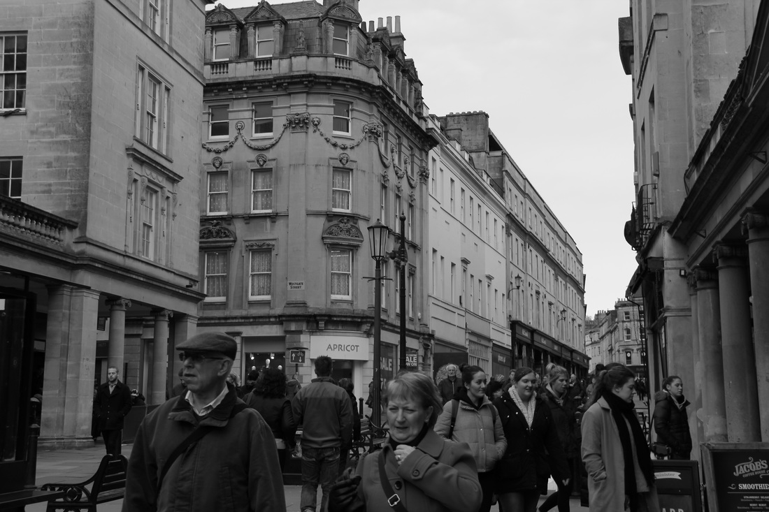
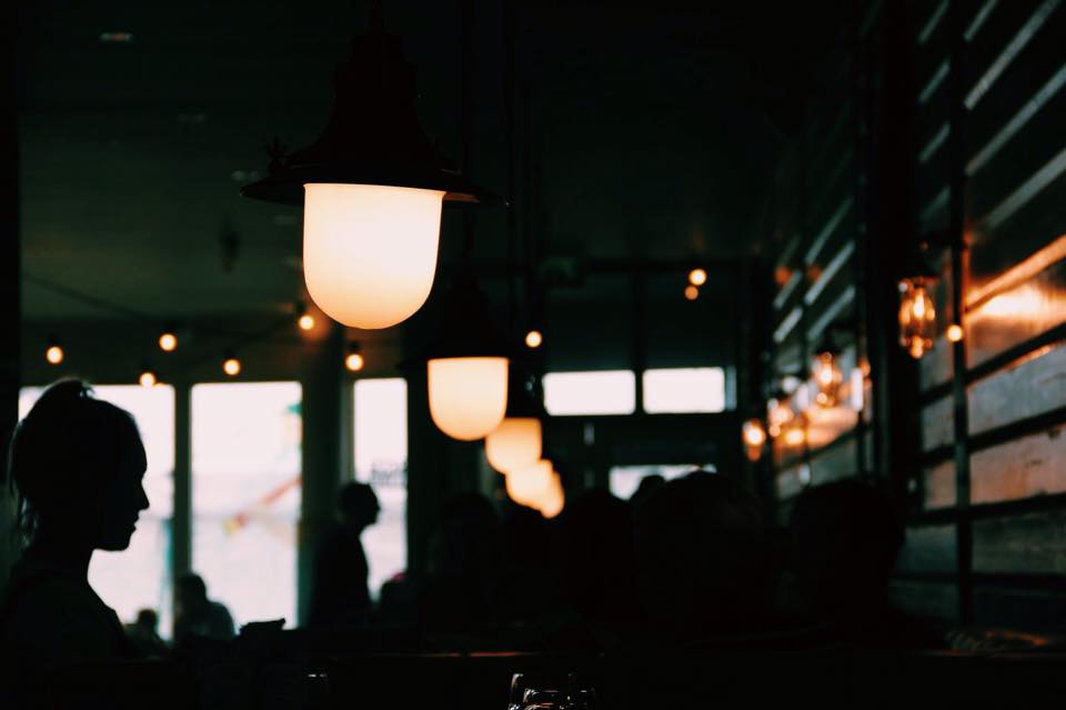
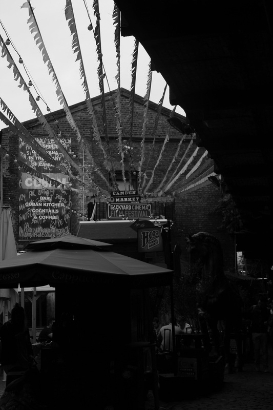
Paul Gonella is a famous street photographer, who takes photos of the 'quiet corners' of an area.
What i particularly like about his work is the colours; they tend to be slightly green or blue toned and each photo links together somehow because of this tone which makes them aesthetically pleasing as a whole. His work varies from close up objects to the street or the landscape, which is another aspect of his work which i enjoy, as it means he captures a variety of images which are all very different, but in a good way. In many cases we focuses in on things which people may not usually take any notice of, the reason for his website being named 'quiet corners' as he takes pictures of the quieter and less noticed areas which you may not consider to be photogenic at first glance.
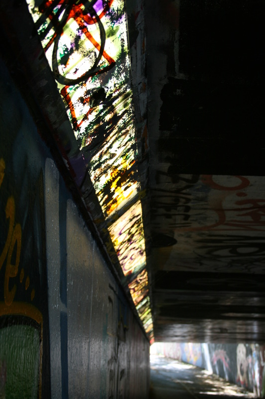
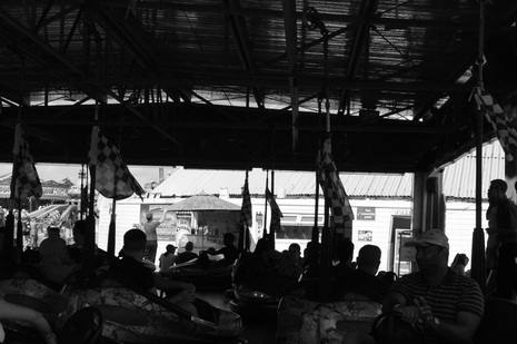
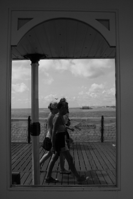
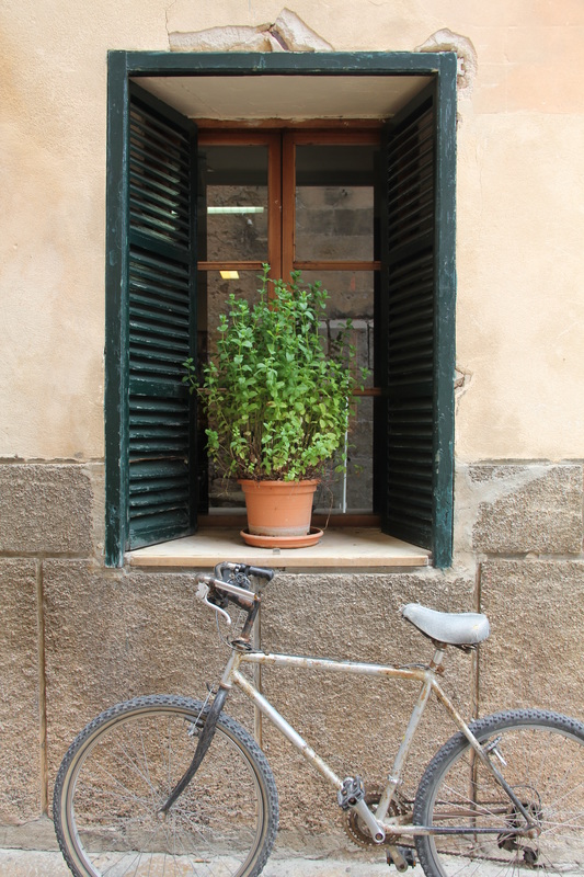
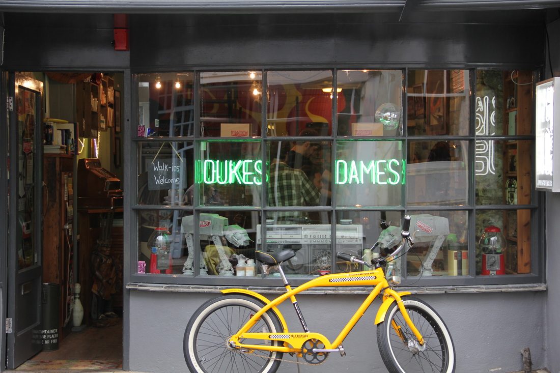
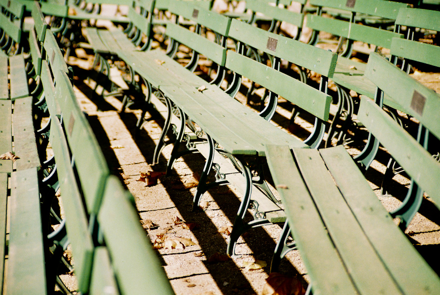
my photos // in the style of paul gonella
I used a filter on each of these images to give them the same effect as what Paul Gonella's work has, and to make them look more similar to his photos. I feel as though this gives them a nice blue/green undertone, the same as we can view in Paul's work.
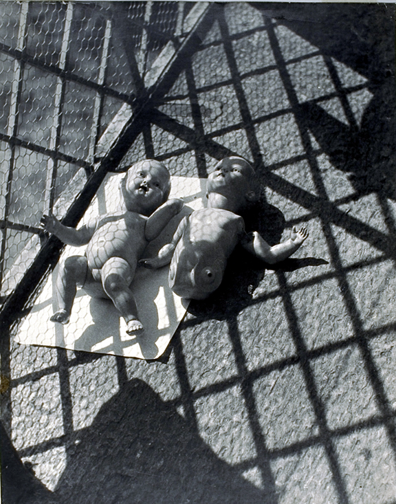
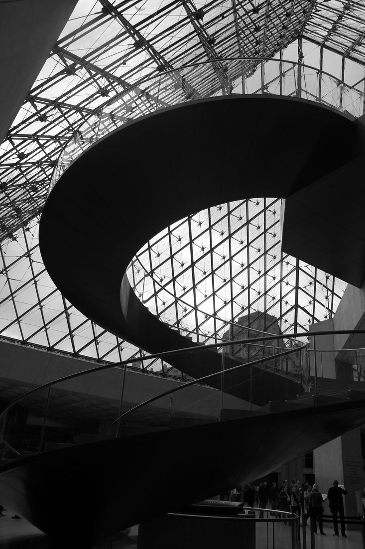
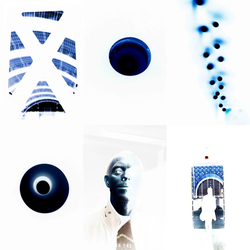
abstract // my photos

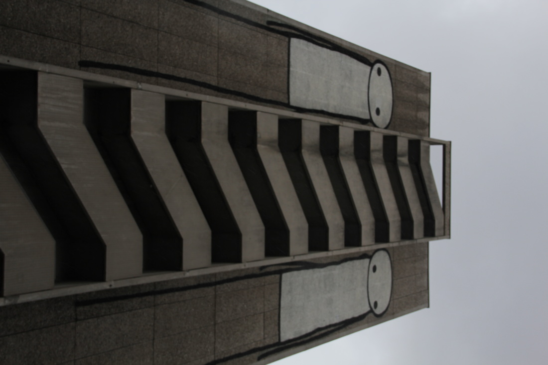
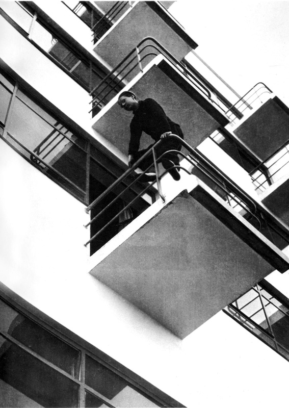
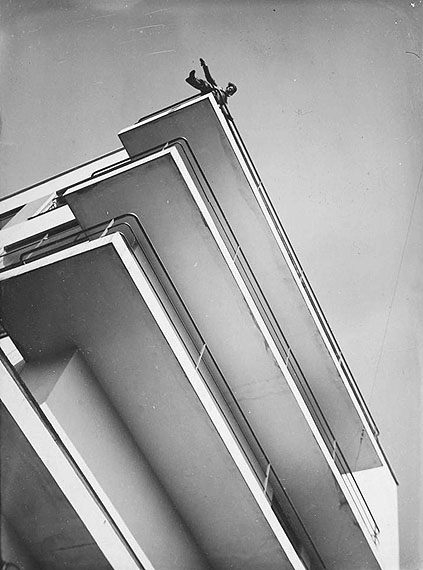
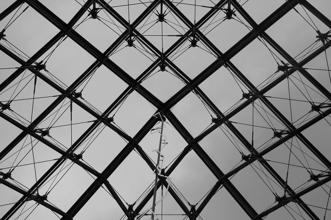
Moholy-Nagy
Moholy-Nagy was a Hungarian painter and photographer, as well as a professor in the Bauhaus school.He was highly influenced by constructivism and a strong advocate of the integration of technology and industry into the arts. Many of his images are looking up and down, focusing on buildings and the shaped they create. i used this aspect of his work to influence my own images and create edits using Photoshop, which creates an interesting effect.
looking up - in response to moholy-nagy


edited images
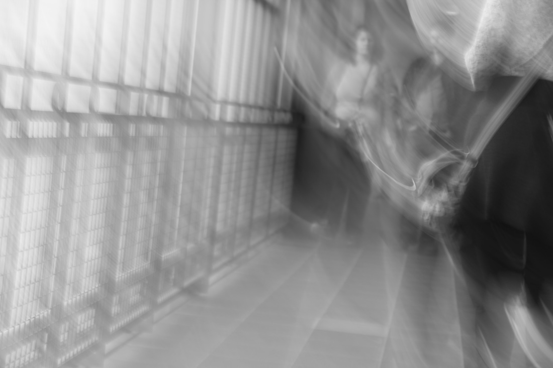
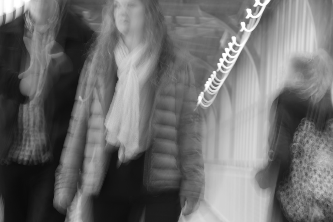
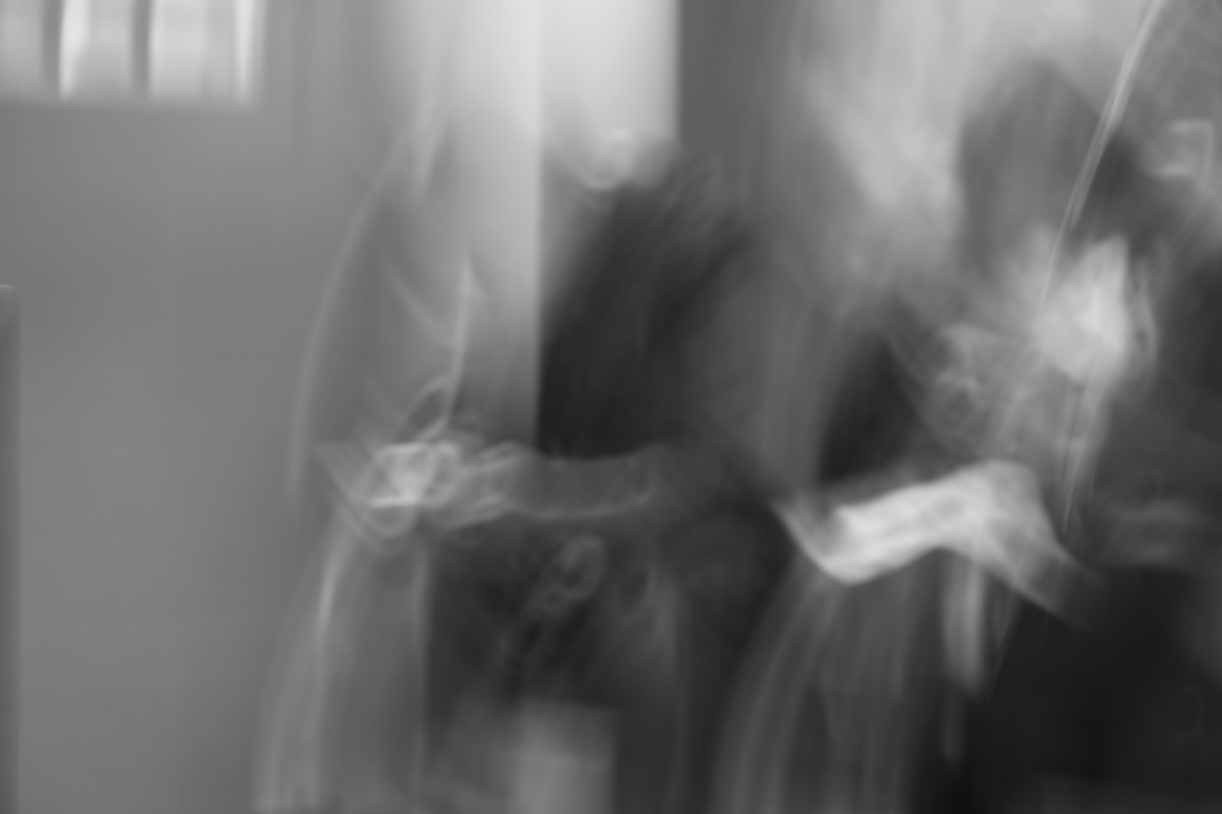
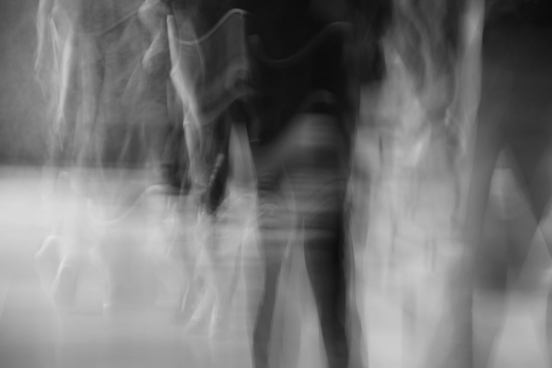
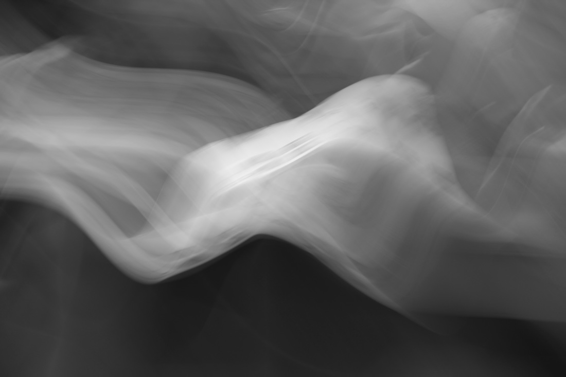
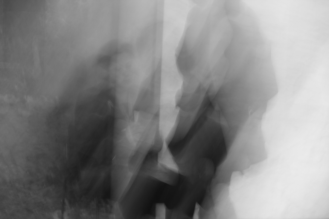
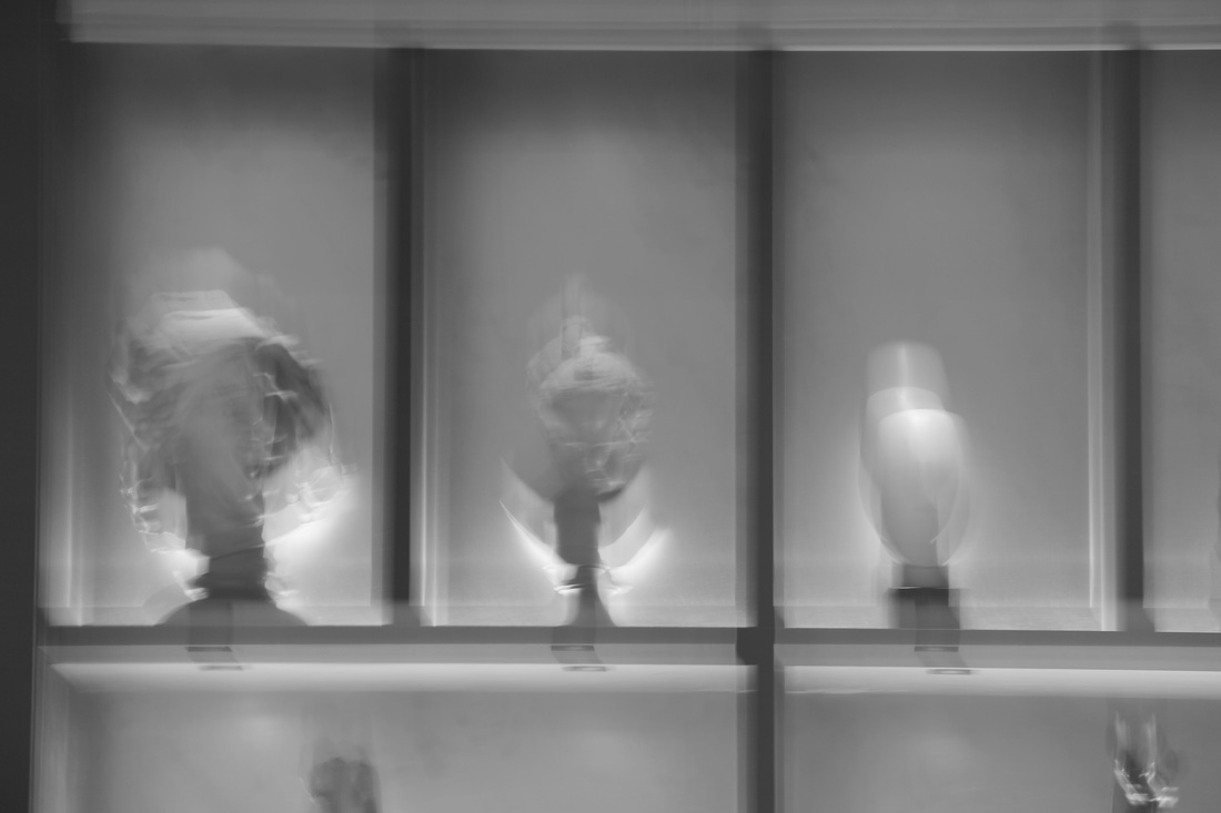
ghosting // my interpretation
in these following images,instead of using photoshop to create the ghost effect i kept the shutter open for a longer period of time than a usual photograph which helps to capture the movement of the objects and creates a different, yet equally interesting and creative, ghosting effect.
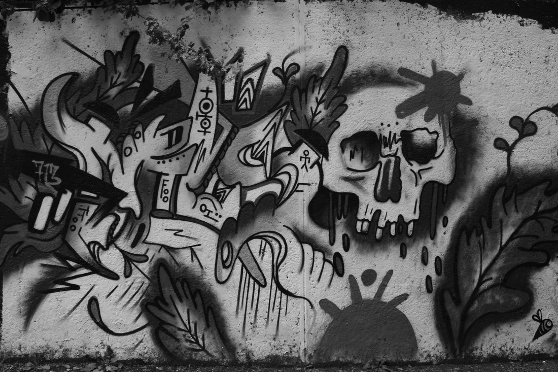
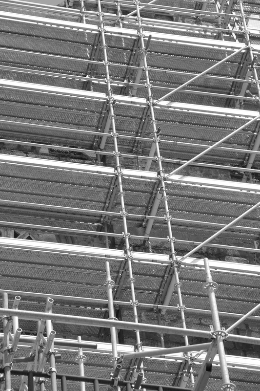
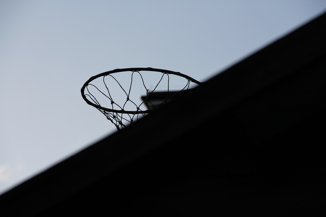
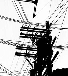
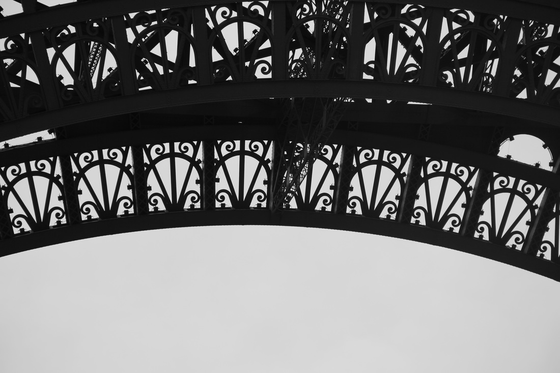
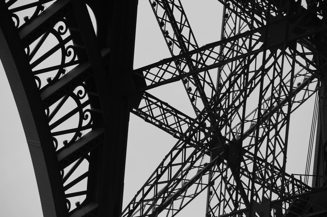
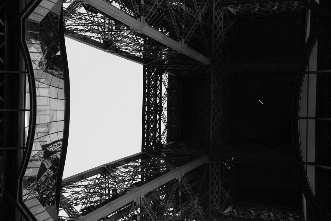
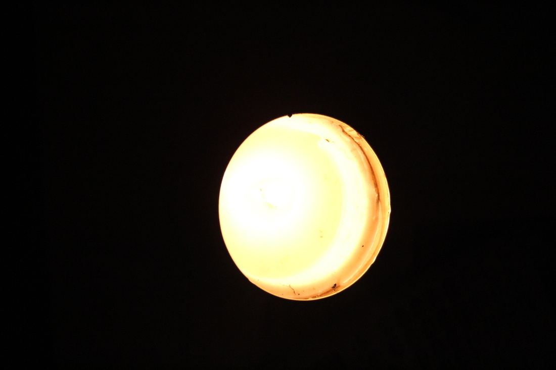
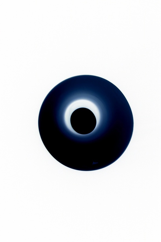
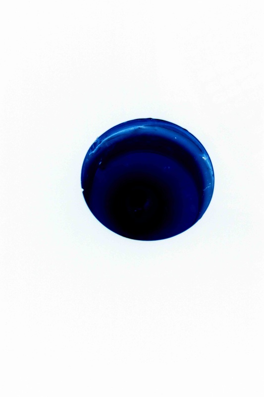
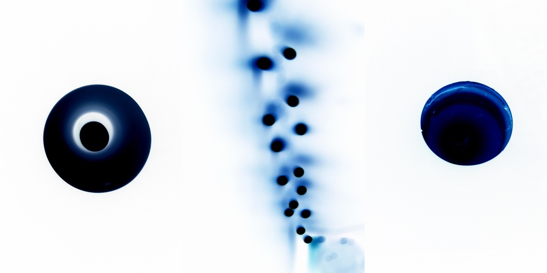
Keld Helmer Petersen
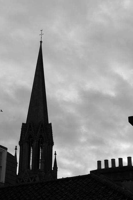
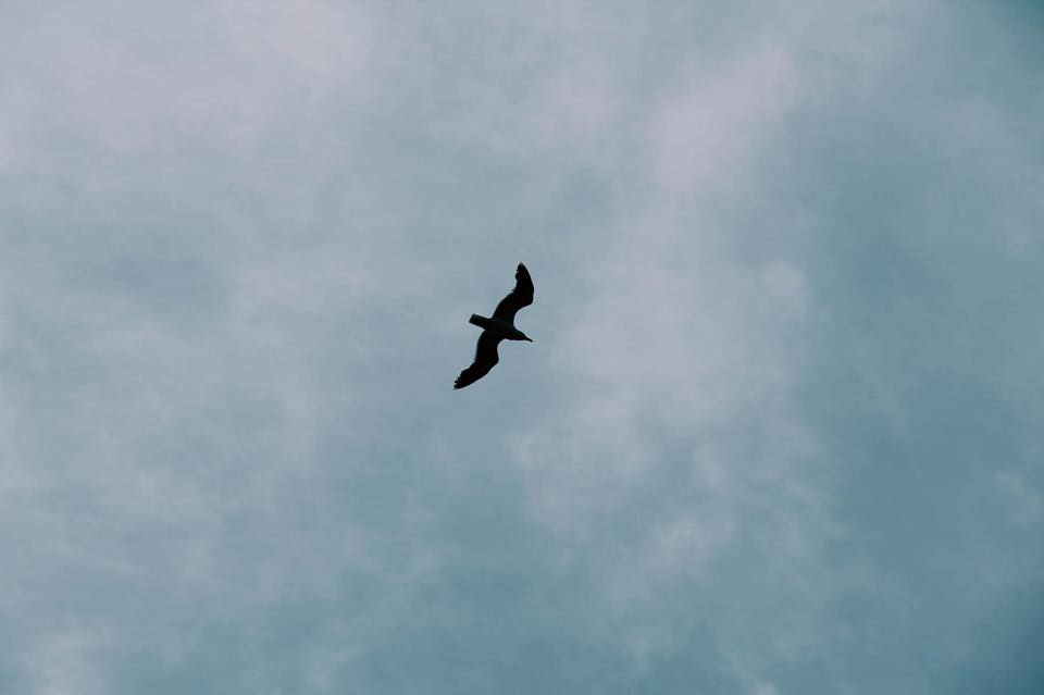
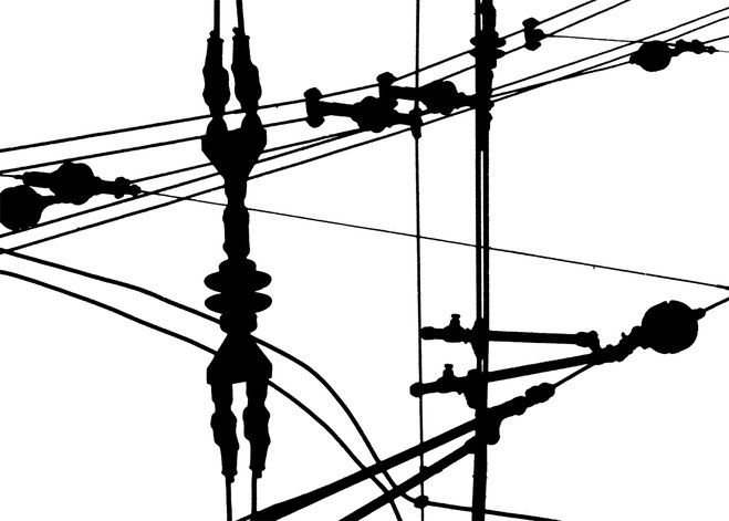
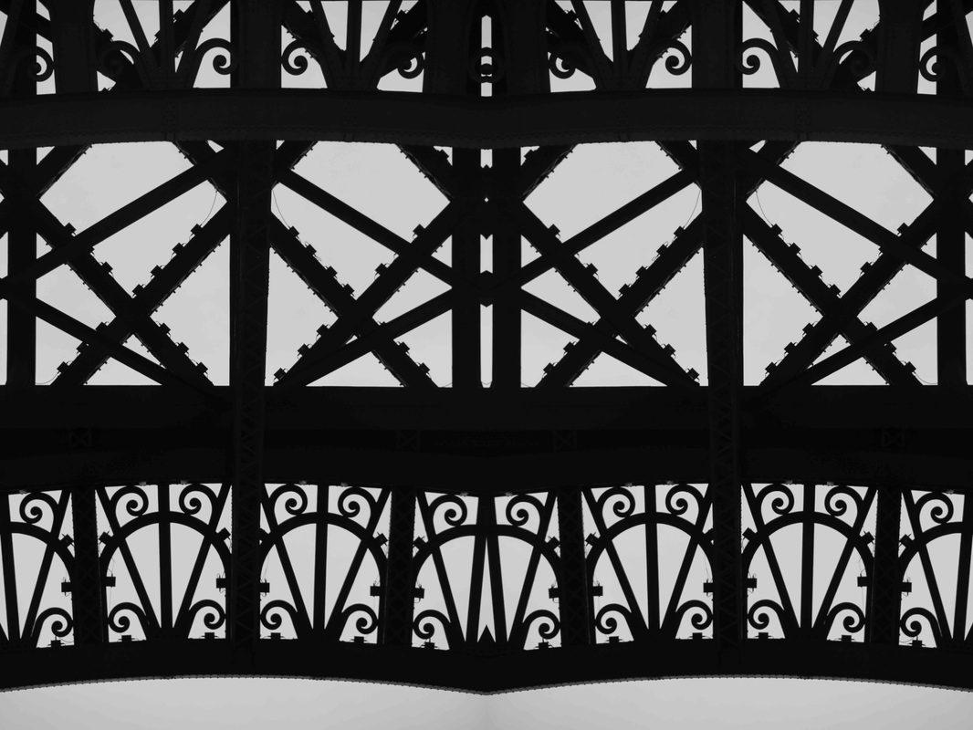
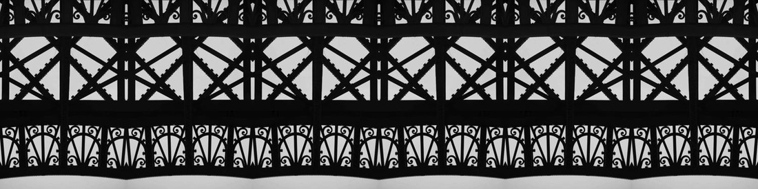
Keld Helmer Petersen's photography focuses on the outlines, or silhouettes of structures. I have attempted to replicate this below. the dark, defined structures contrast with the bright white backgrounds. this draws all the focus to the complex structures.
in the style of Keld Helmer Petersen


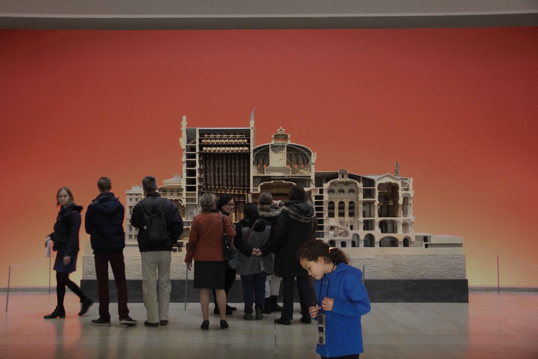
resolving my ideas
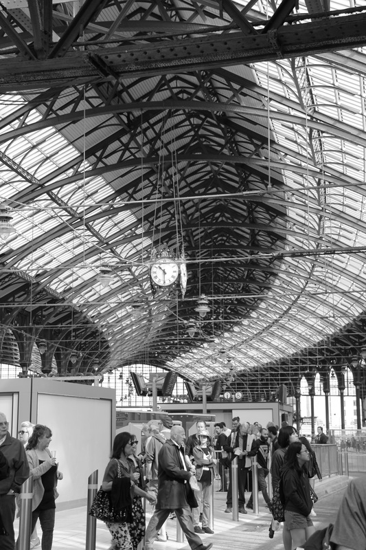
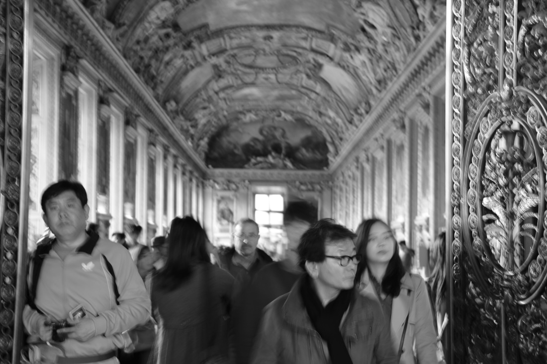
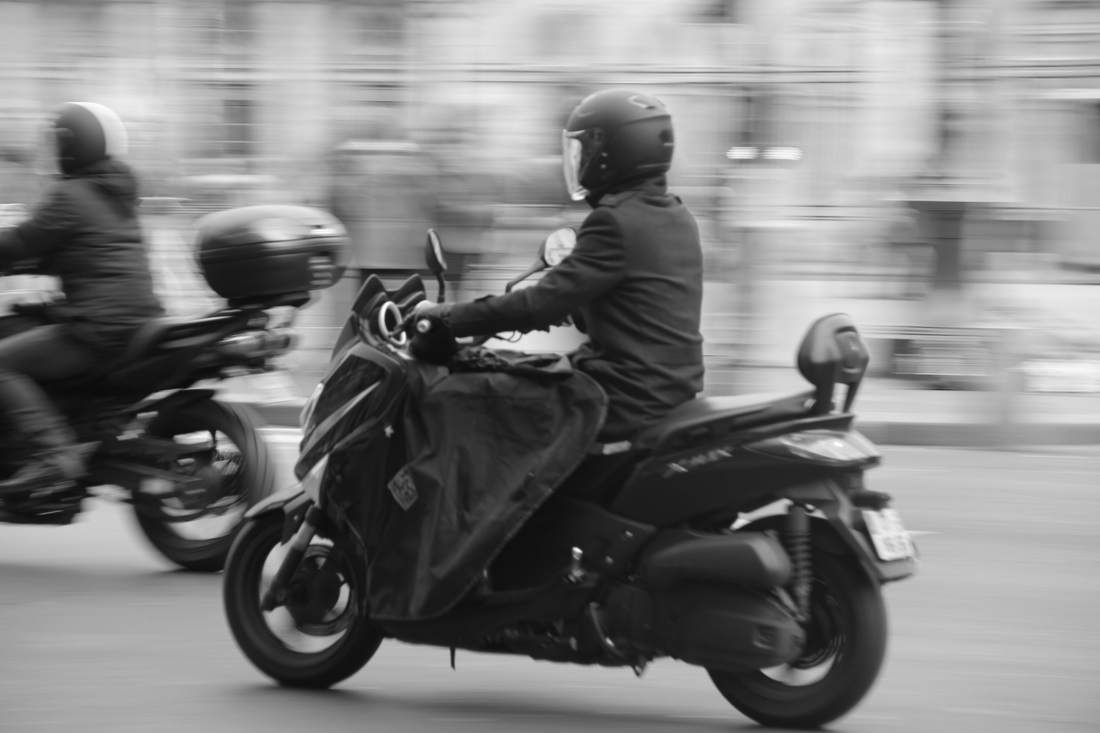
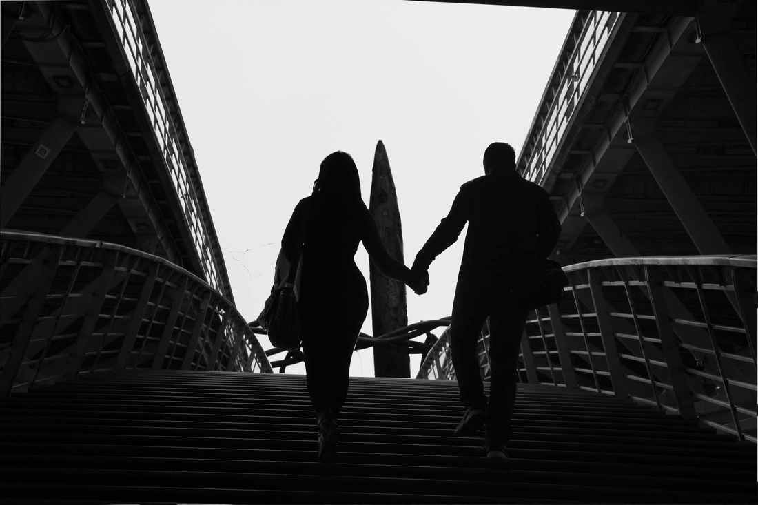
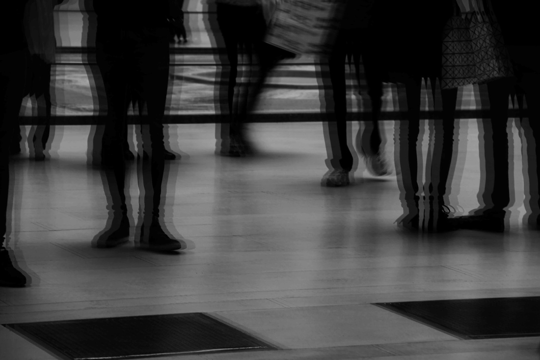
theme 1 - people // movement
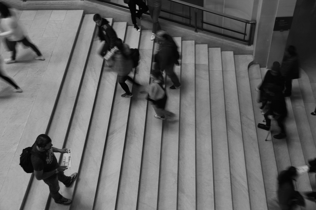
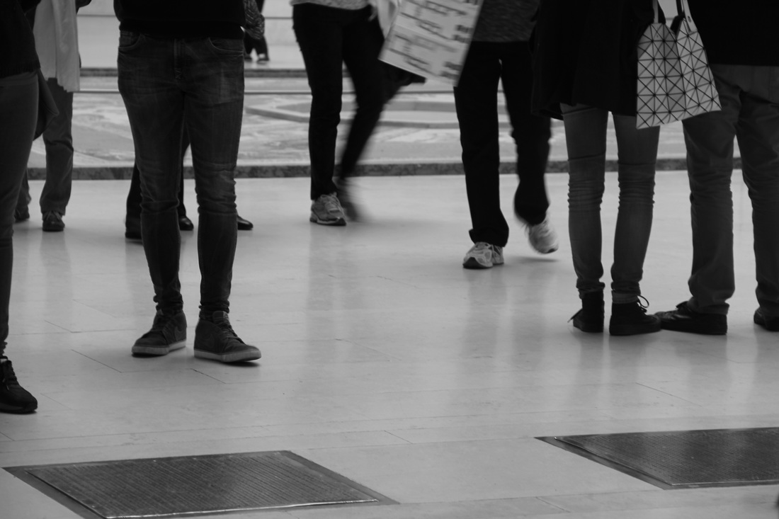
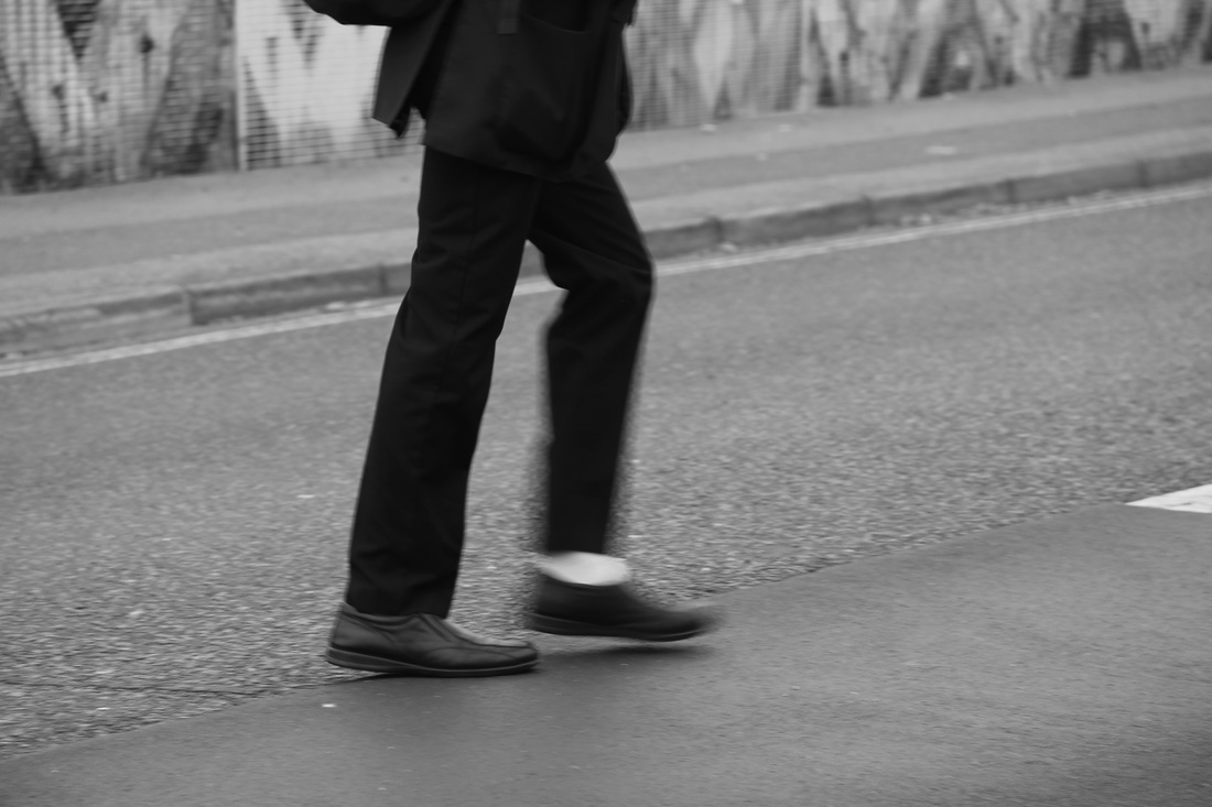
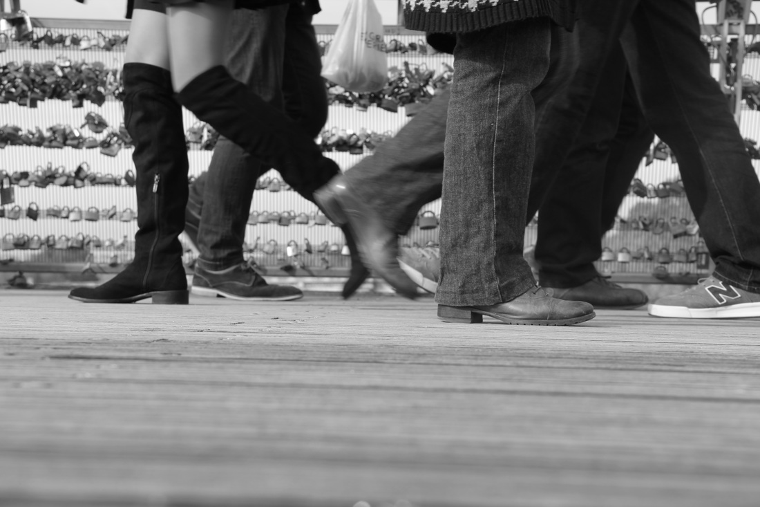
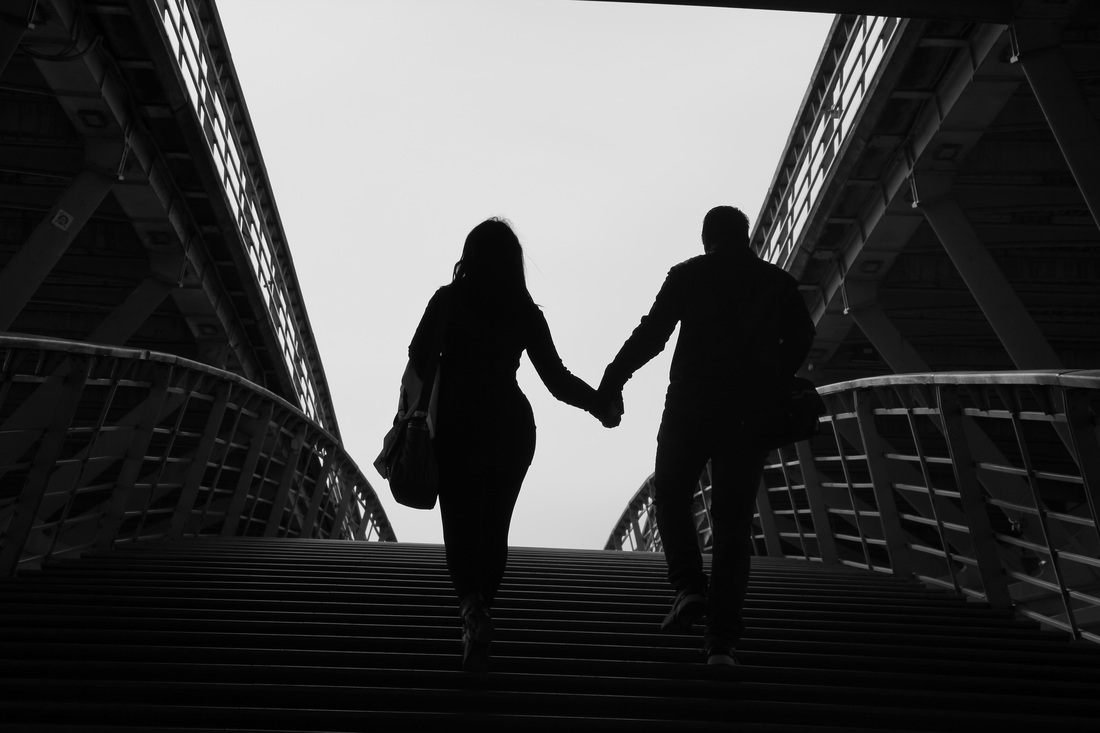
edited images
in this image I darkened only the man which was not moving, this contrasts him from his surroundings and makes him stand out. the visible movement in the background also contrasts with his stillness, which is emphasised by his darkness.
|

here, i blurred only the background and not the man to enhance the legs and make them the centre of attention in the photo. it also enforces the idea of the movement of the man. i did this by duplicating the background , decreasing the opacity and moving it slightly off centre.
|
in this edit I moved the people and bridge over an image of some barb-wire using the polygonal lasso tool. I like the effect this creates as it seems almost as if it were some sort of structure, and the 2 images merge together well.
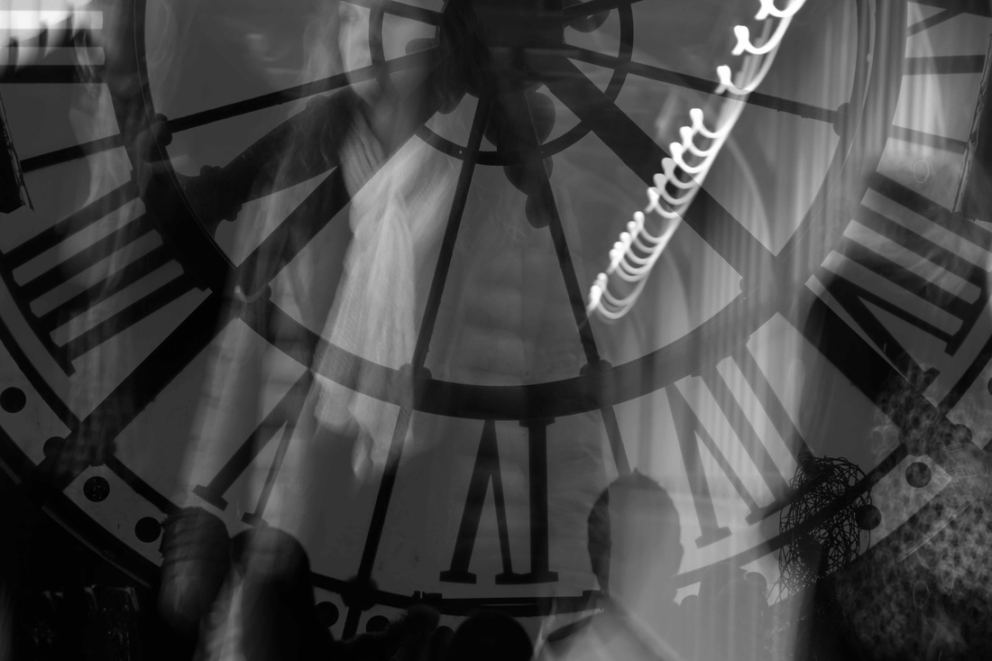
to create this image I took two photos, and moved the one of the clock over the one of the people. I followed this by decreasing the opacity of the clock image, allowing the photo behind to be seen through. I like this as it adds interest to the photo and it is unique.
|
here, I duplicated the image twice and decreased the opacity of each of the duplicates to different levels. I then moved them slightly off-centre to give the picture a blurred effect which represents the movement.
|
I decreased the saturation of everything apart from the girl in the foreground to make her the focal point of the image.
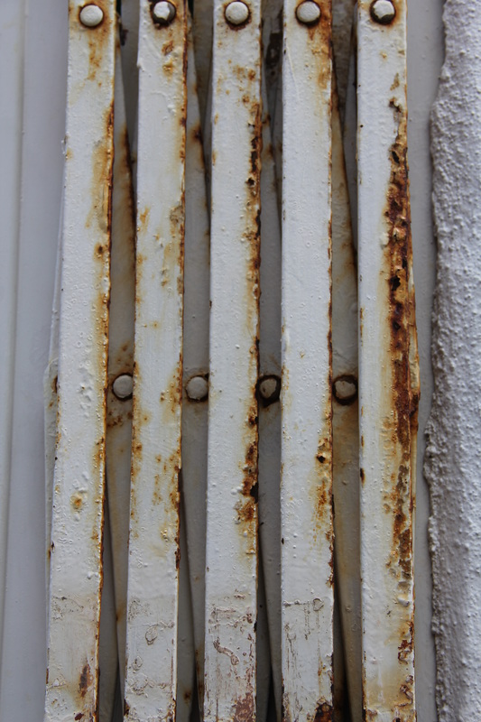
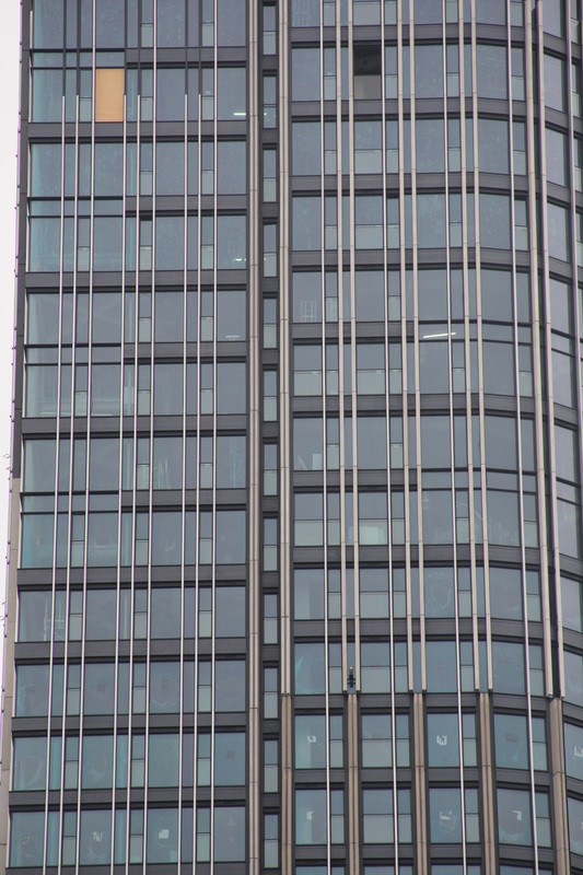
theme 2 - structures
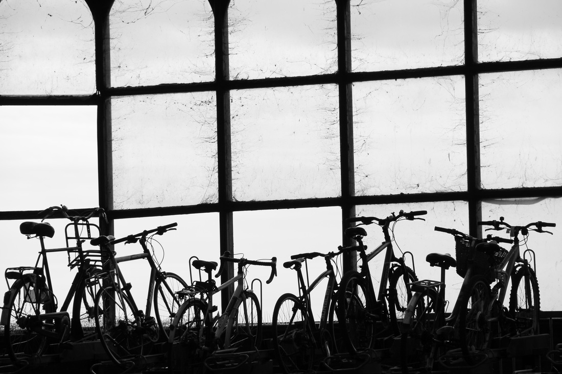

edited images
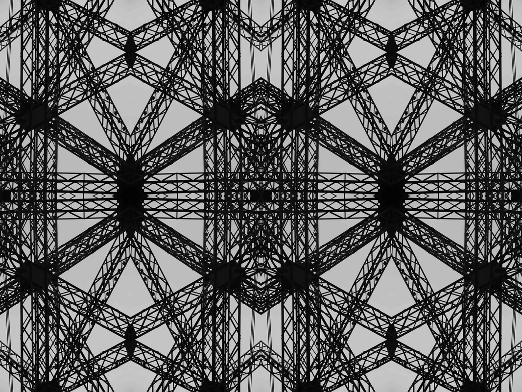
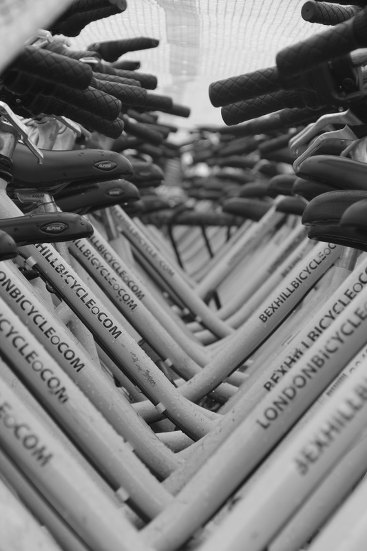
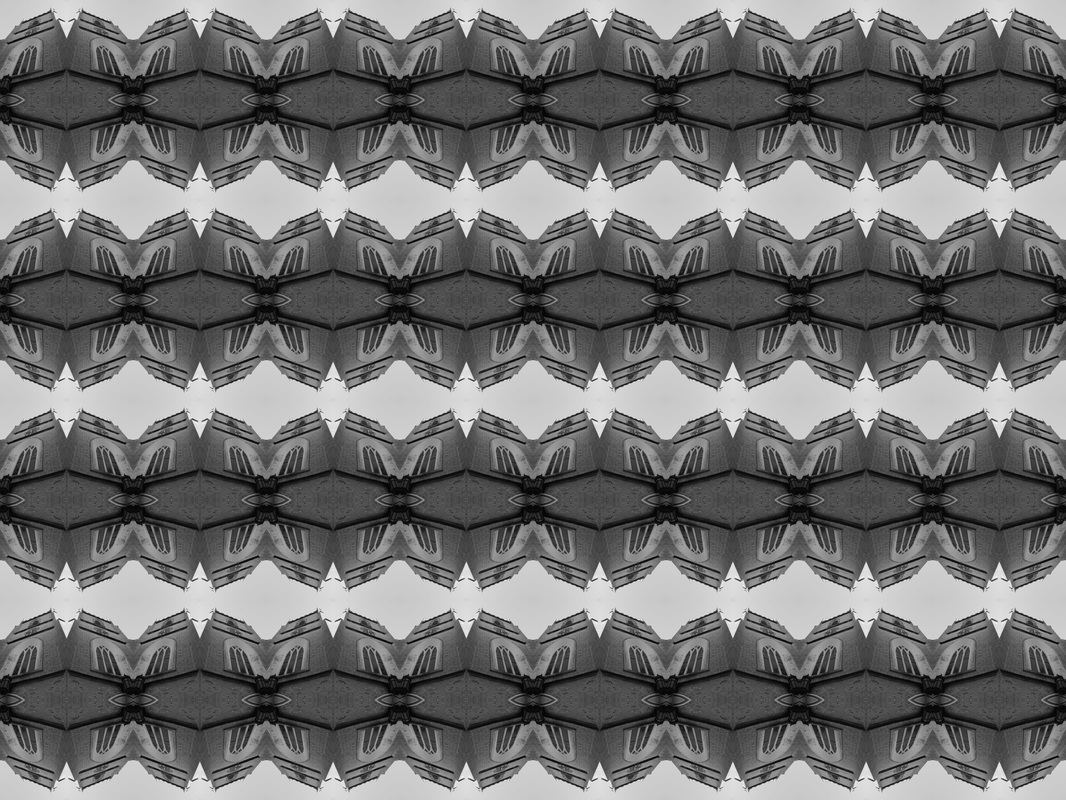
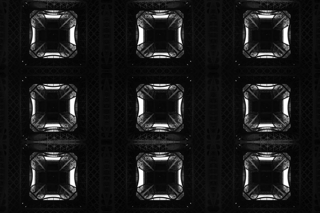
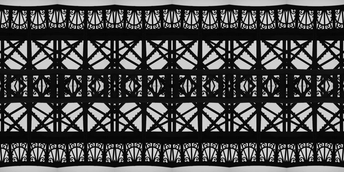
This image is in the style of Keld Helmer Peterson. I created this by duplicating the layer then increasing the canvas size, and using the transform tool to flip the images so they blend together creating a complex structure.
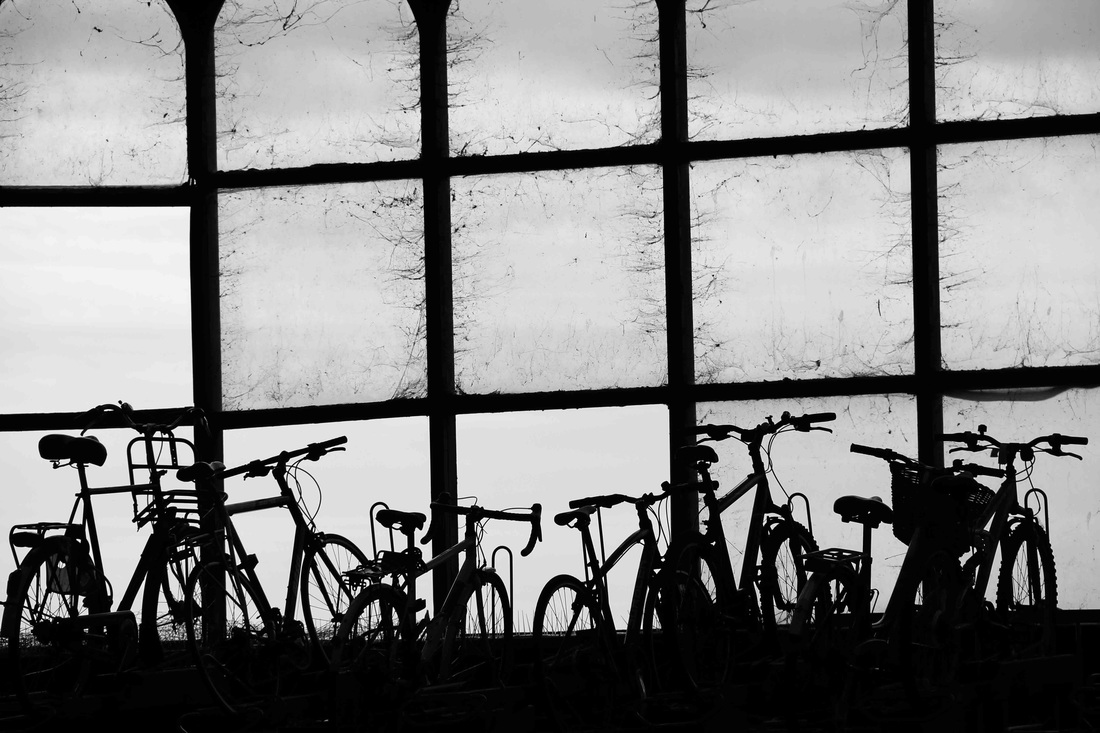
stage 1 - here I darkened the image using curves to make the bikes more silhouette-like.
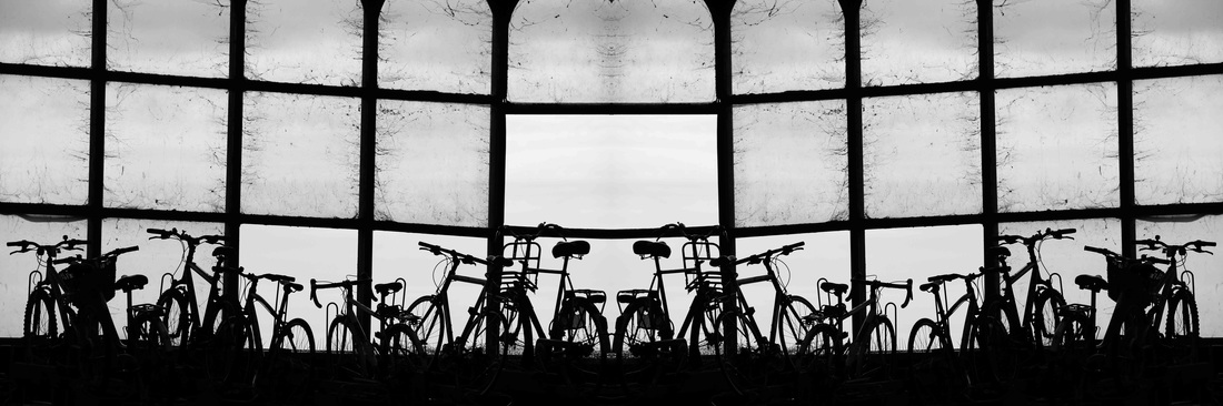
stage 2 - I then increased the canvas size by 200% and duplicated the image. I flipped it horizontally using the transform tool to blend the 2 images together, creating a mirrored effect.
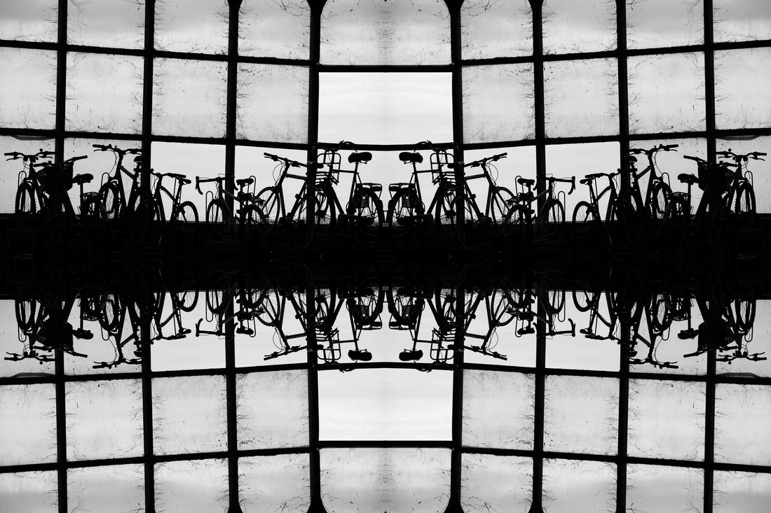
stage 3 - for the final stage of my edit I once again increased the canvas size by 200%, but this time by the height. i duplicated the already mirrored image, then flipped the second one vertically using the transform tool to create a double mirrored effect. i did this because it makes the structures in the image seem more complex, and makes it more interesting, and visually disorientating which adds an element of confusion, therefore making it more interesting and unusual.
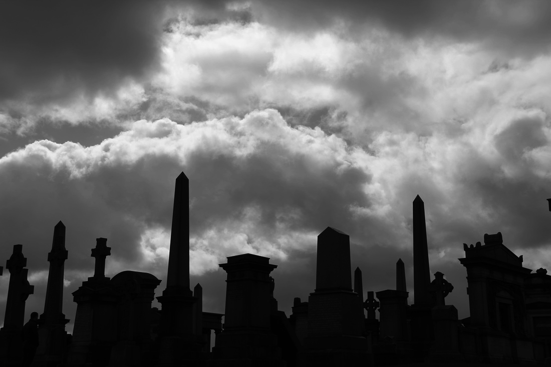
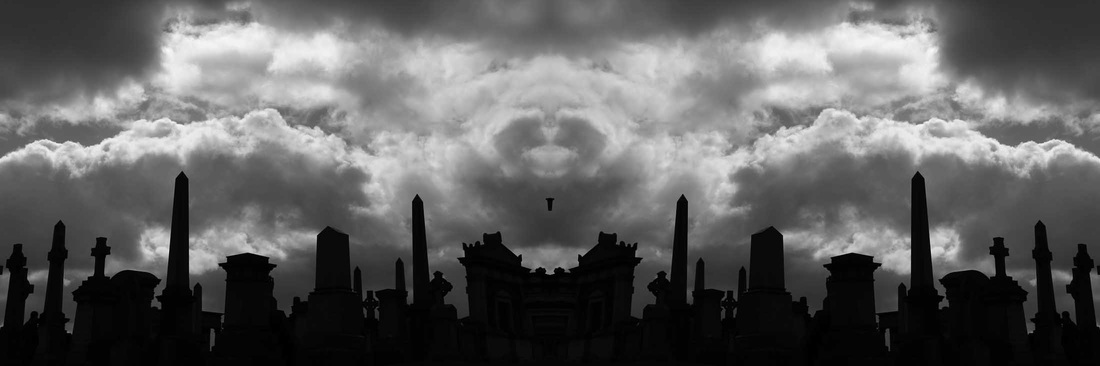
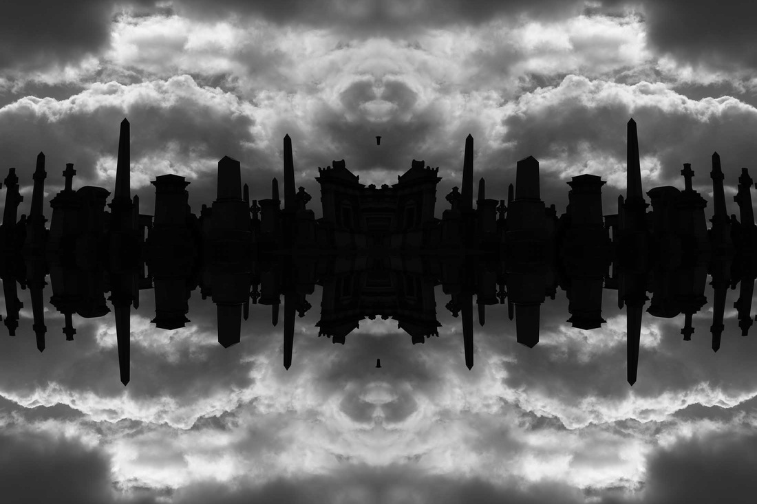
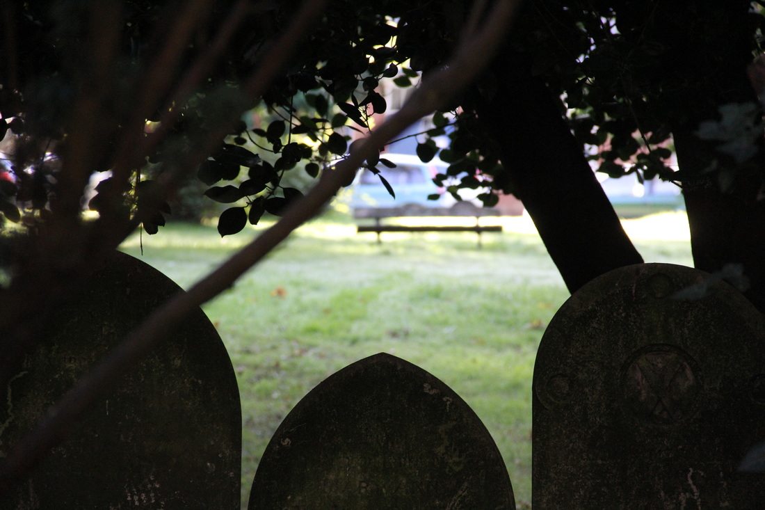
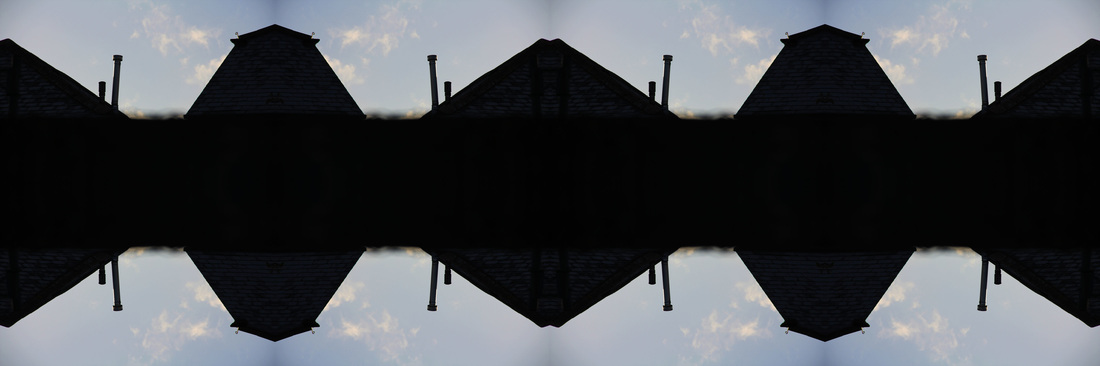
in this image I repeated the same process as in the picture of the bikes above. I think the contrast between the gravestones and the sky is very effective.
the original image.
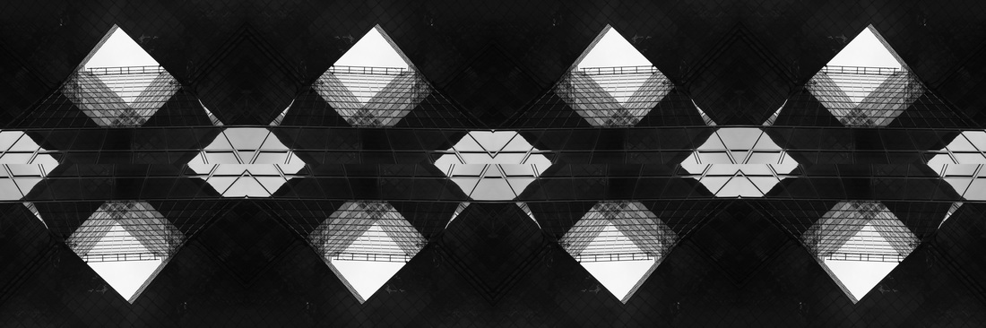
i once again duplicated the image, but this time three times, and increased the canvas size by 300%.
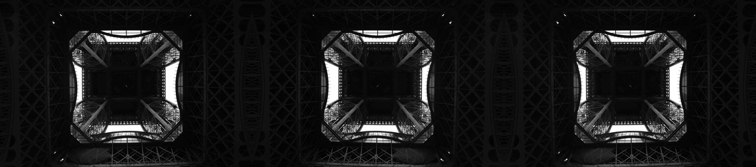
i repeated the second stage but this time vertically. duplicating the image creates an interesting structure, and the light squares in each image stand out more an contrast from the dark background, where the complex structure is more subtle. they also emphasise the complexity of the building and give depth and contrast to the image.
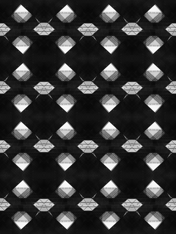
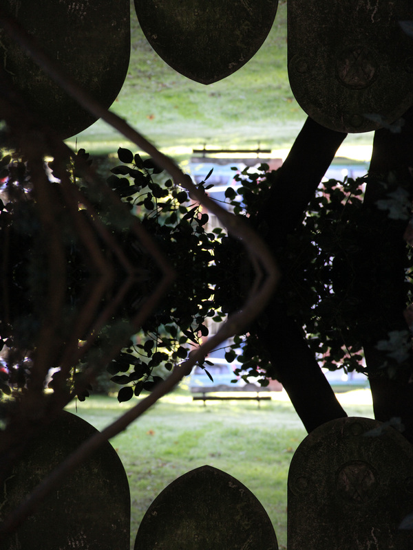
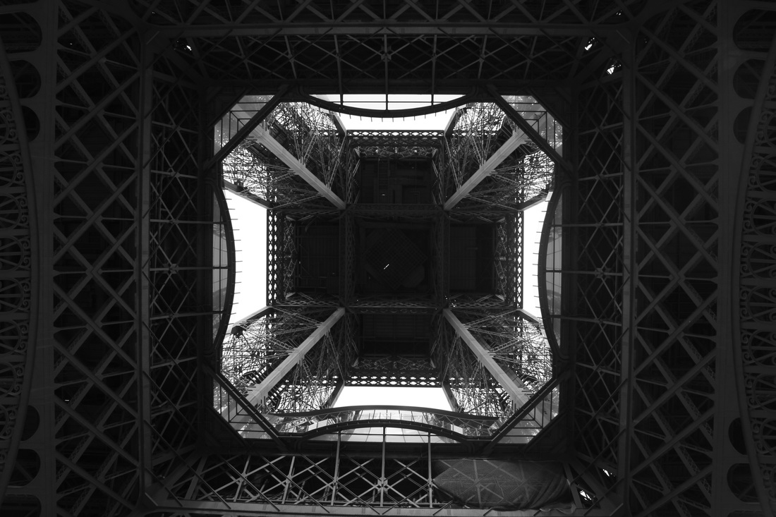
I first duplicated the original image.
I then repeated this so there is 6 of the original image.
I then duplicated the 6 images, and increased the canvas size by 200% vertically to create this image
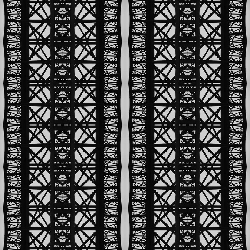
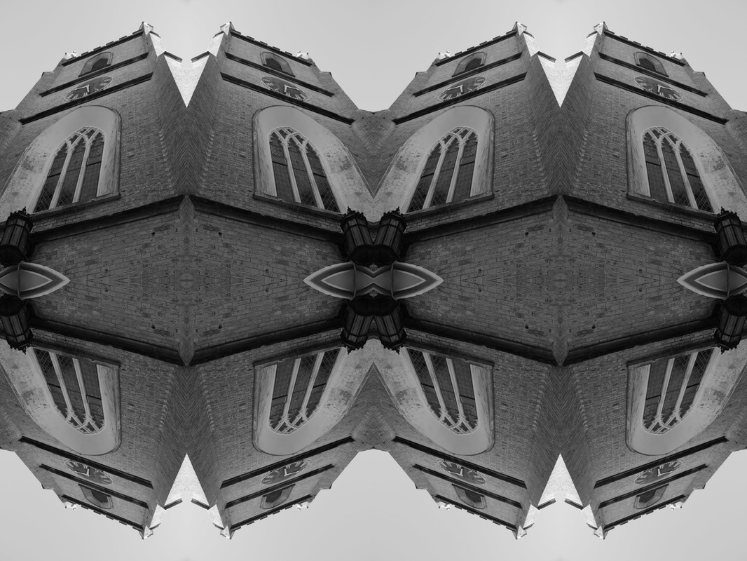
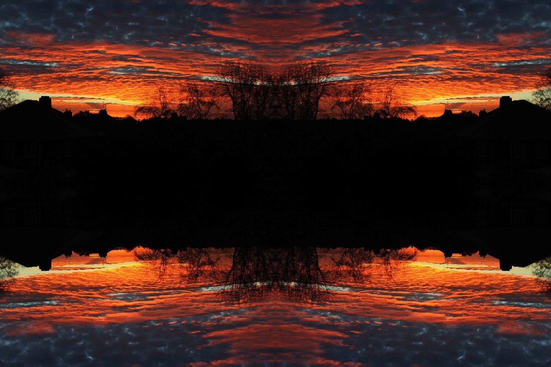
i once again duplicated the image above and flipped the canvas by 90 degrees, creating 2 parallel images. the dark silhouette of the structure is effective and contrasts greatly with the plain, light background. i created this because it is once again a complex structure and is an interesting image to view.
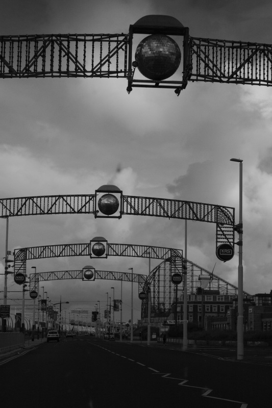
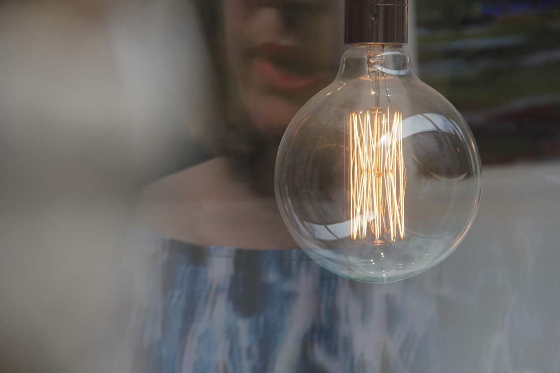
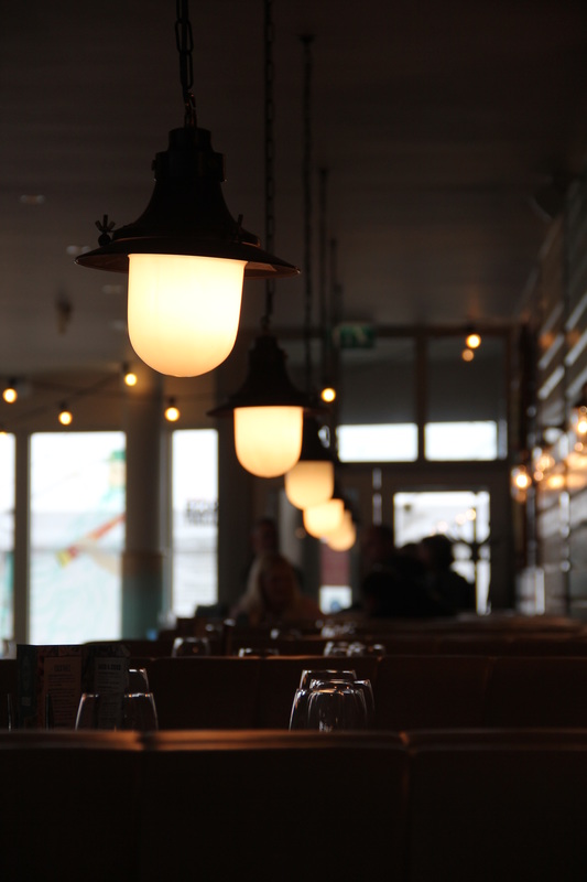
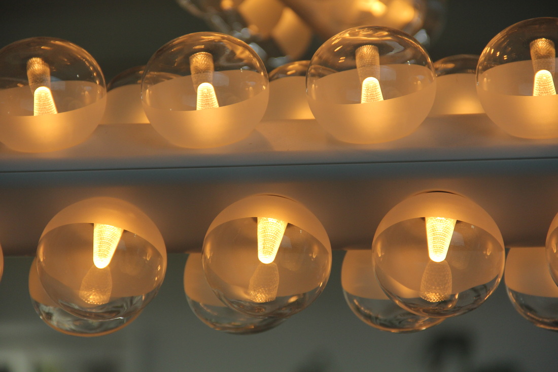
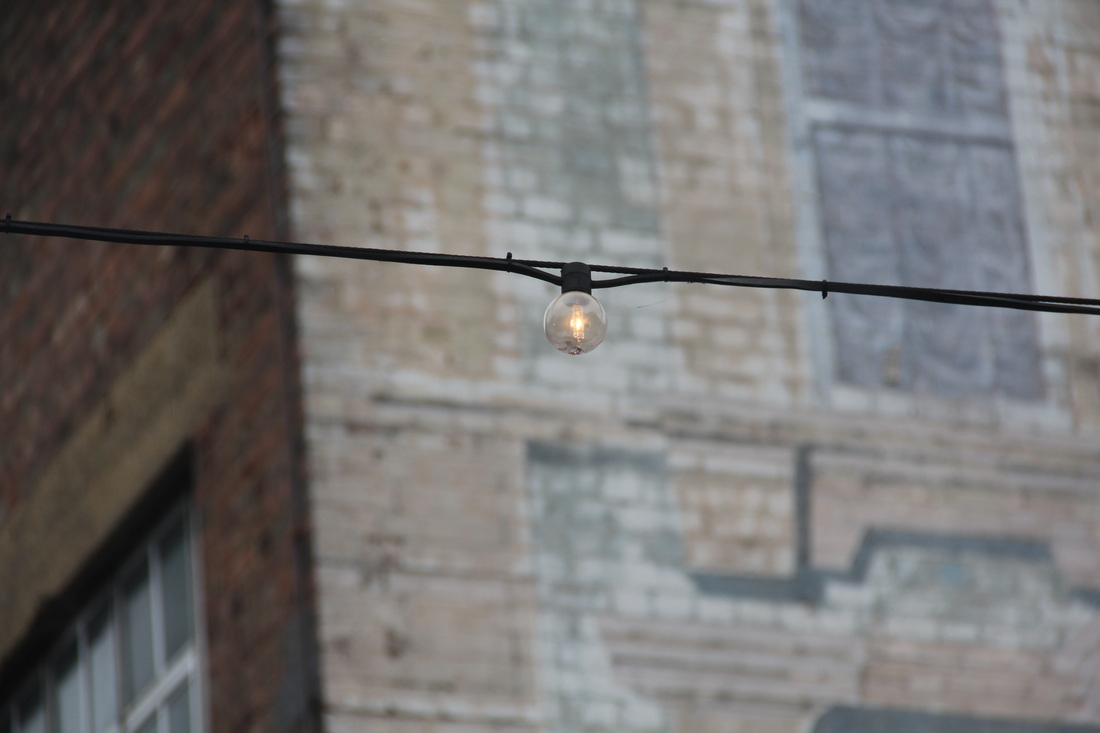
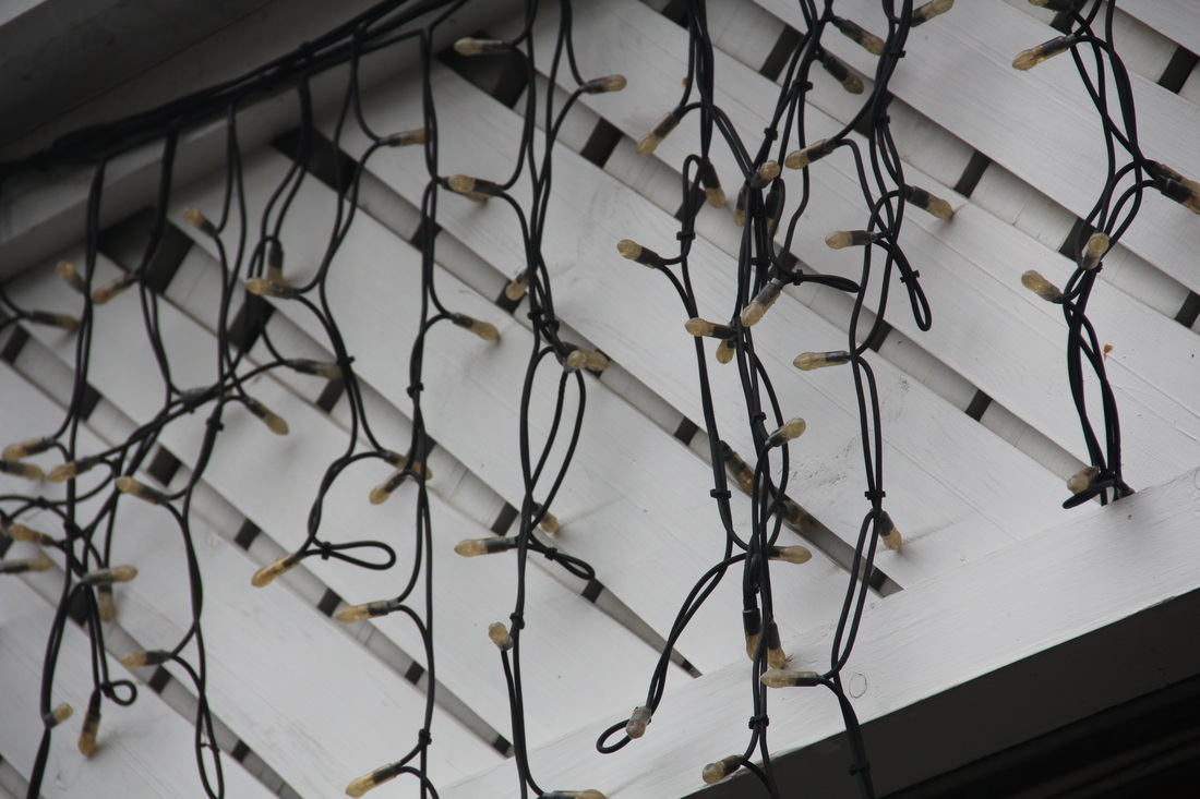
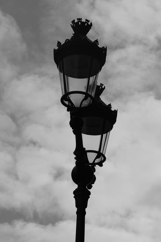
theme 3 - lights // contrasting images
edited images ((inverted lights))
i chose to edit these images in this way because it creates an effect of mystery, at first these would be unrecognisable as lights due to the fact they have been inverted, and in my opinion, as a whole, these images look extremely effective together, which can be seen below in my final edited image.
final edited images
this is my first image, I put just 3 of the inverted images together. the colour scheme is effective as each of the images bled together due to the constant background colour. it is also very minimalistic and clean looking.
in my second edit I added more images, although I prefer the original edit I think this is still effective as thee colour scheme is still constant, however the pictures are not of as high a quality,
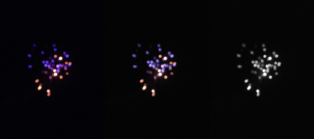
in this edit, I decreased the vibrancy and saturation each time as moving right along the frames. the unfocused image enhances the lights and the decreasing saturation gives an interesting effect, especially as the backgrounds of each images merge together quite smoothly, however there is a slight difference in colour.
other edited images
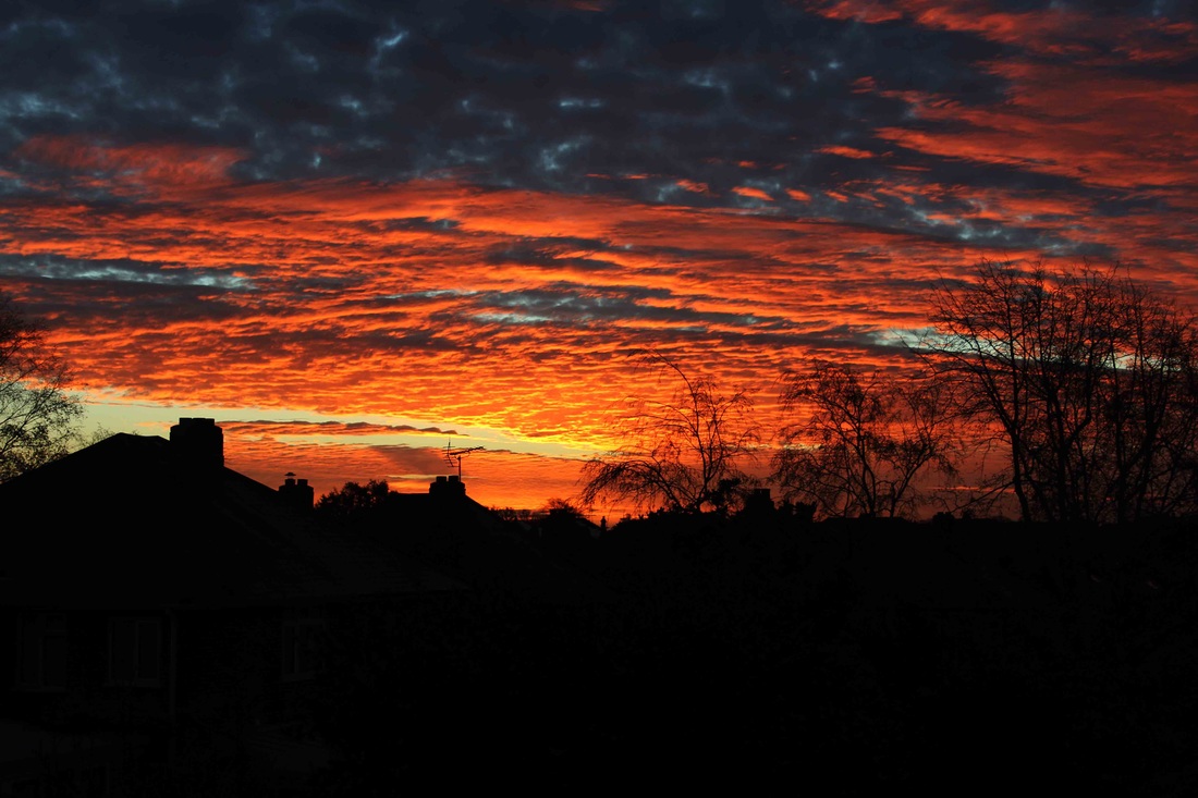
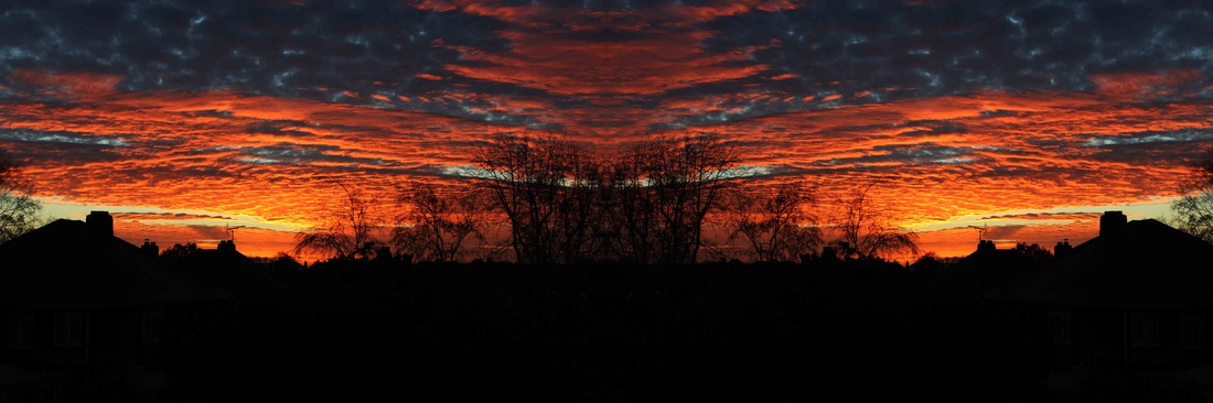
in these images I used the curves tool to darken the image, and the vibrancy tool to make the colours stand out. i then duplicated and rotated the images to form the final edit above. the colours, especially the orange, are extremely vibrant in this image, which is an aspect which I like. also, I like the way the black silhouettes of the buildings and trees contrast with the bright and colourful sky behind. the clouds create depth, making the photo look more three dimensional.
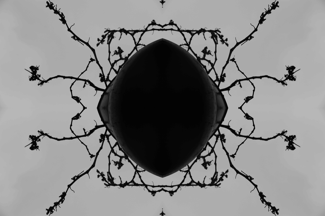
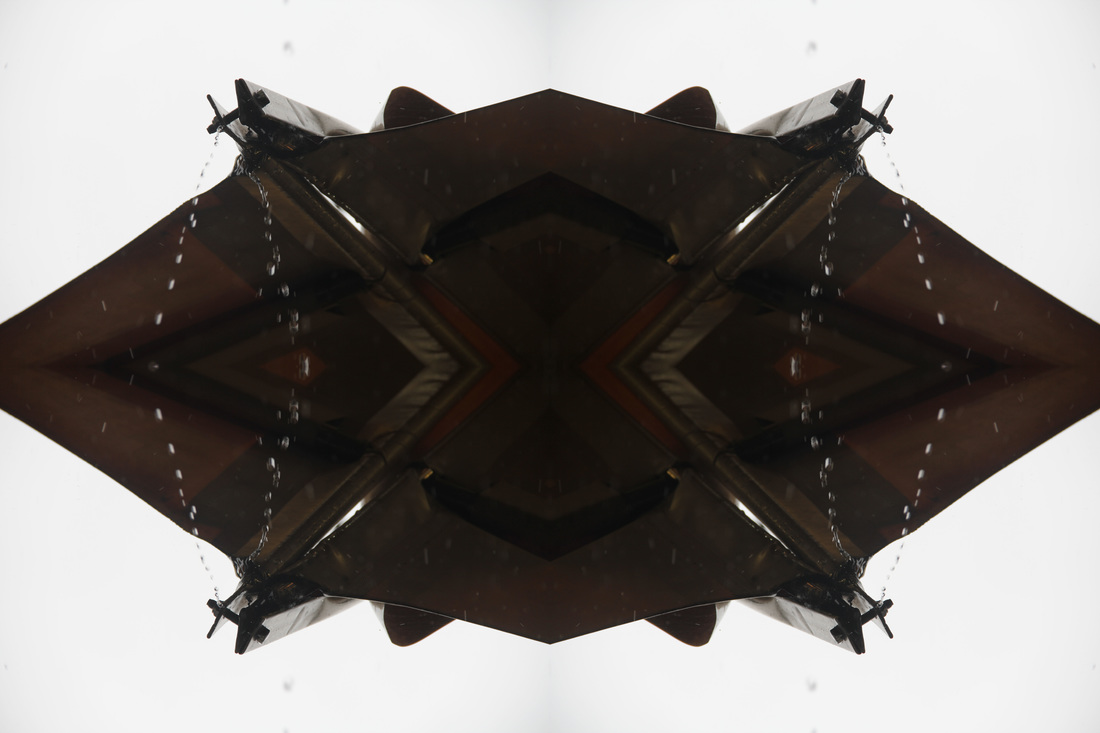
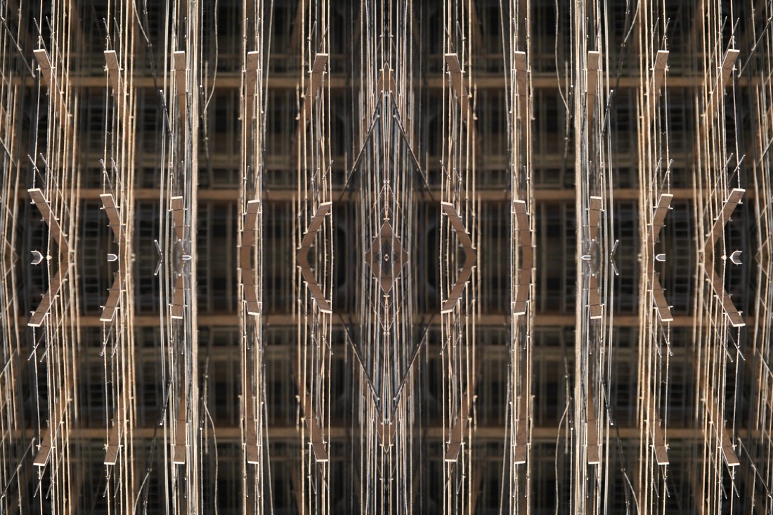
here, I took the original image, duplicated it 4 times and increased the canvas size by 200% both height-wise and width-wise. I then used the transform tool to flip the images horizontally and vertically so that they slotted together, creating a single object in the centre of the canvas. this created an interesting pattern formed by the branches around the centre.
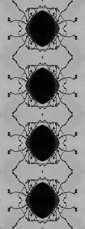
I duplicated the image 4 times in order to develop my edit further.
|
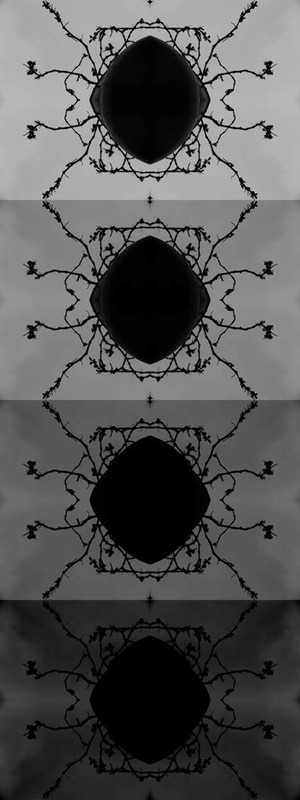
I used the curves tool to change the darkness and contrast of each of the images, creating a gradient effect.
|
I edited each of the images using differing exposure levels to create a gradient effect.
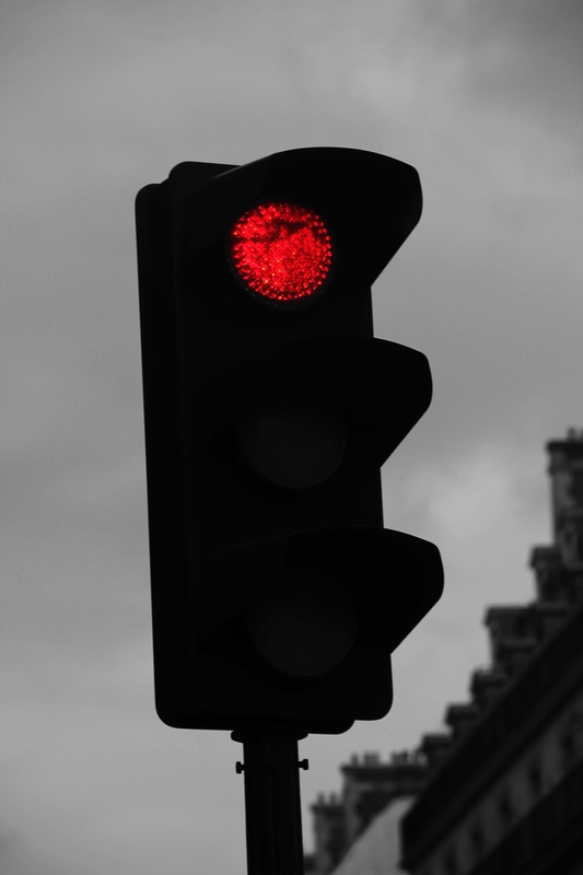
I changed the background in this edit to black and white, with the exception of the red light. this makes it stand out from its surroundings, and the vibrant colour contrasts with it's dull background, making it the focal point of the image.
|
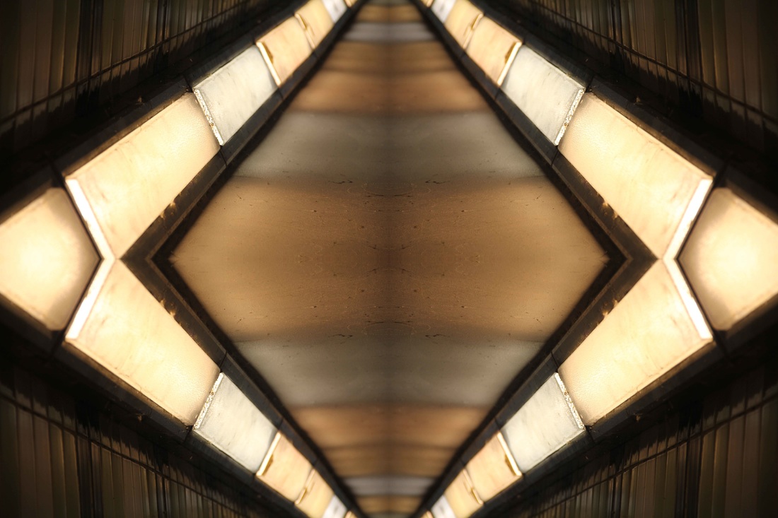
in order to form this image, I copied the original photo so that there were four of it, and increased the canvas width by 200%, and the canvas height also by 200%. I then moved each of the images to each corner, and used the transform tool to flip them horizontally and/or vertically to create this diamond shape crated by the strips of light. I like this edit because it gives the image more depth and contrast. the white and yellow lights stand out from the bland surroundings of the outer edge, and the lights create effective looking strips through the centre, which enlarge as you move closer towards the centre which is the aspect of this image which makes it look three dimensional and gives it depth.
|
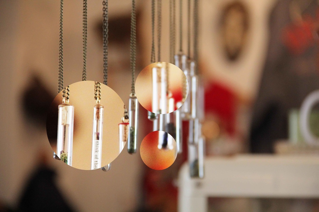
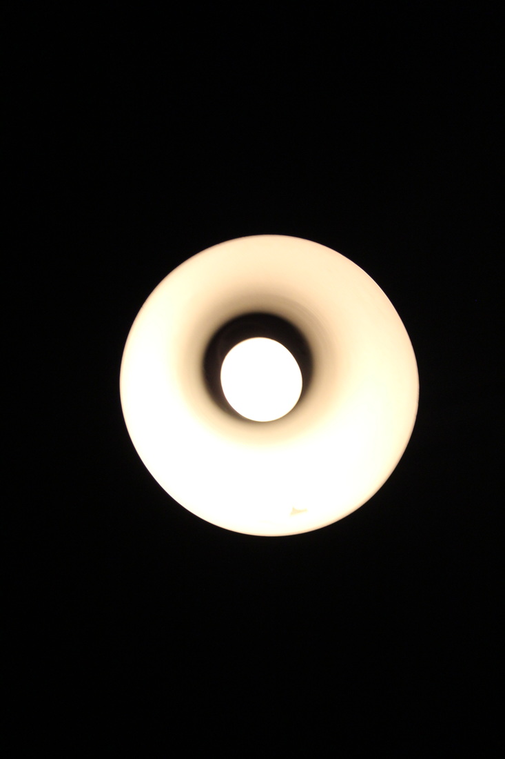
to create this image i selected circular aspects of the original image and enlarged them using the free transform tool. i also brightened them and increased the contrast. i did this to make these selected key aspects the main focuses of the photograph, brightening and enlarging them draws attention to these parts. the circular shape also creates and interesting effect.
my final pieces

|

|
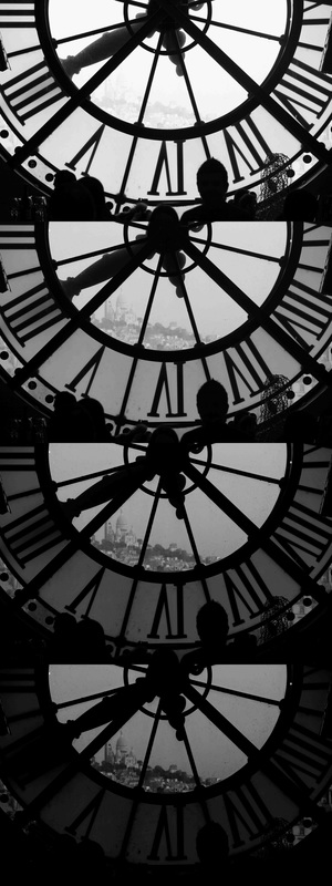
I have chosen these two images as my final pieces. they are both very abstract edits and I feel as though the gradient creates a good effect. the image on the left is particularly abstract because of the patterns created by the branches, which I like. and the picture on the right looks effective because of the contrast between light and dark in each of the four images. I like how the branches and the clock face stay the same colour throughout the gradient which gives each of he images a constant theme, linking the four in each line together and making them flow better as you look down the image. the black and white effect of all the images also adds a constant theme and links them to one another.

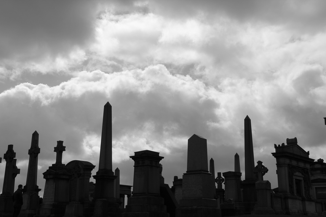
I have also chosen this as one of my final images as the contrast between the sky and the dark, gravestone silhouettes is very effective. the broken clouds in the sky create depth of field and add a dark atmosphere to the image, also adding a great contrast between the light and dark aspects of the photo, where the sun is shining though. I used curves to edit this image, adding contrast and darkening the gravestones in the foreground.
evaluation
in this project I have researched photographers such as Paul Gonella, who's work has become one of my inspirations. we were assigned to research him by the school, and from studying his work I have learnt how having a common colour scheme in sections of image makes them flow together very well, and makes them look much more effective, and gives the images a common theme when being viewed as a whole piece. he has also taught me how some of the best photos may not be the most obvious ones, as he takes photos of the 'quiet corners' of an area, the parts which people would not associate with as being particularly photogenic, but the photos he has achieved in these areas are amazing. During this project I explored the themes of urban, repetition and capturing the moment. I enjoyed the urban theme as we got to explore shapes and different viewpoints.
