exam
outline
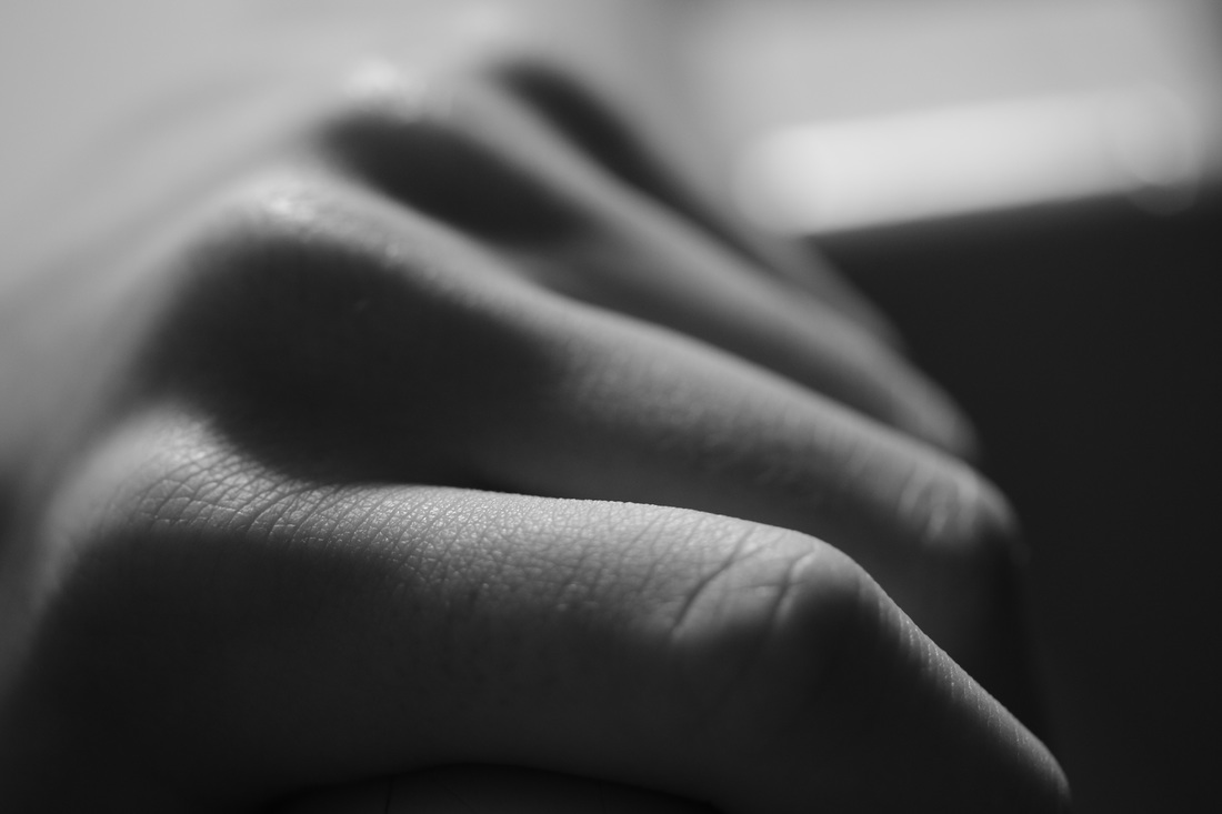
Light, contrast and depth of field are the main aspects of photography which create and outline, I will explore these in this projects as well as physically editing outlines using Photoshop, or drawing them on by hand. in this project I am going to collect images of silhouettes and other shapes which represent the theme of outline. I have chosen this because silhouette photography is something which I particularly enjoy, and this can be reflected in this project. I will also explore close up images, where natural lines and outlines can be viewed as i feel this is a unique way of interpreting this theme, and there are many photographers which demonstrate this aspect of photography in a somewhat inspirational way. I will explore outlines in their natural form, as well as enhancing them through editing. I will demonstrate outline in my photographs using both natural objects and urban settings, using lighting to enhance the images.
inspiration
joan fontcuberta
paul gonella
|
saul leiter
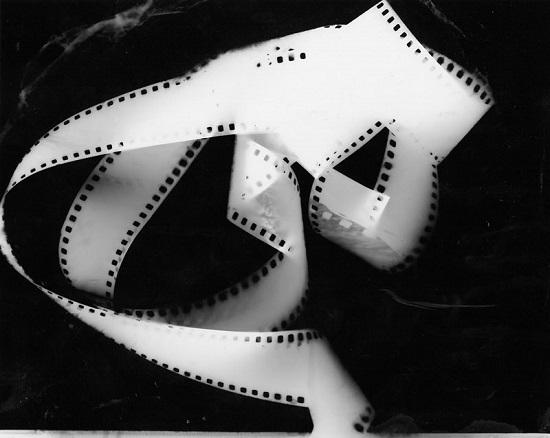
bill beckley
|
albert renger-patzch
peter keetman
|
paul gonella
peter keetman
|
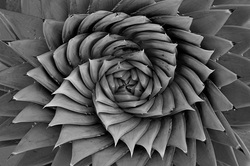
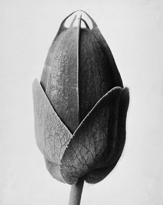
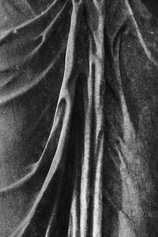
theme one- natural outline
photographer research / inspiration
|
bill beckley
|
karl blossfeldt
|
|
|
|
|
|
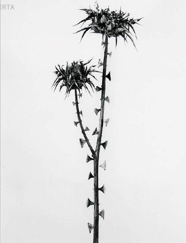
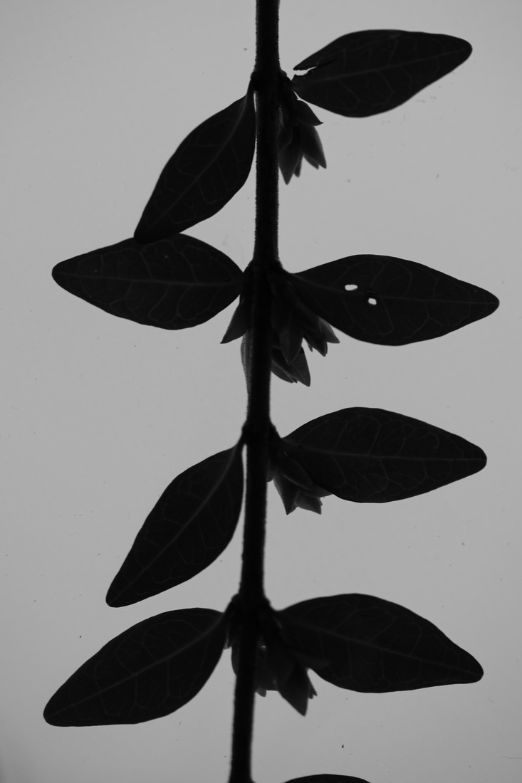
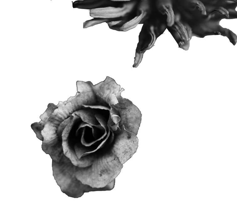
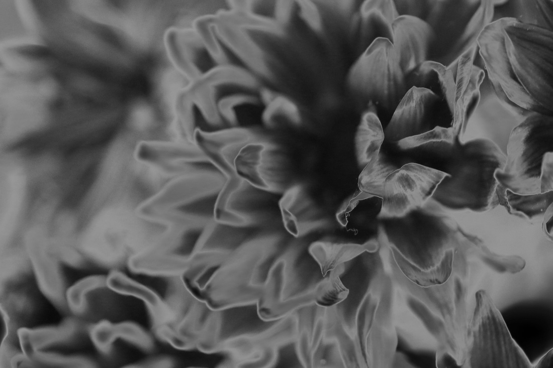
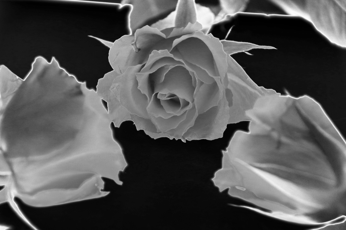
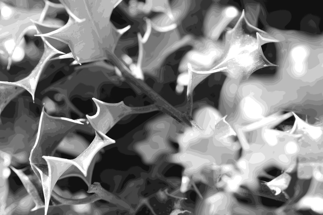
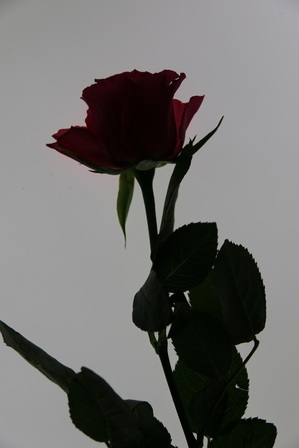
bill beckley - he takes fine art photos, mainly of plants and flowers.
the stems and sharp, defined edges in these images represent the theme of outline very well. the outline in each of these is definitive, and edge of the objects stands out, and lines the image in an effective way creating a defined and precise image. this is why I have chosen bill beckely as one of my photographers for inspiration and I will try and replicate his images in my own style for this exam piece. |
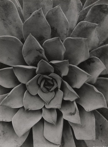
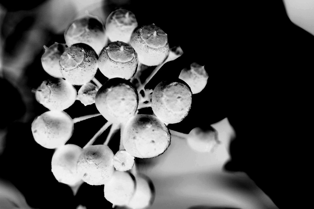
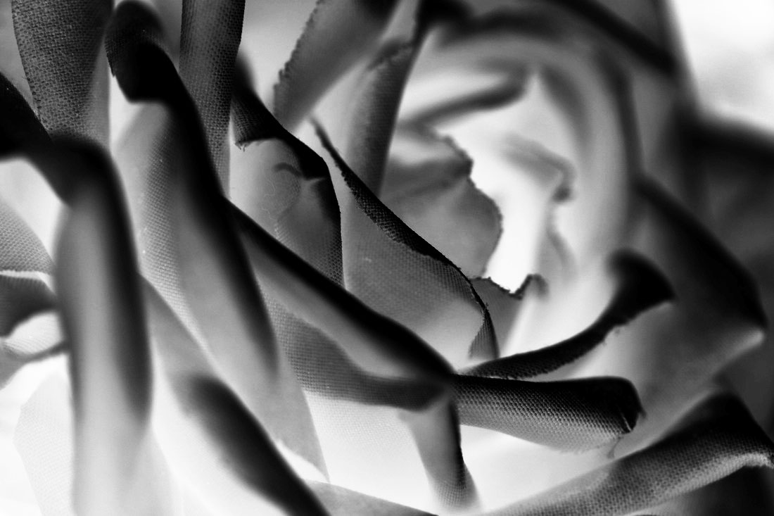
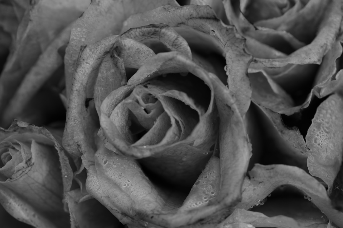
karl blossfeldt explores close up images of plants and flowers. i like this style as there is a contrast in his work between the intricate patterns, and the minimalistic setting. his photos show great detail and represent the theme of outline well due to, one again, the definitive edges and shapes found in these natural objects. the lighting and plain background also enhance this.
|
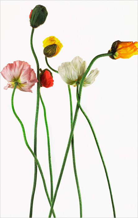
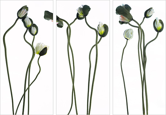
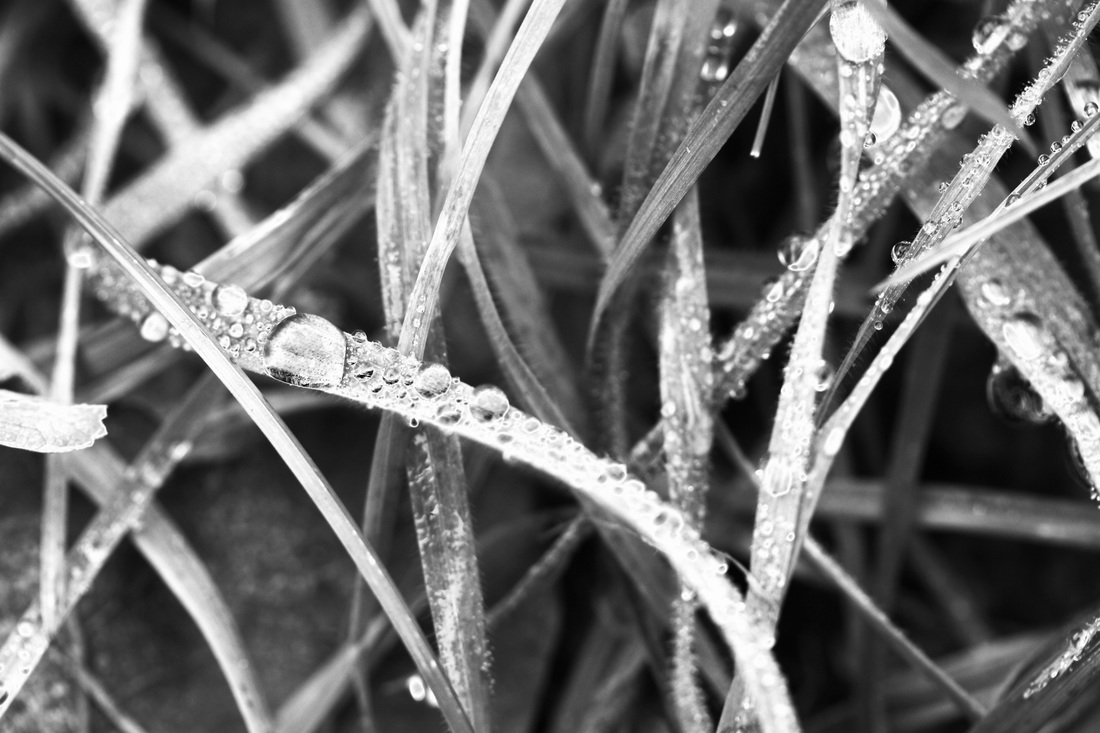
photoshoot one
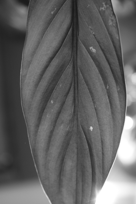
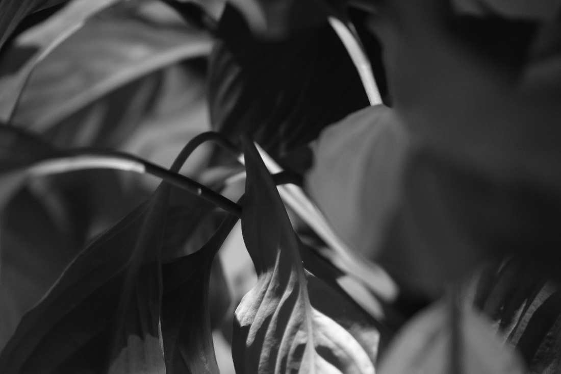
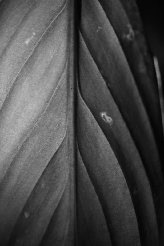
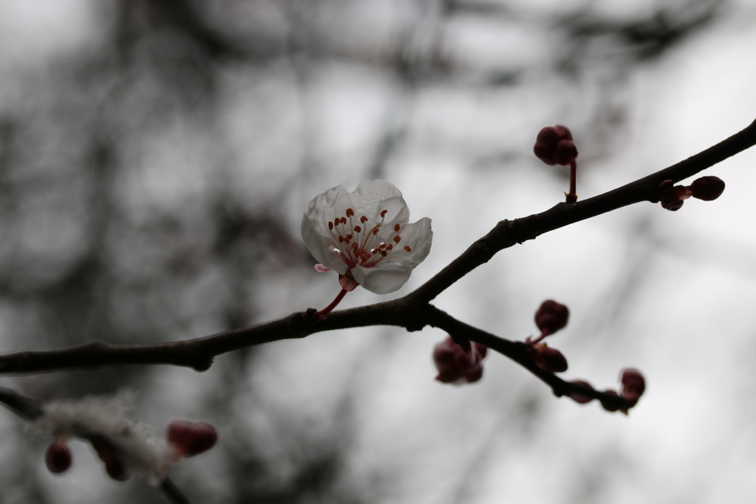
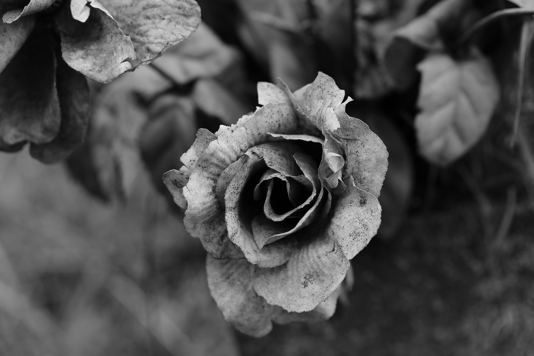
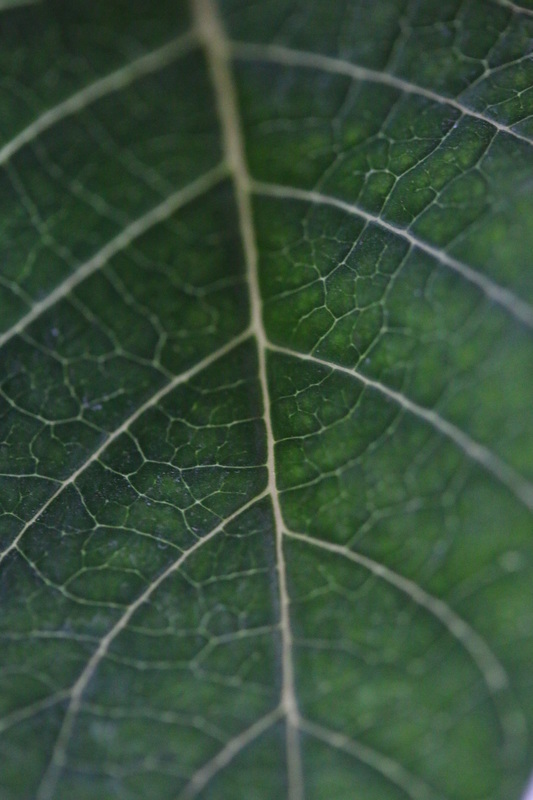
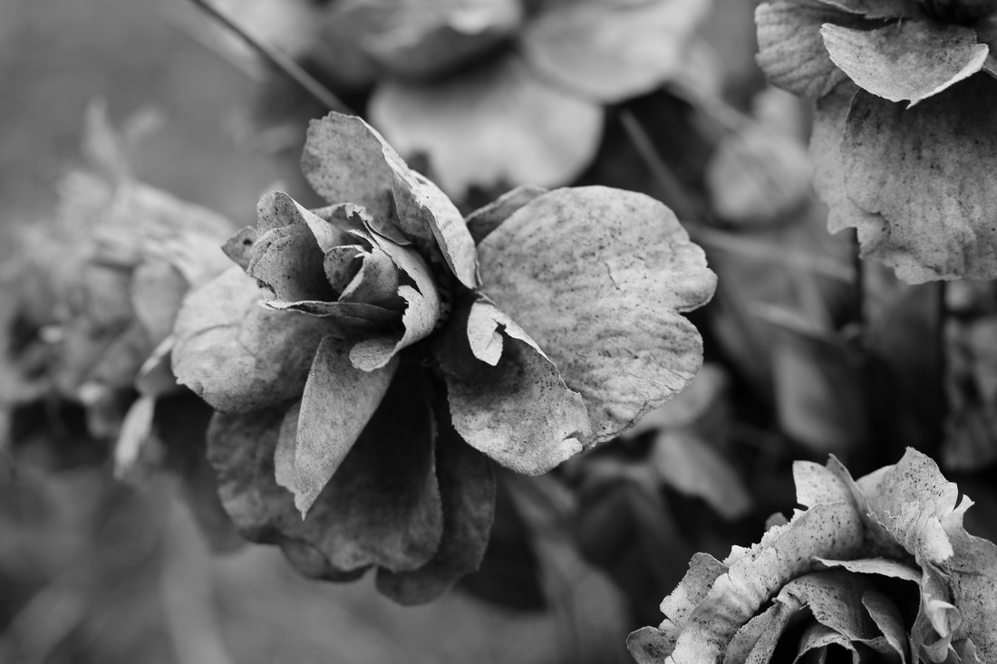
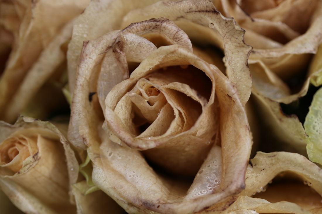
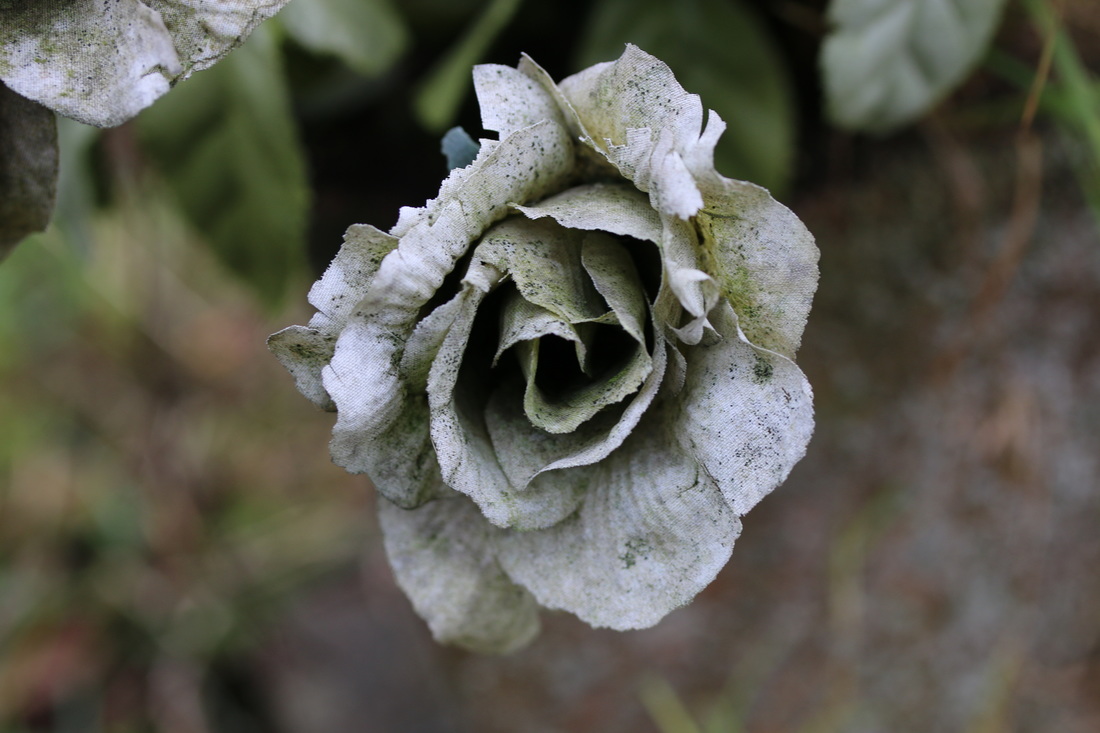
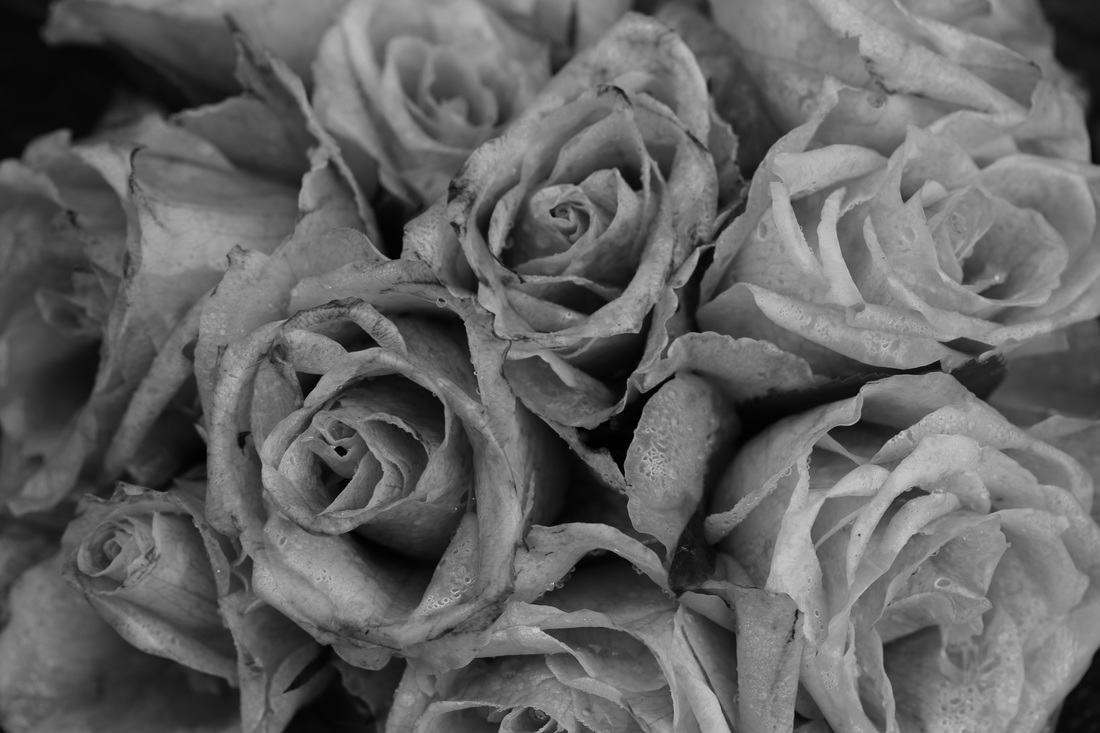
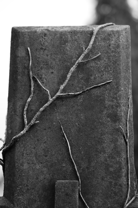
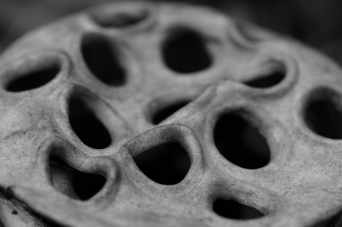
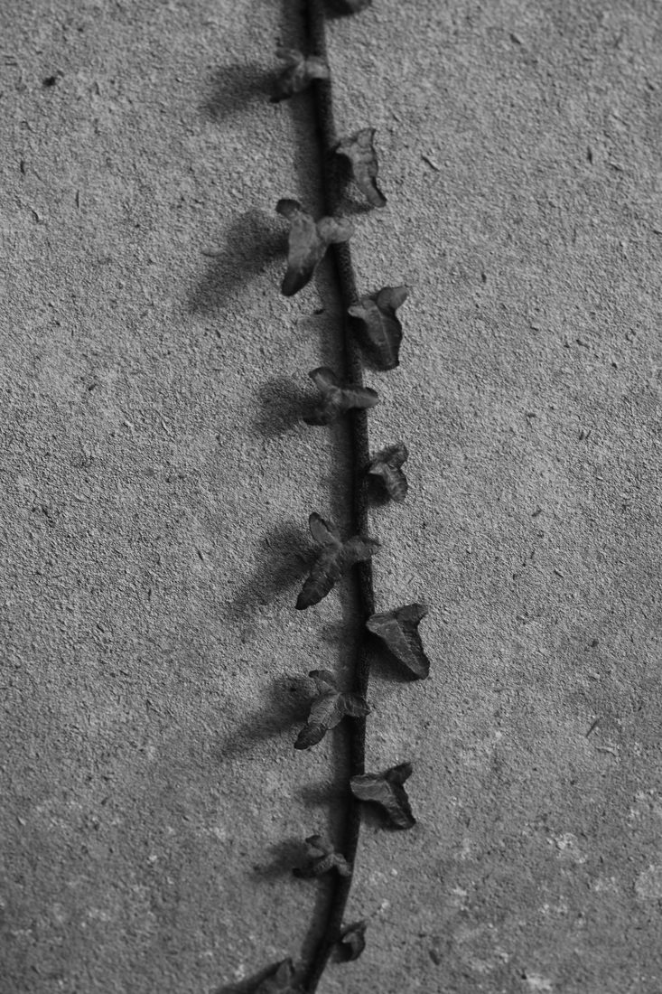
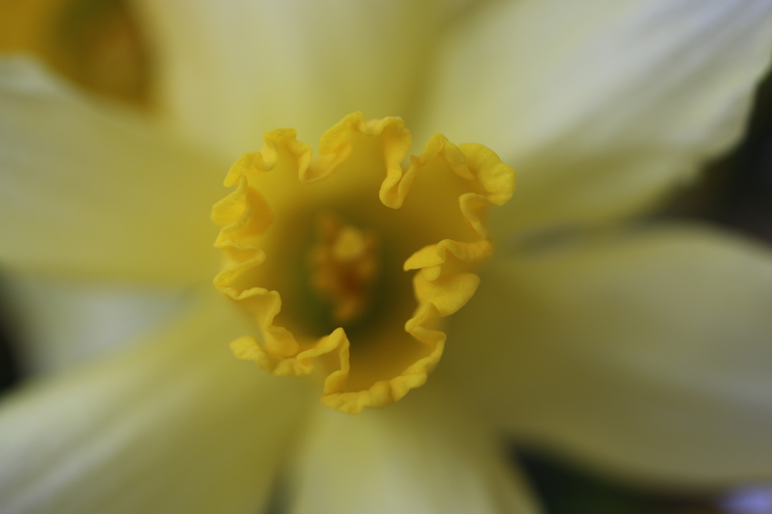
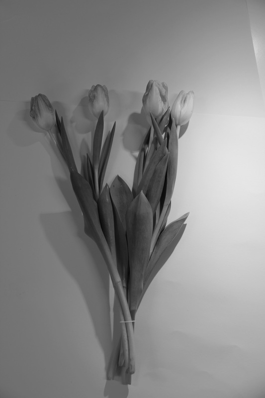
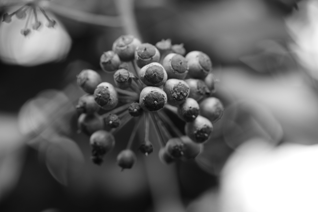
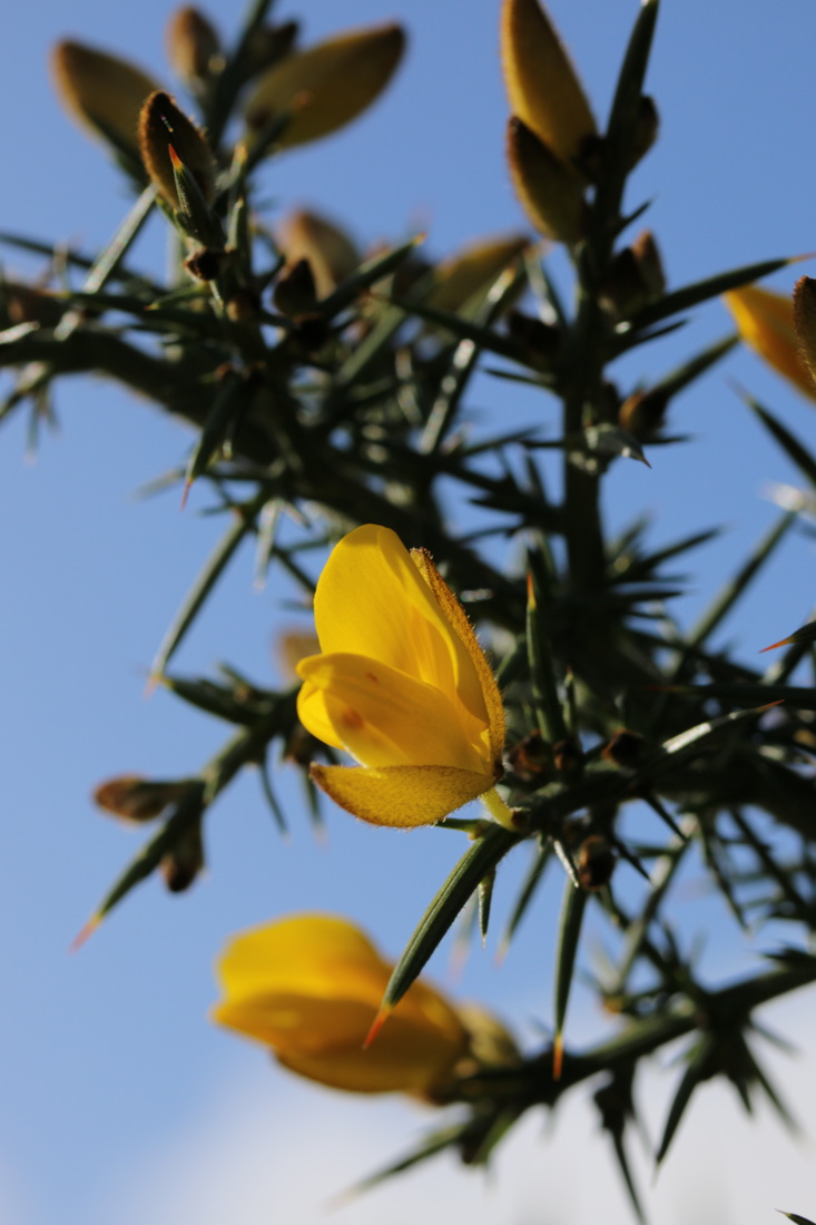
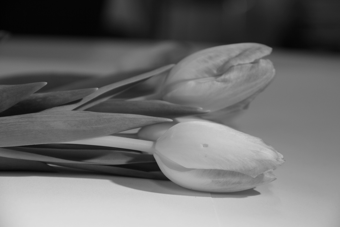
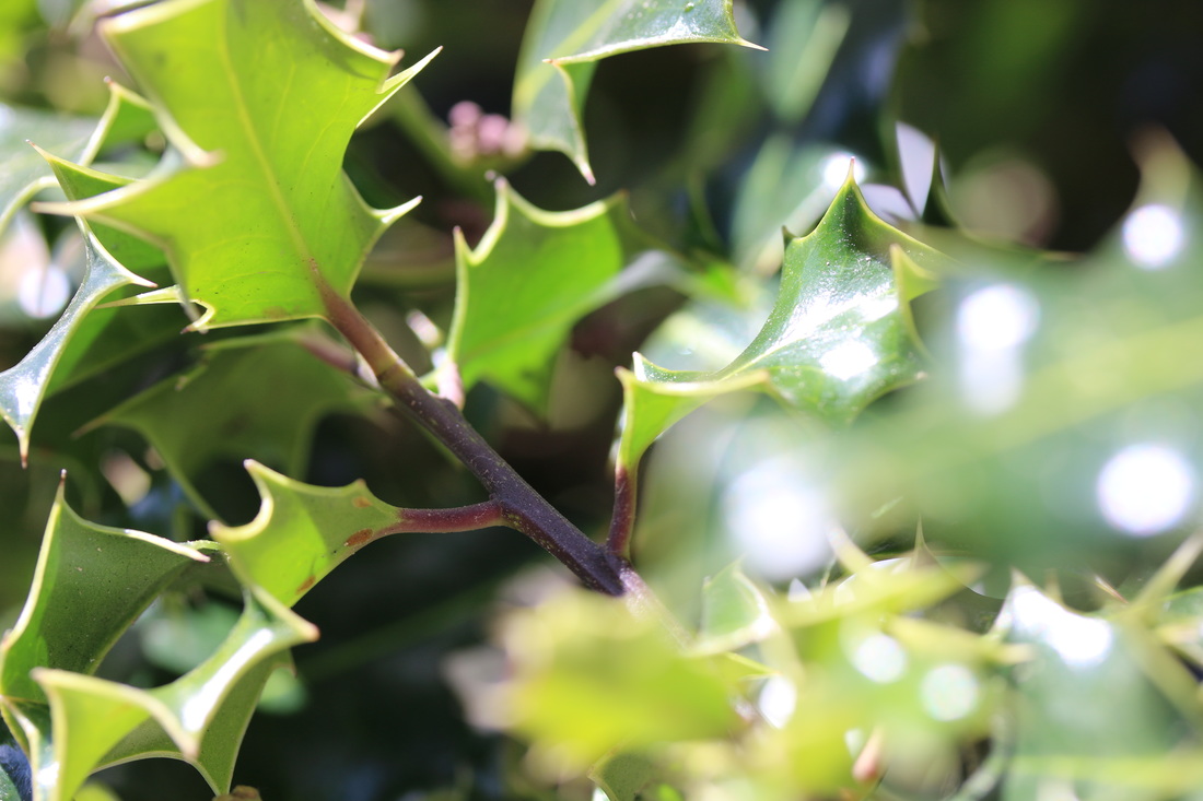
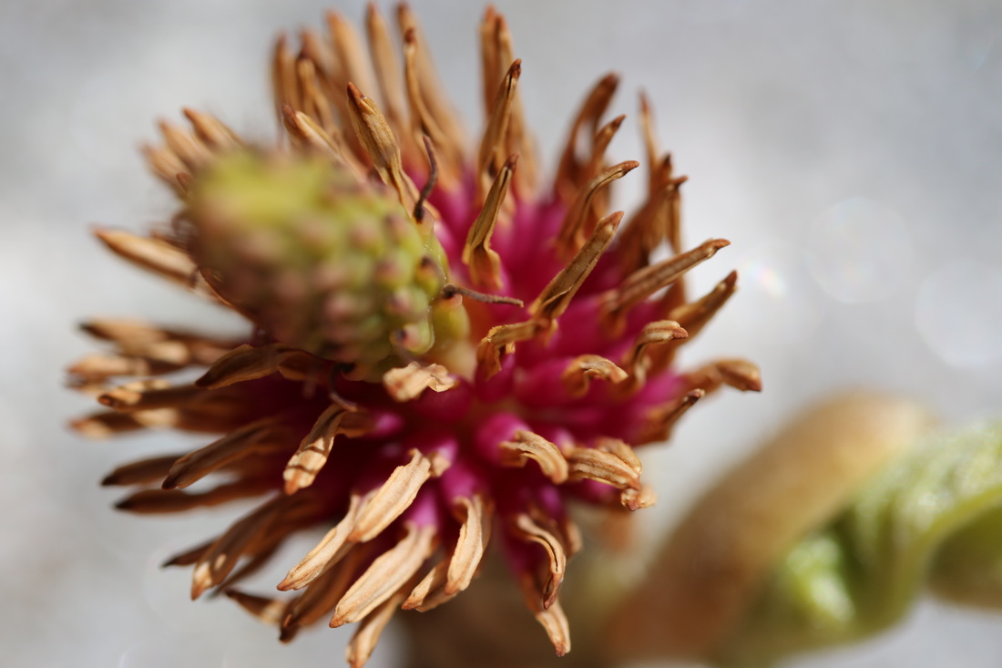
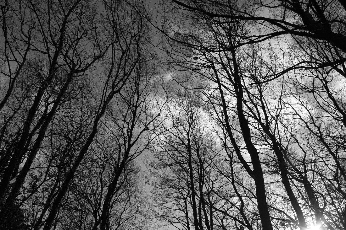
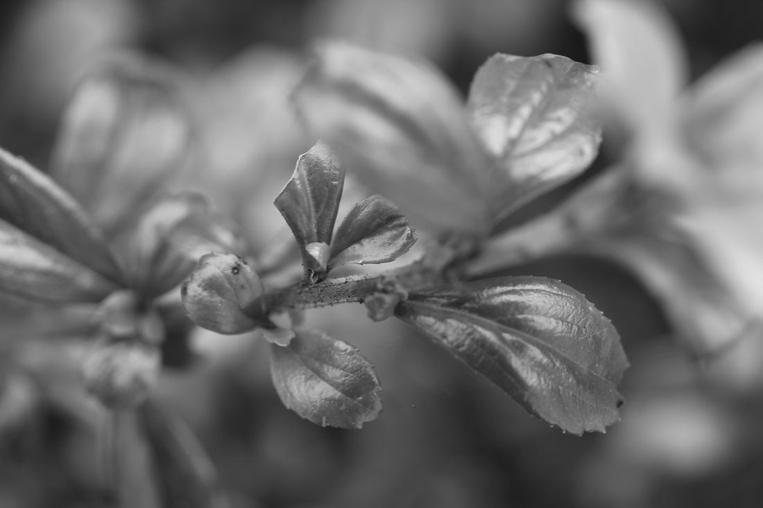
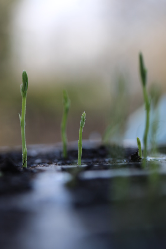
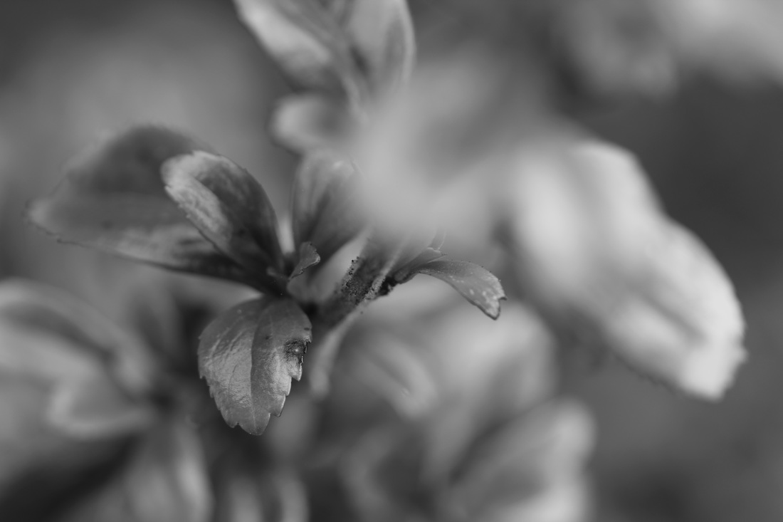
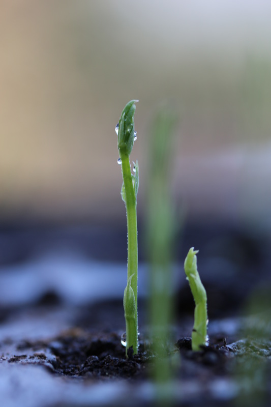
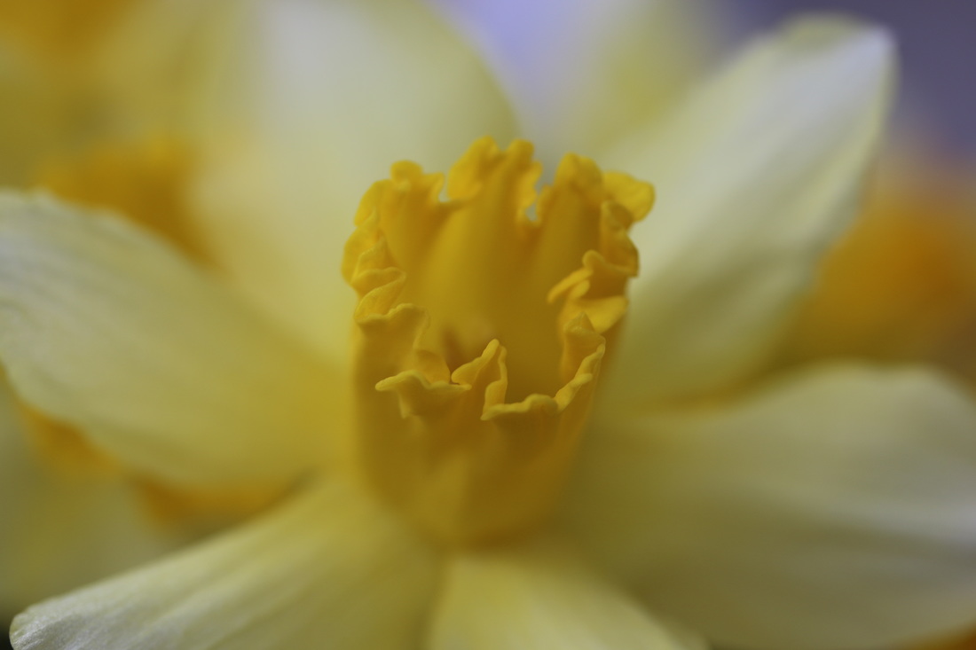
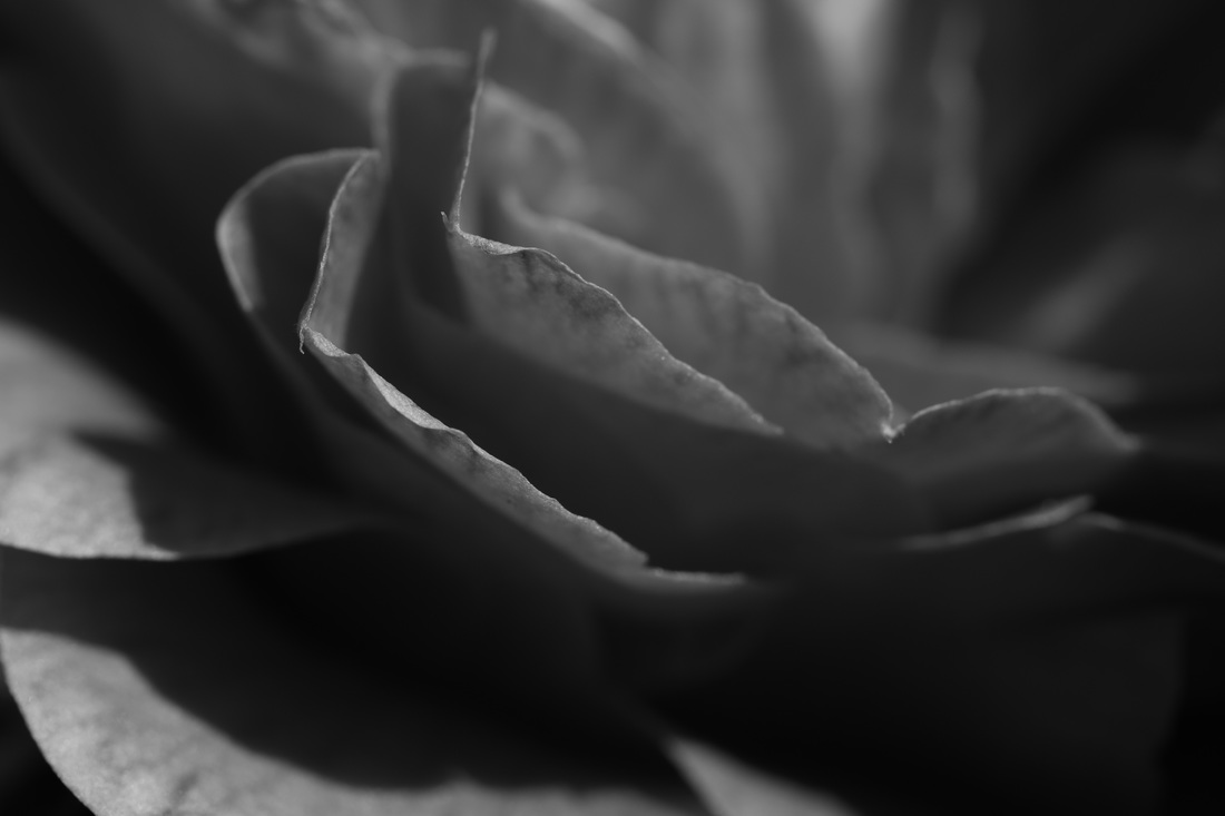
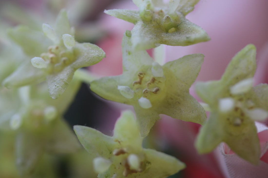
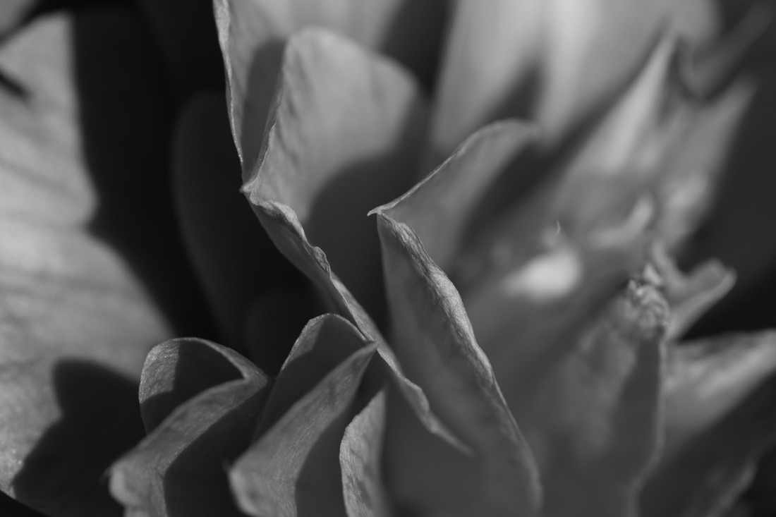
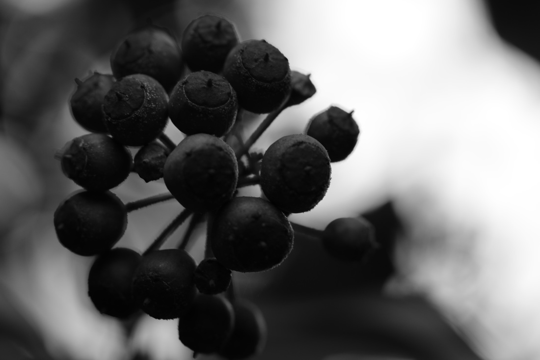
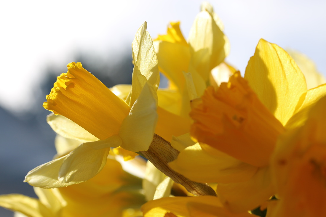
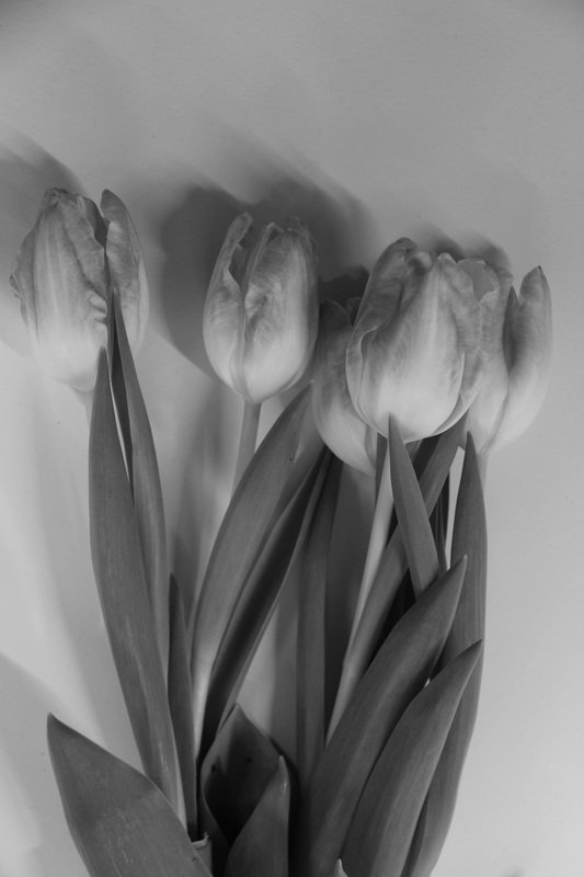
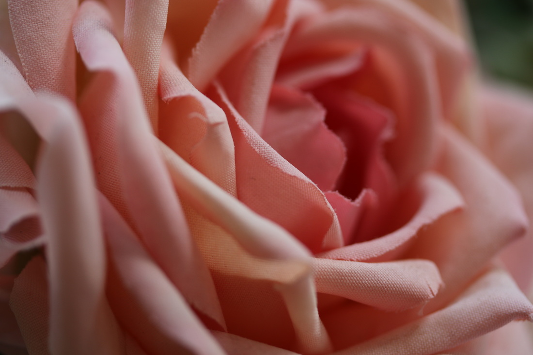
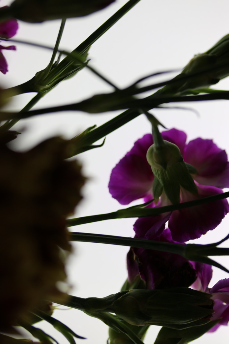
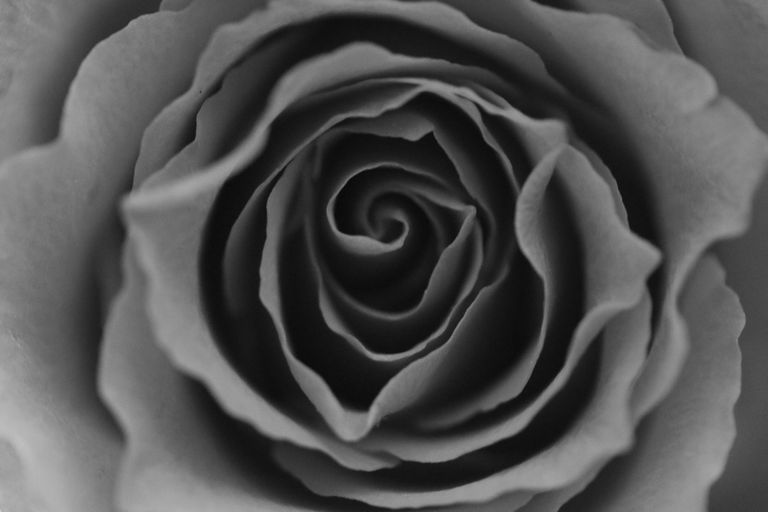
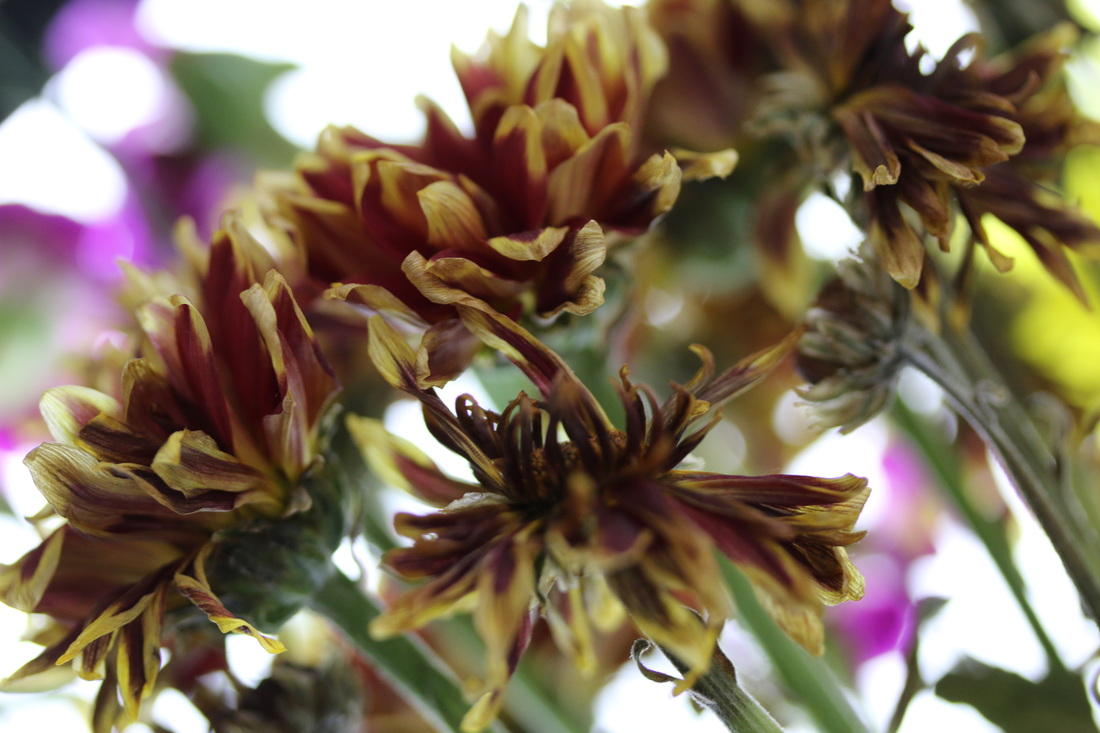
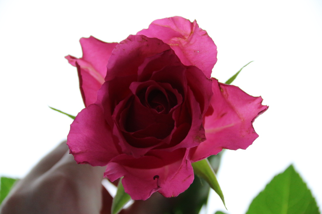
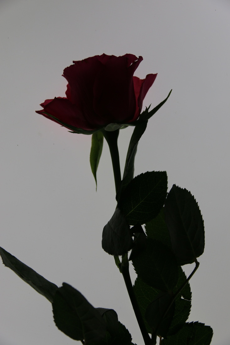
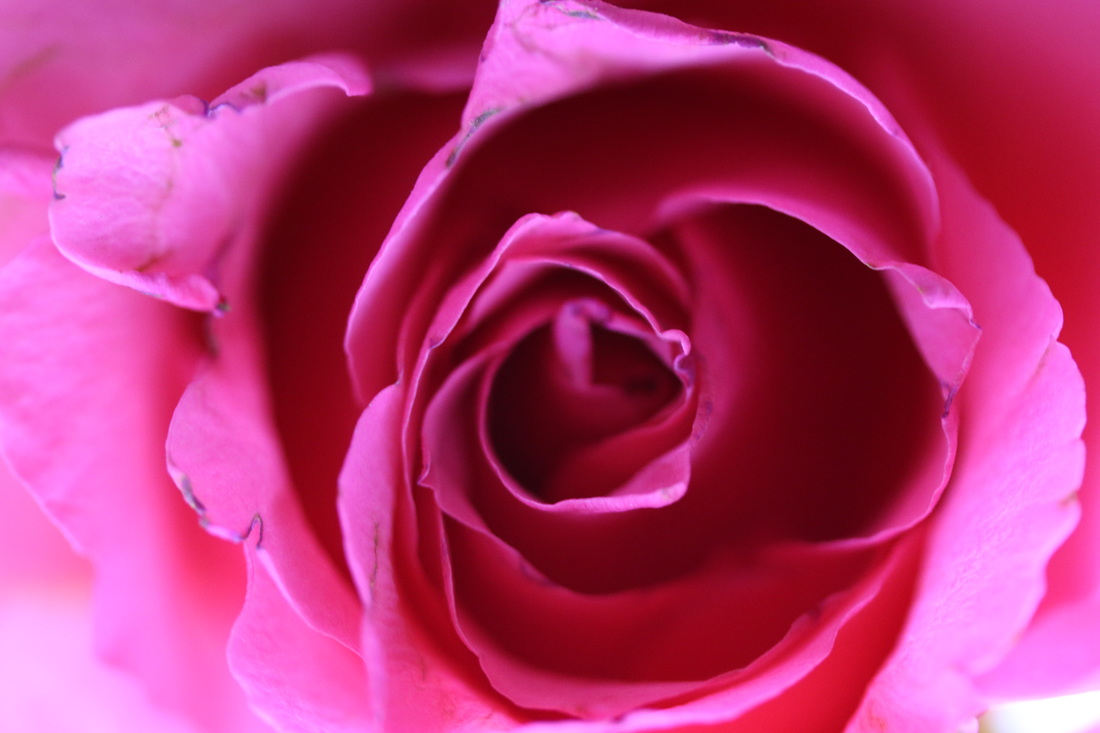
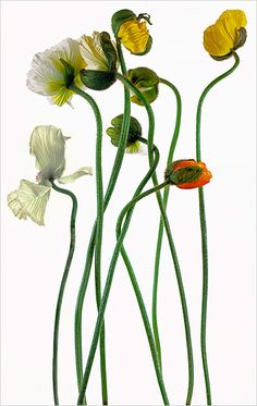
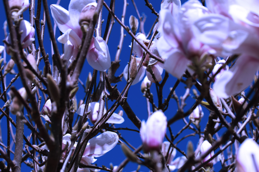
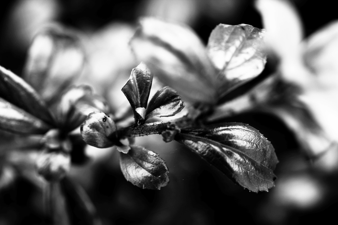
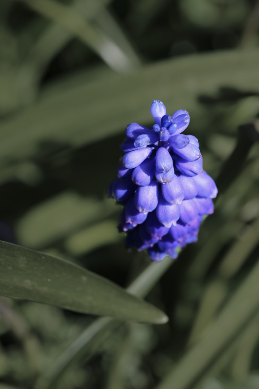
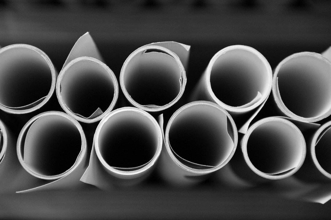
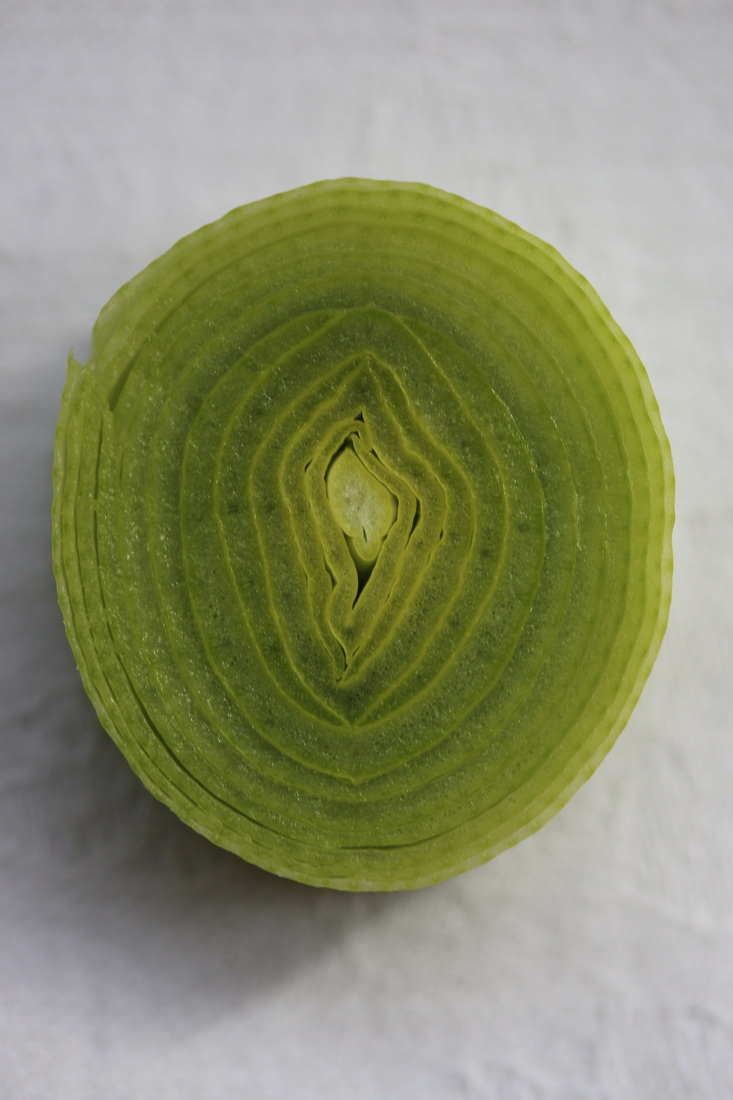
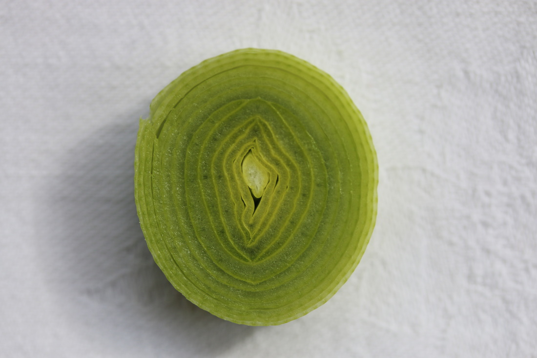
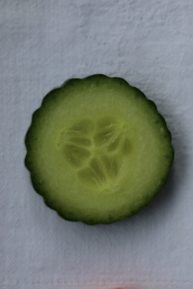
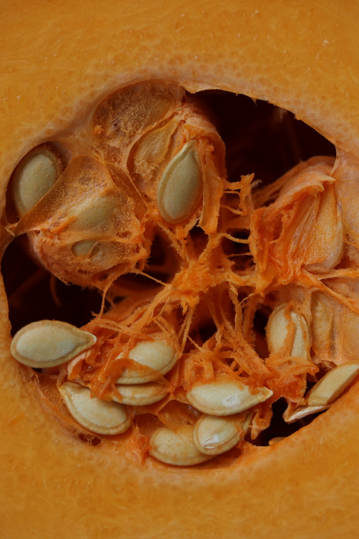
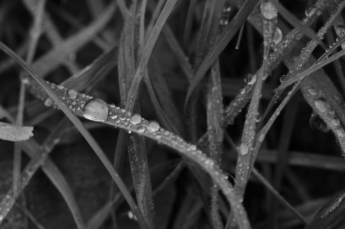
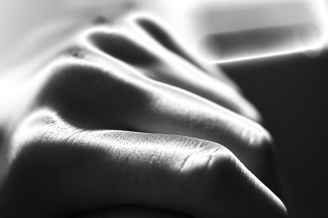
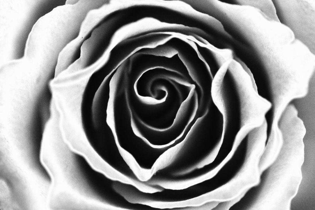
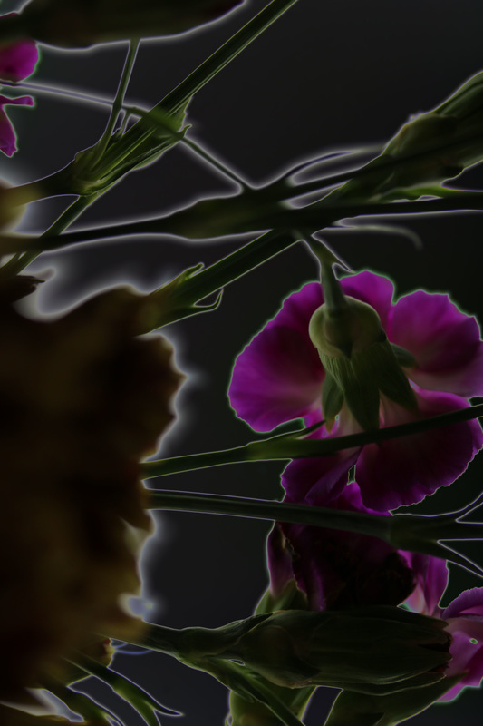
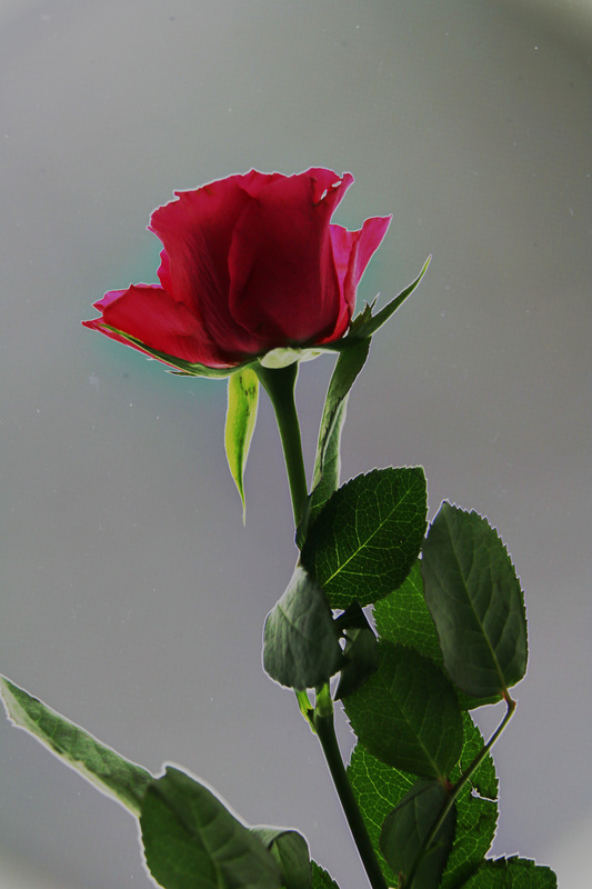
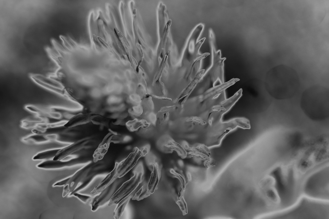
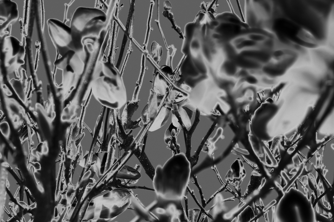
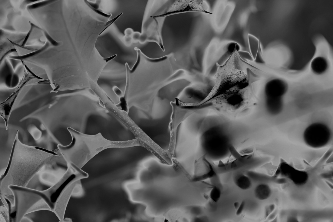
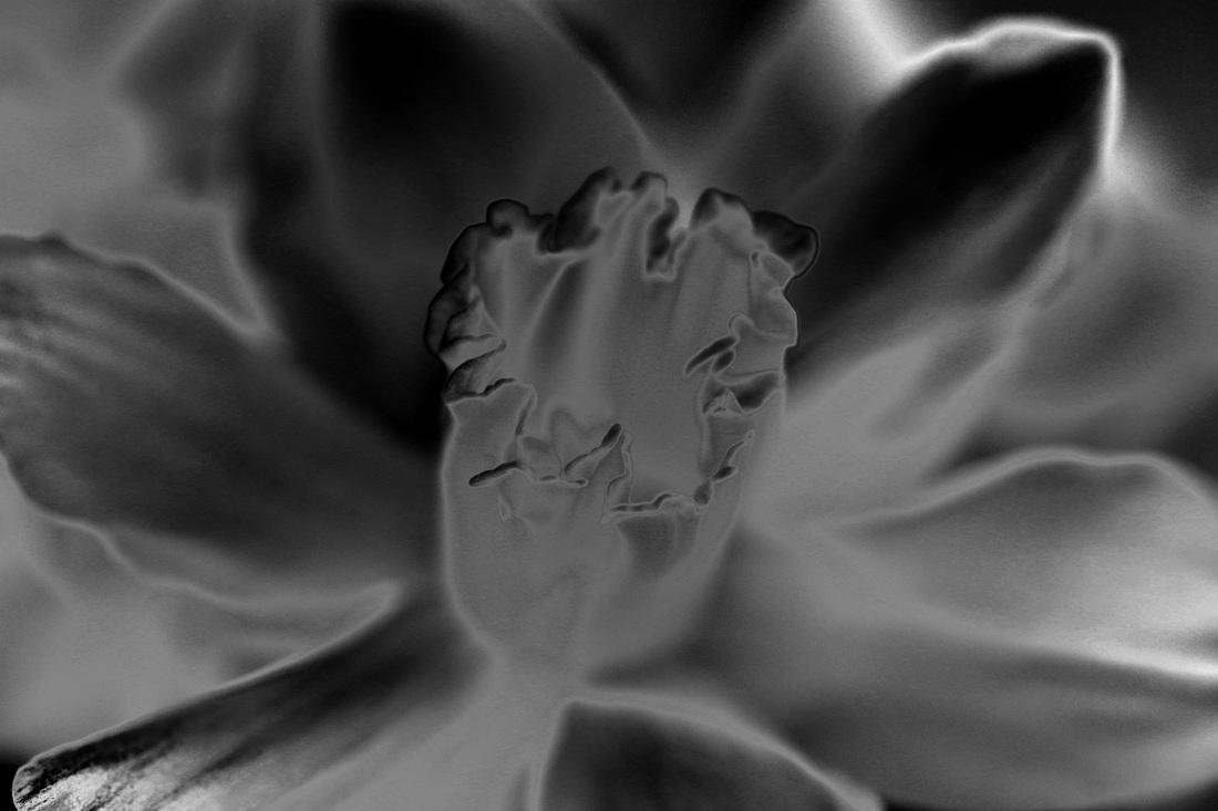
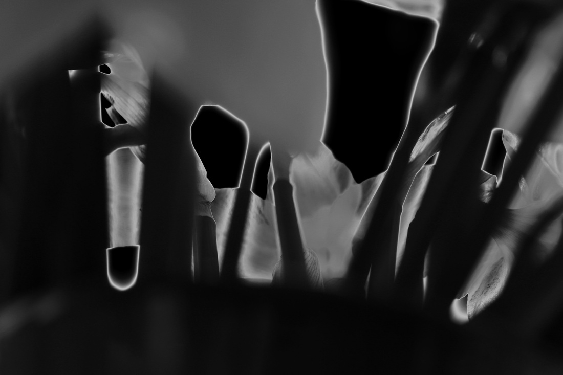
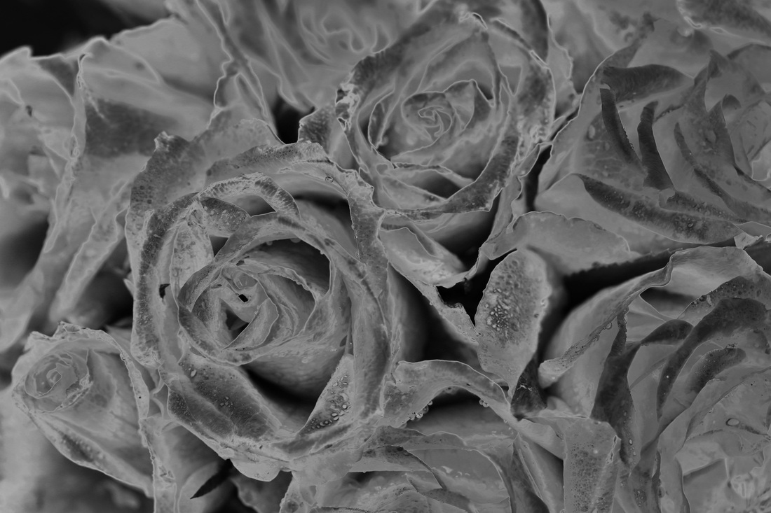
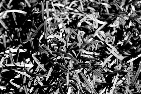
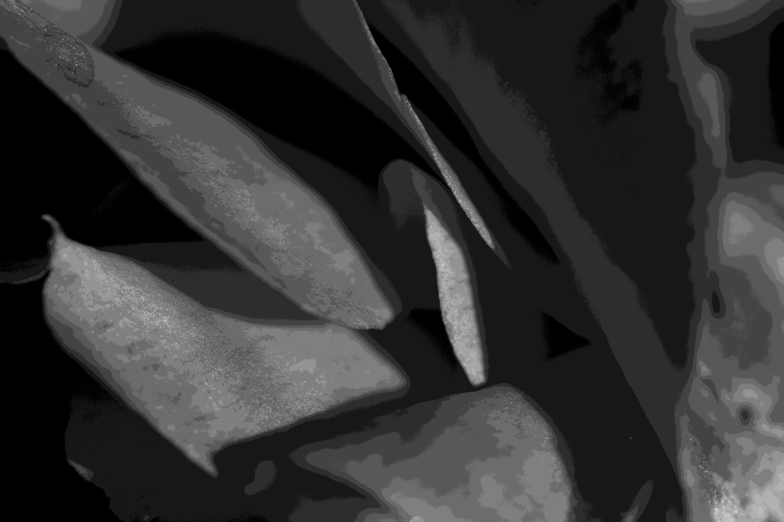
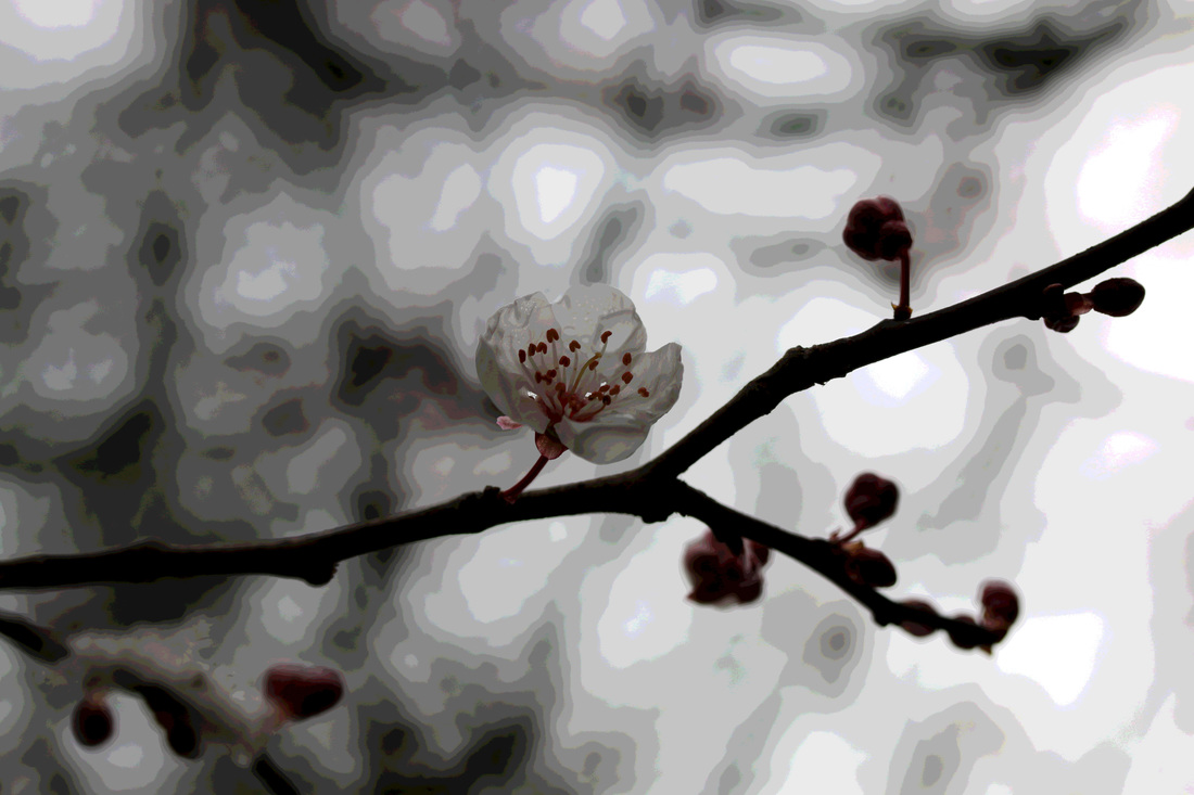
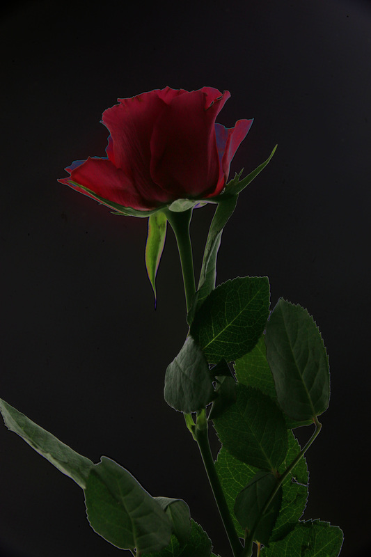
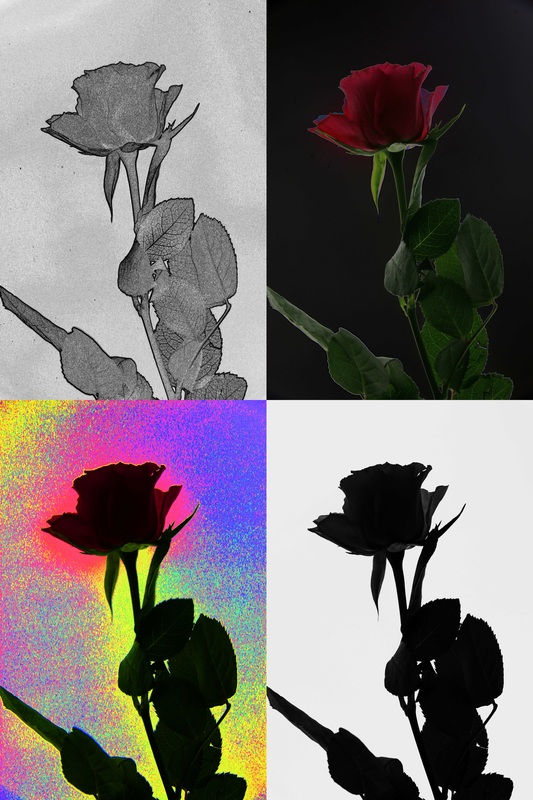
in this photoshoot I am exploring natural outline through close up images of plants and flowers, this shows the great detail of the structures of the plants, and the defined edges included represent the theme of outline well. i used a macro lens in this as it defines the plants and shows their detailed, intricate and precise form, and also enhances the natural lines and outlines of the plants
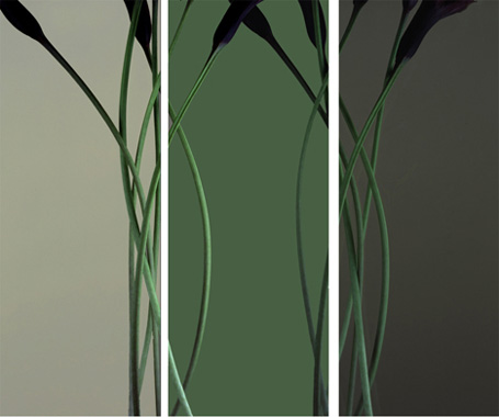
refining my ideas
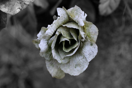
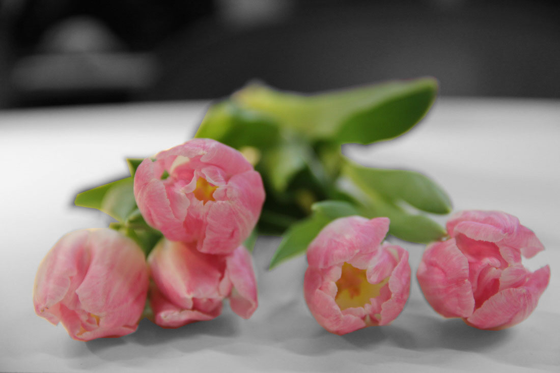
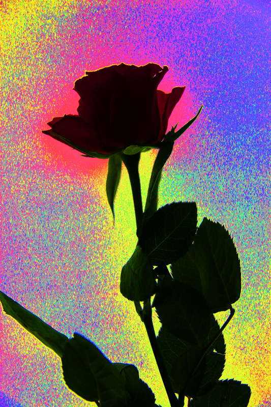
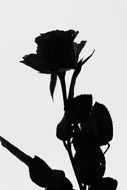
in this edit I made the background black and white, keeping the flower in colour which enhances the outline of the flower by making it different, and stand out from the rest of the photo due to the contrast in colour.
i inverted the colours in this image and increased the contrast which creates an alternate outline, the increased contrast in colour enhances the outline of the plane, which is light compared to the dark background.
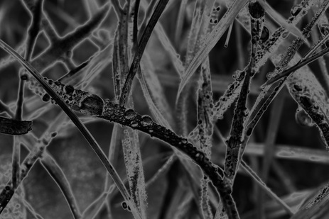
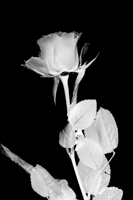
i changed this image to black and white, inverted the colours and increased the brightness and contrasts to greatly define the edges.
|
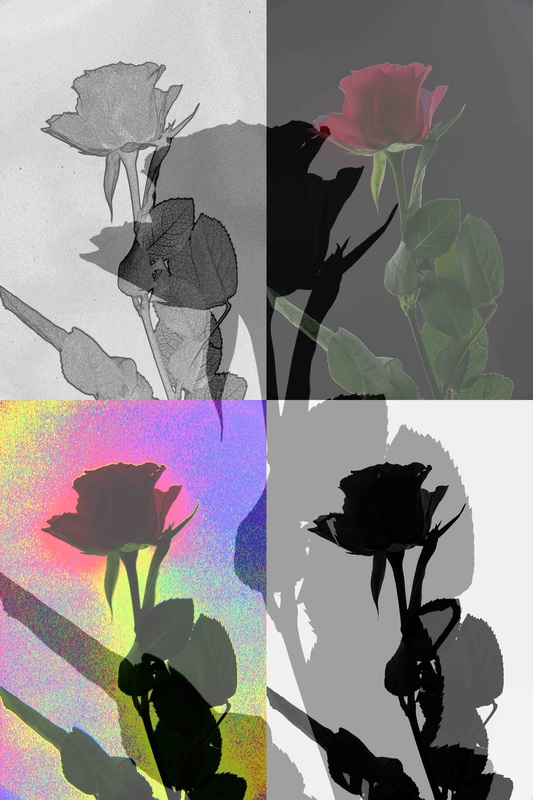
I did the same thing in this second edit.
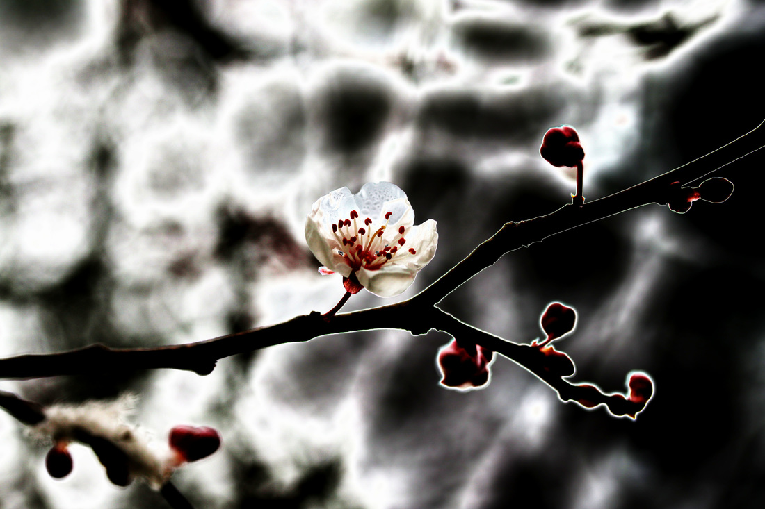
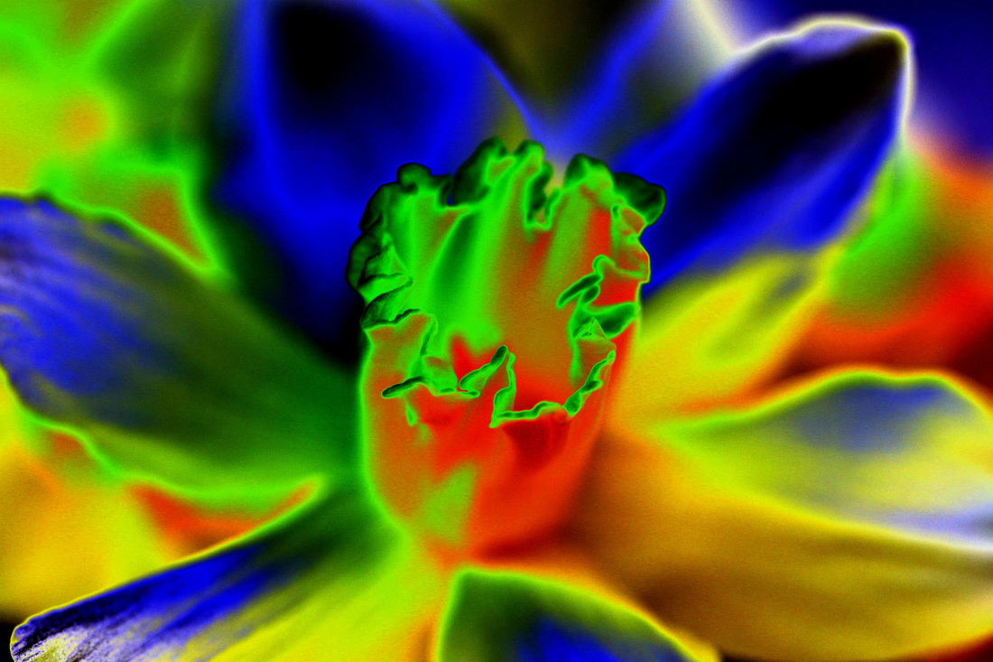
this image has also been inverted, I changed it to black and white to enhance the outline further. this links to some of Karl Blossfeldt's work due to the colour scheme and bright white lines and the clear outline of the plant.
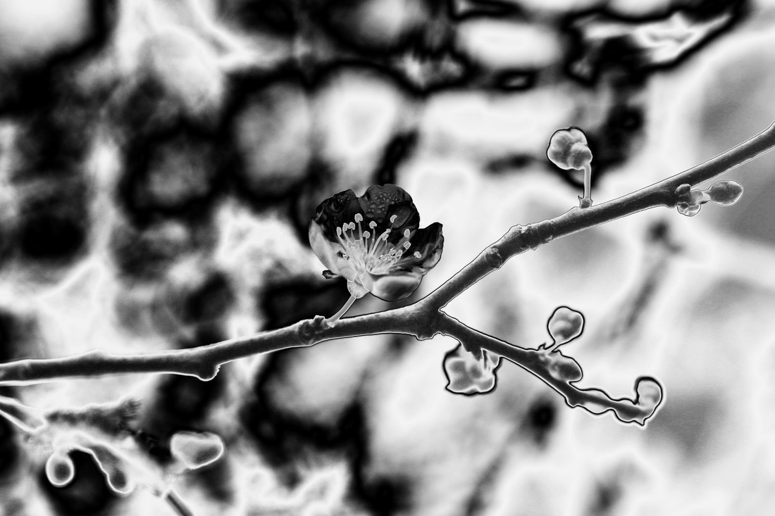
|
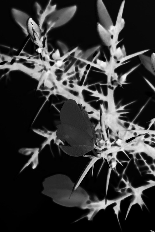
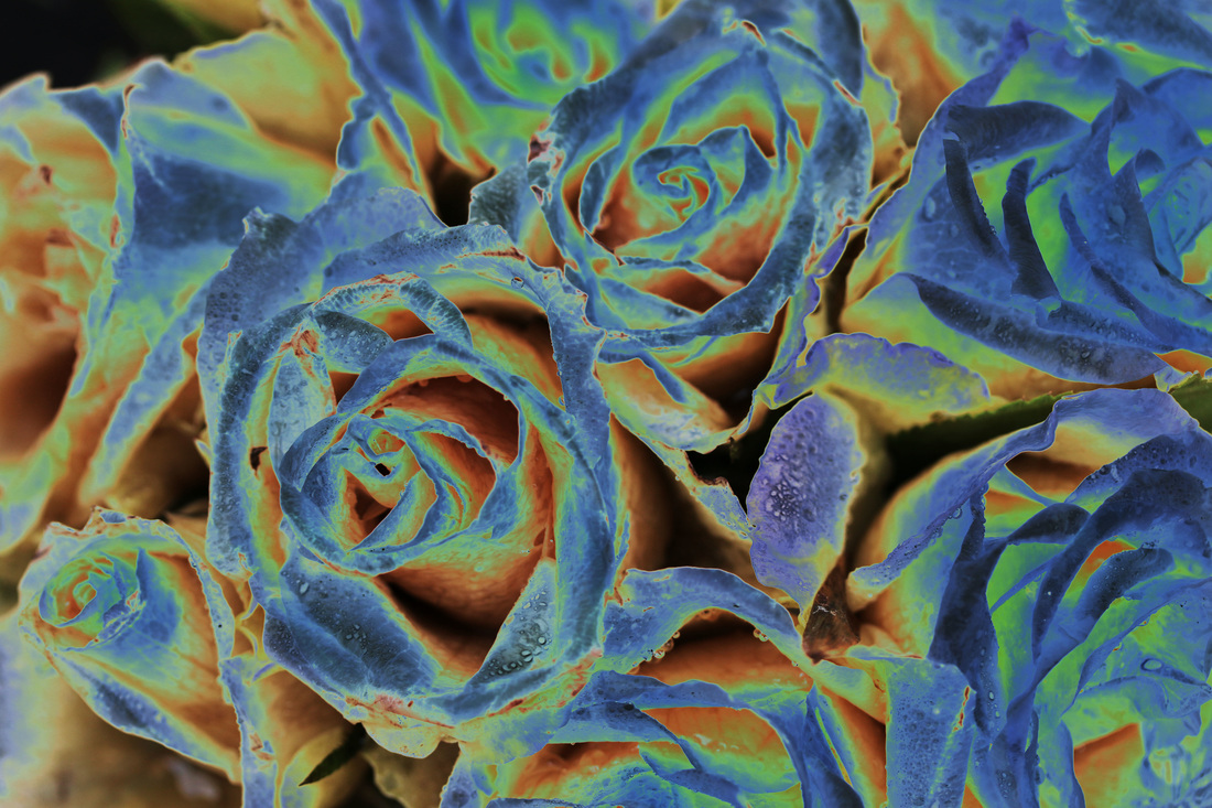
I changed the curves and solarised these images to create a bright, defined outline.
I altered the curves and used the solarisation filter to define the natural outline.
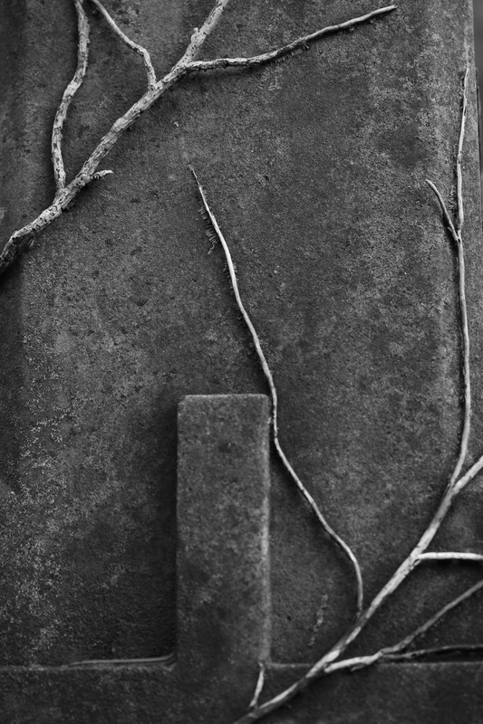
I used the cooling filter and altered the curves which defines the branches from the background.
|
I altered the curves to darken the image and increase the contrast.
i decreased the saturation of the background, leaving only the flower. the vibrancy of it contrasts with the dull, faded background.
|
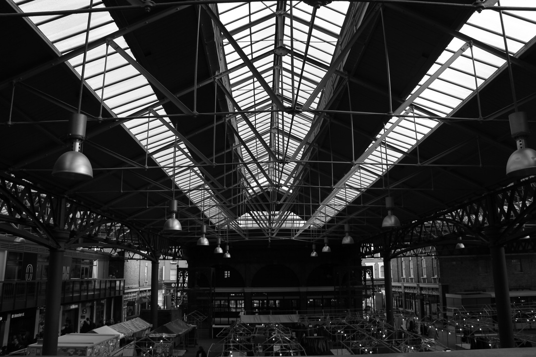
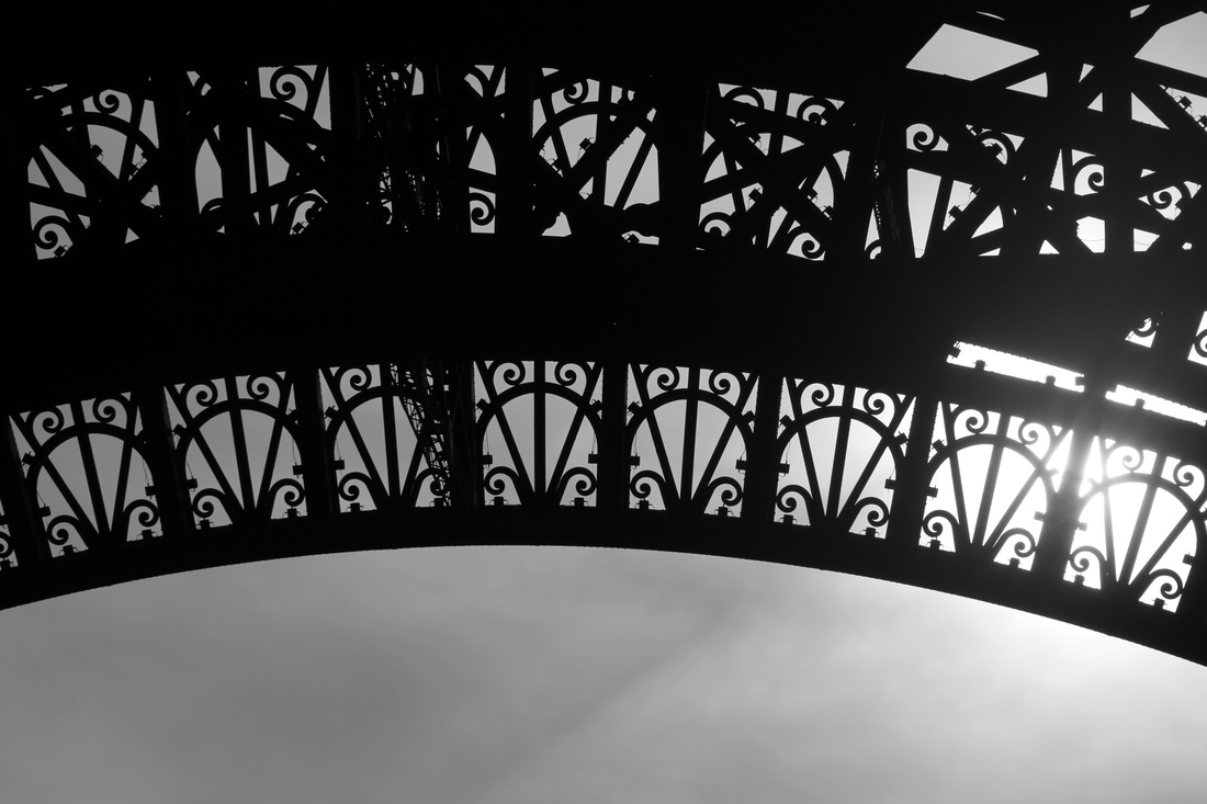
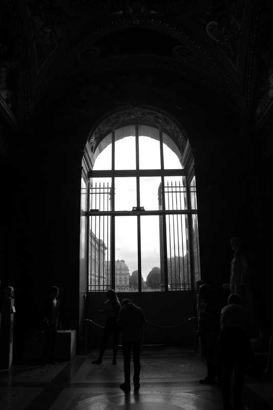
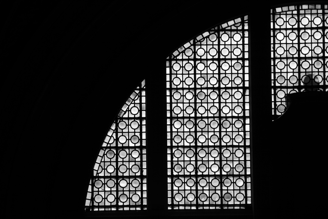
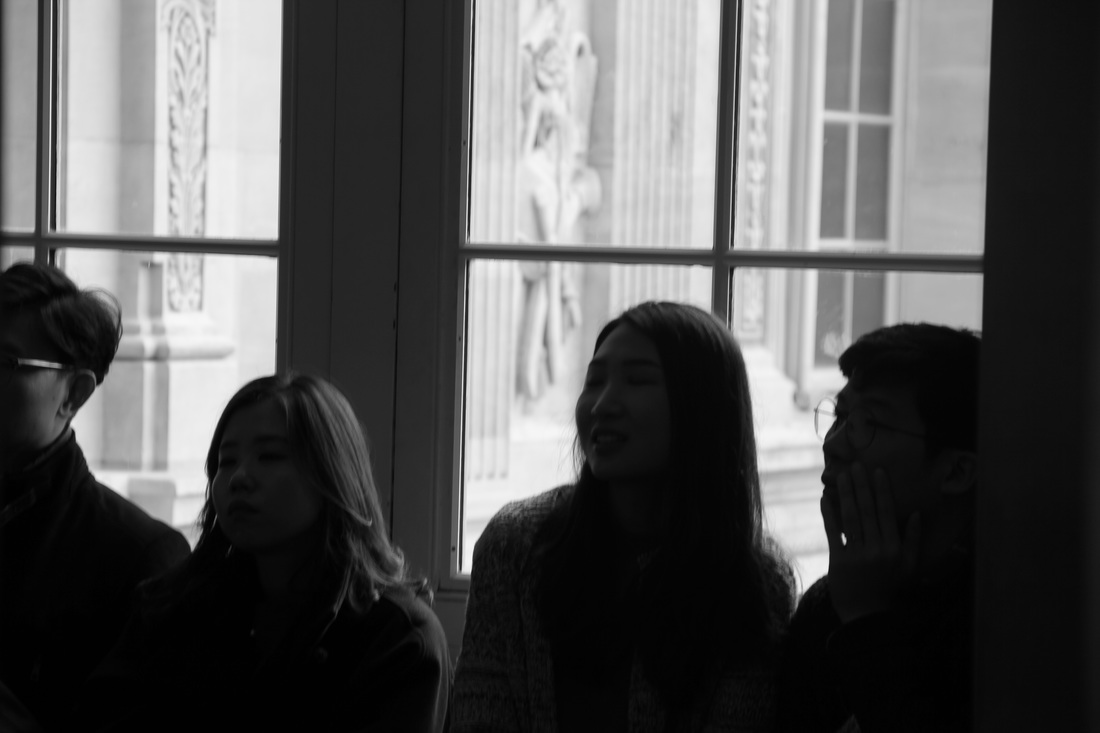
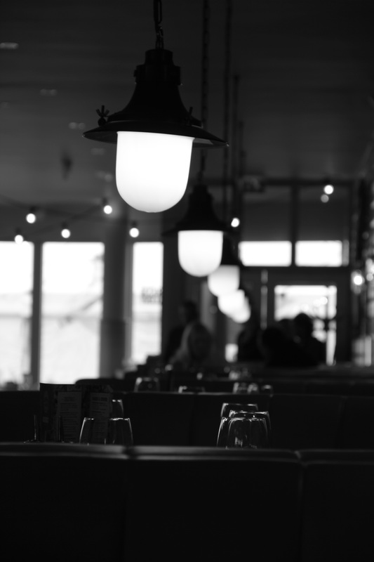
theme two - urban outline
photographer research / inspiration
|
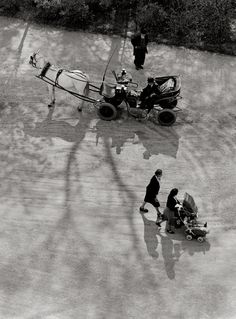
Keld Helmer Petersen
Keld Helmer Petersen is a photographer focusing mainly on the outlines of structures which links well to the theme of the exam. I have used his photos as an inspiration for my urban outline photos.
|
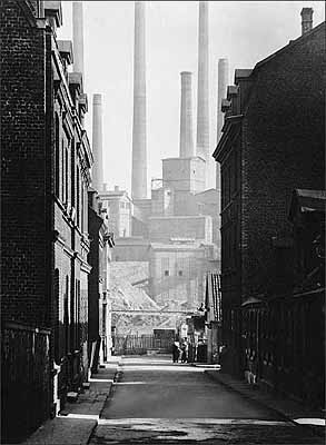
Albert Renger-Patzch
Albert Renger-Patzch was a German photographer associated with the New Objectivity. he took photos in black and white which enhance outlines due to the light contrasts, shadows and patterns/repetition in his images.
|
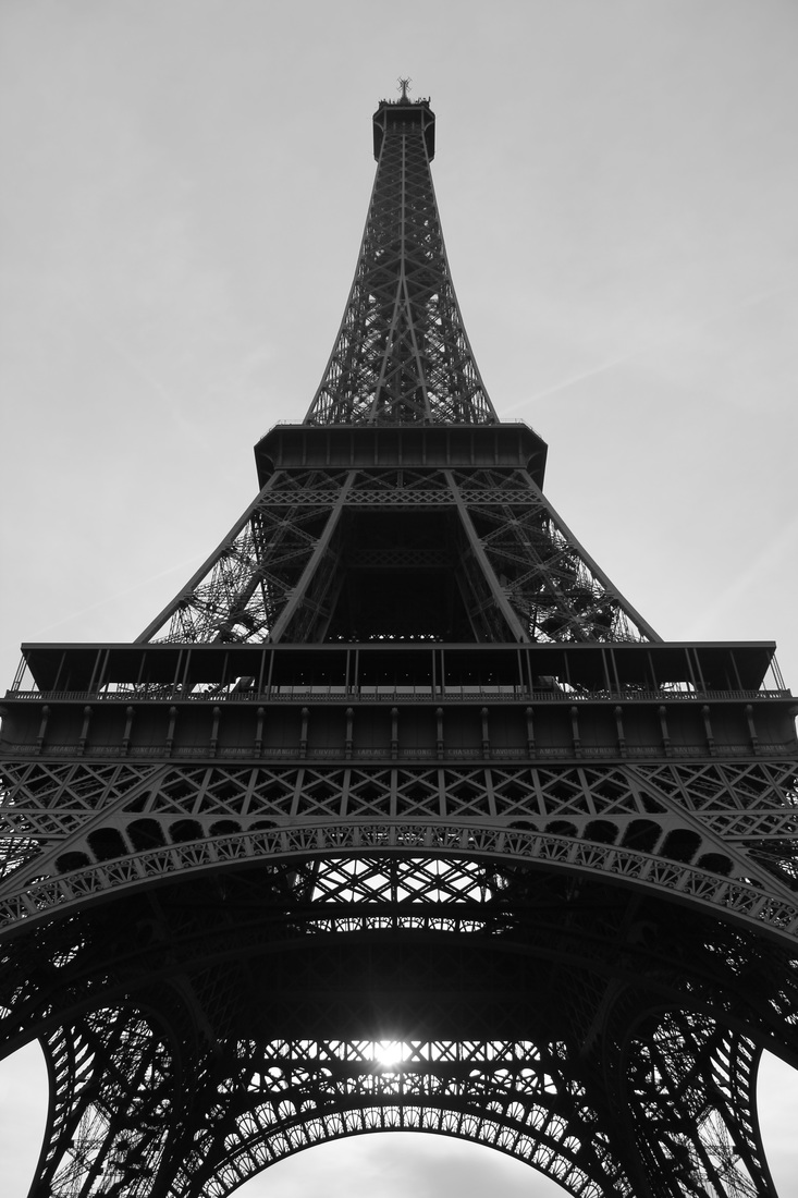
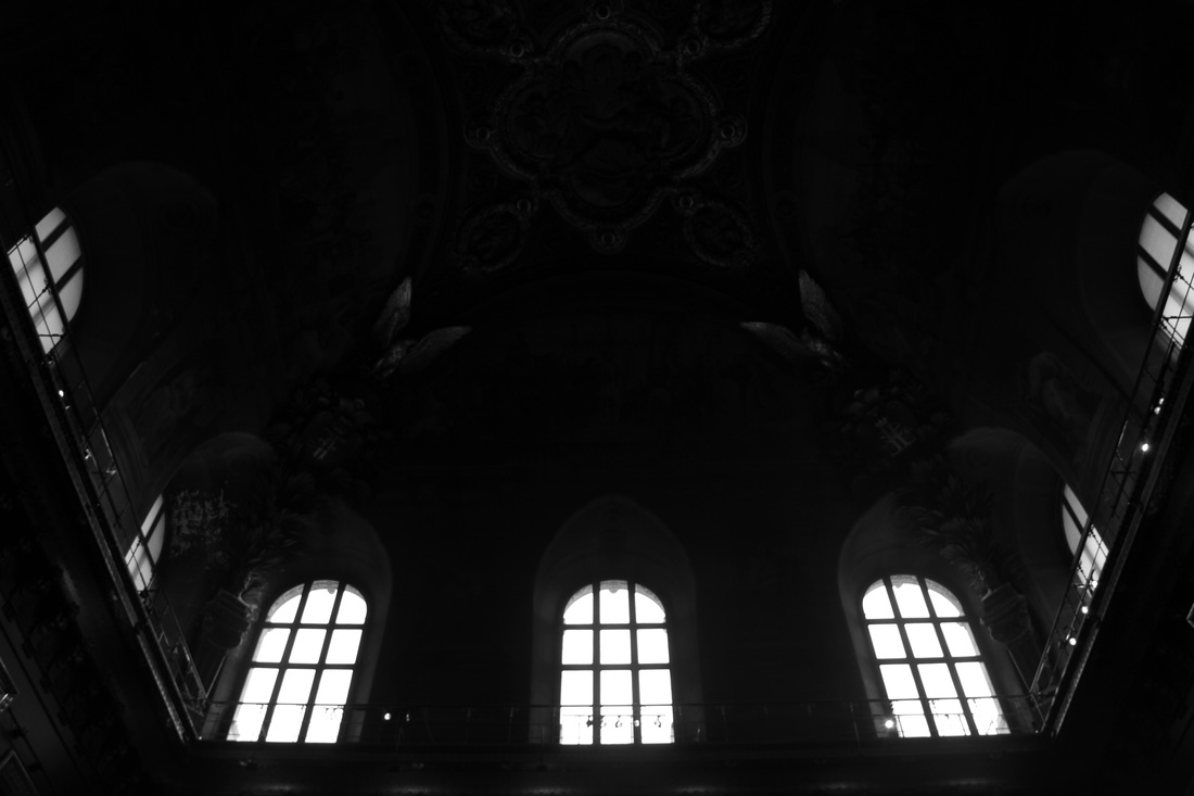
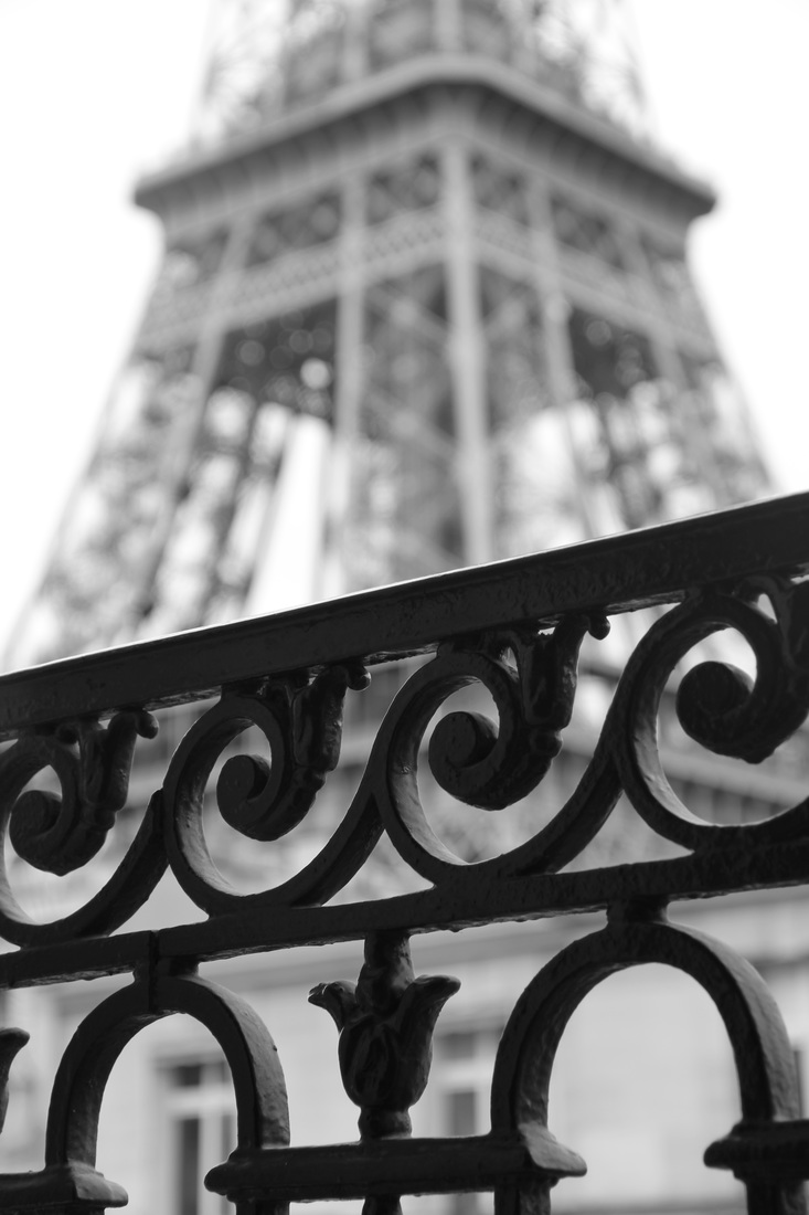
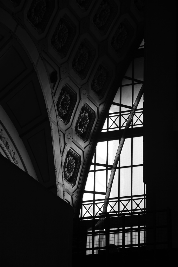
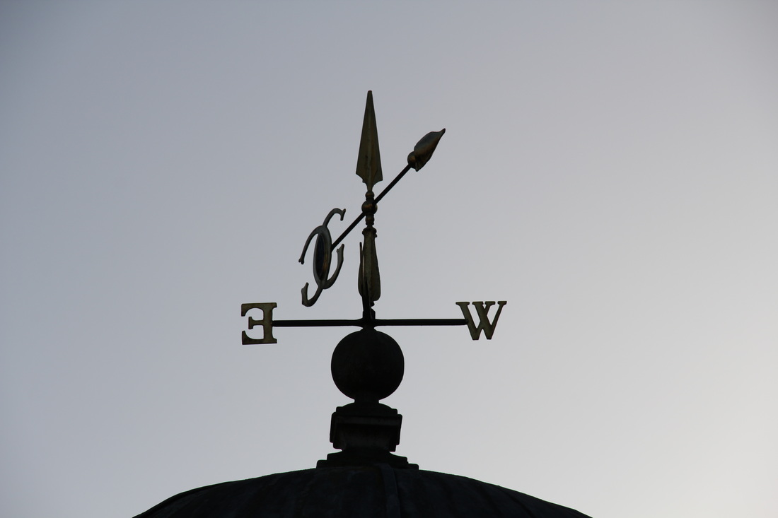
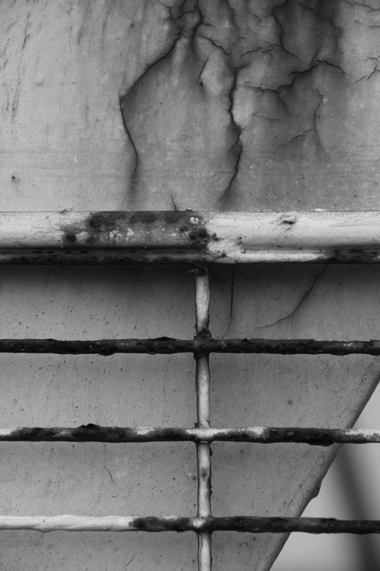
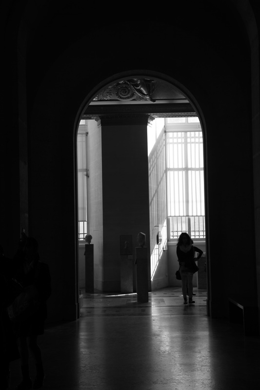
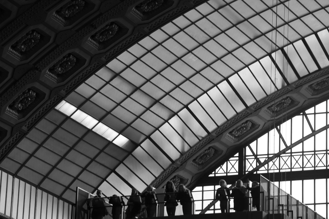
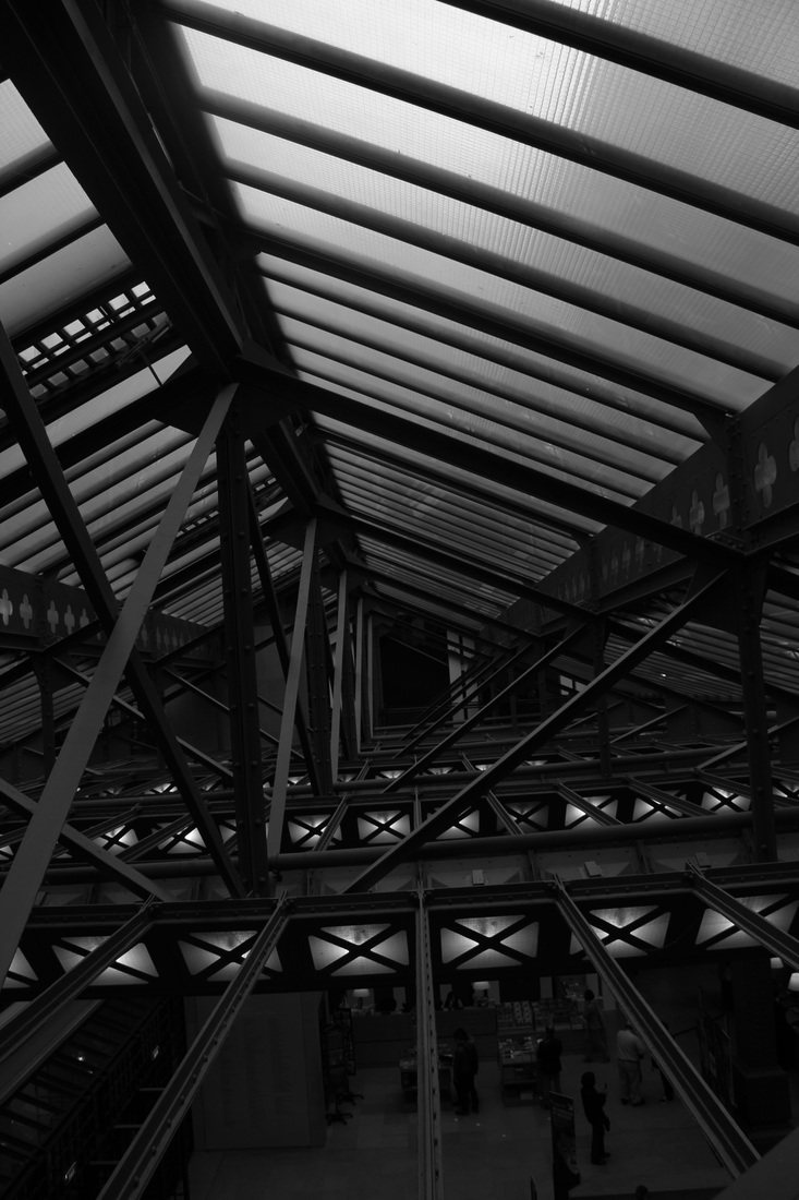
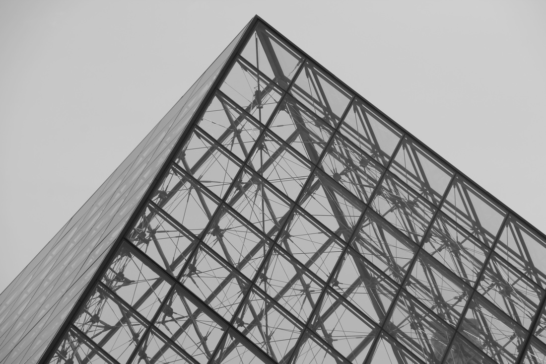
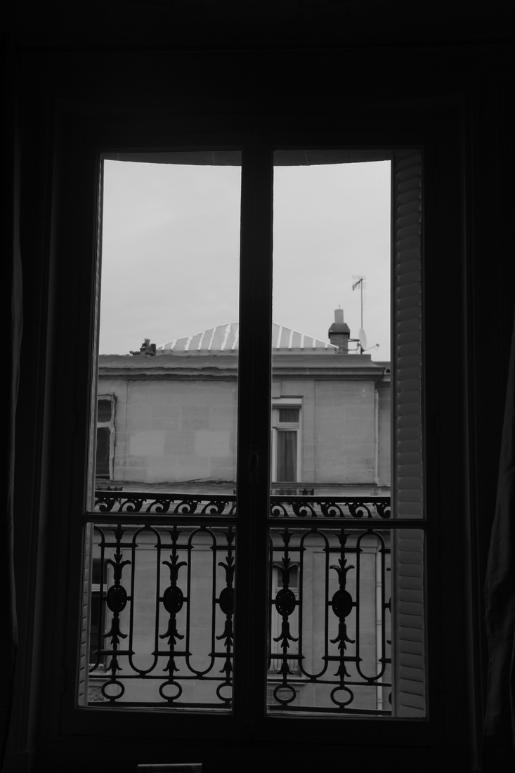
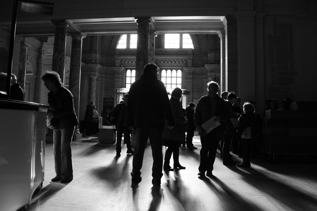
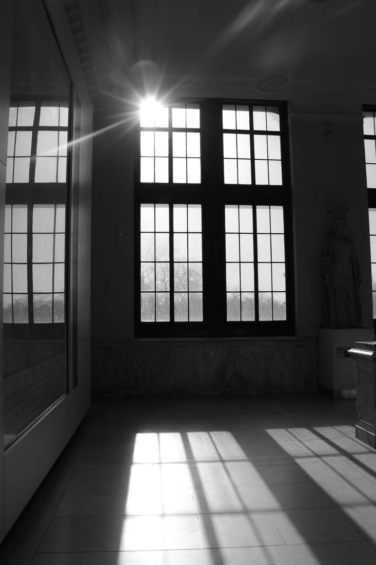
photoshoot two
|
|
|
|
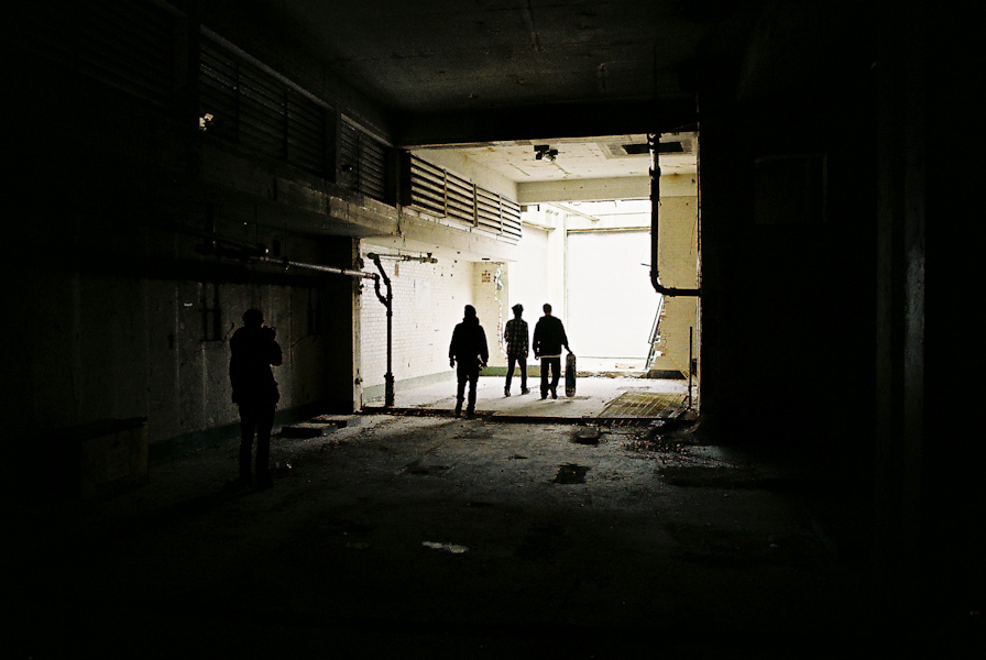
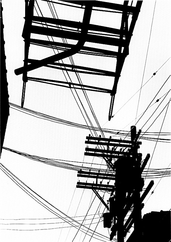
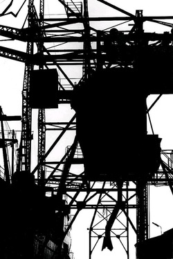
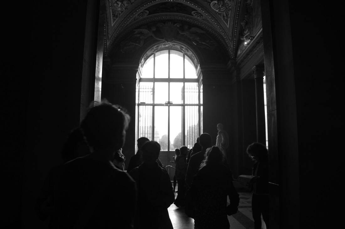
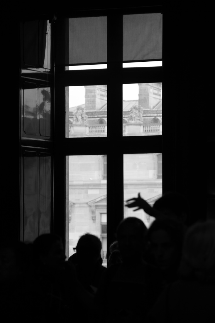
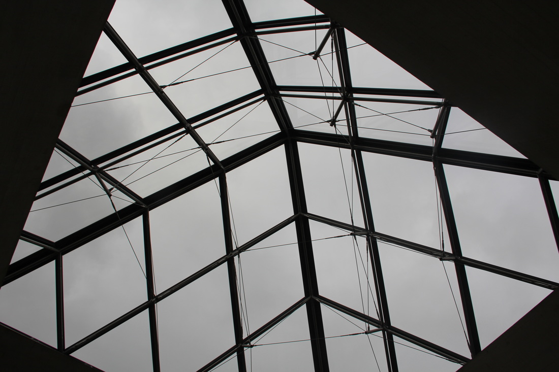
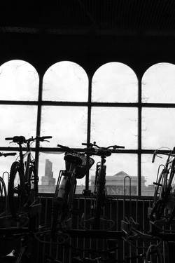
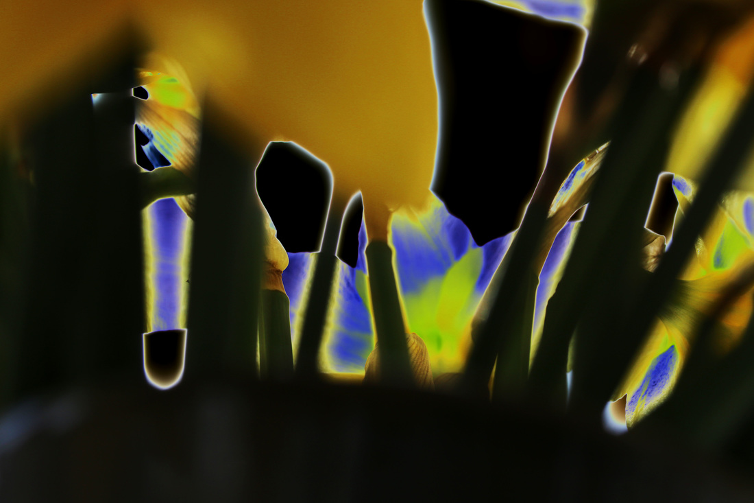
in this photoshoot I am exploring urban outline, manmade structures which are defined both by light and how they were made. I focused on aspects such as arches which create a sharp contrast between light and dark, and other shapes and structures included in man-made things.
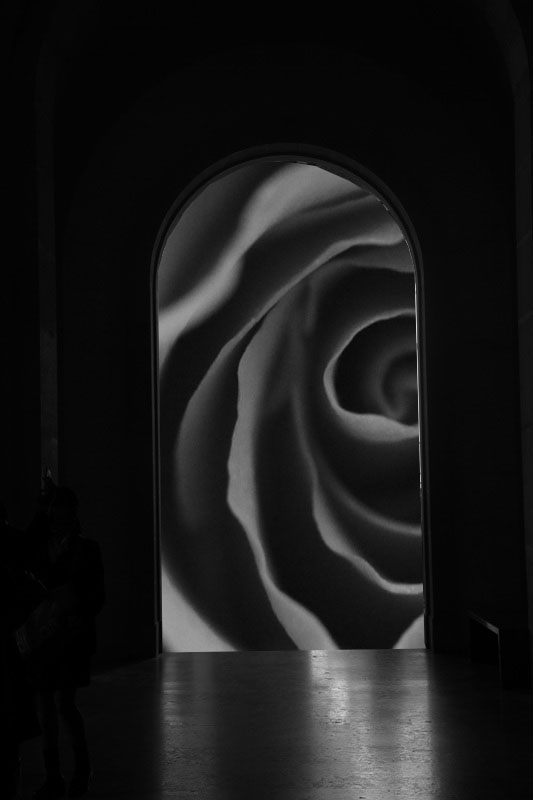
refining my ideas
in this edit I moved an image of a flower behind the arch, this creates a contrast between natural and manmade and creates a defined outline.
|
i used the same concept here, however moving the silhouette of the item over the top of the trees, this creates a dark image with clear outlines.
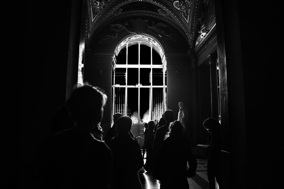
I used the curves tool to almost invert the colours in this image, increasing the contrast and darkening the people in the foreground to draw the focus to the window in the background which is defined by white outlines.
|
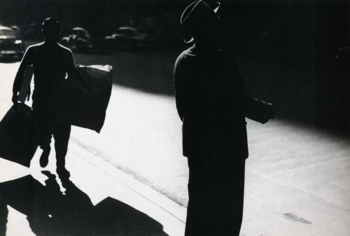
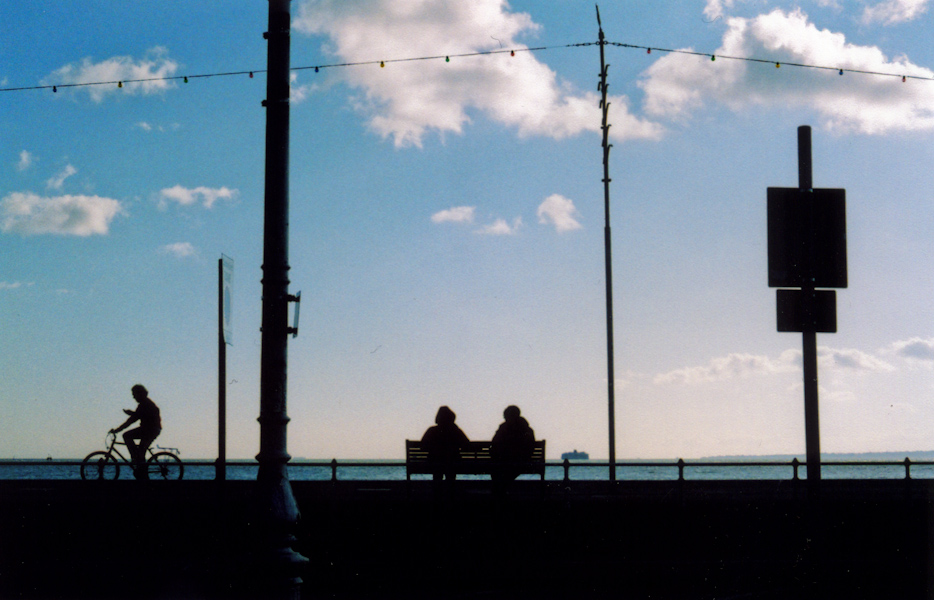
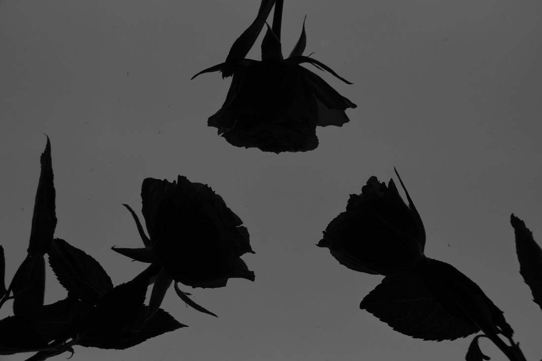
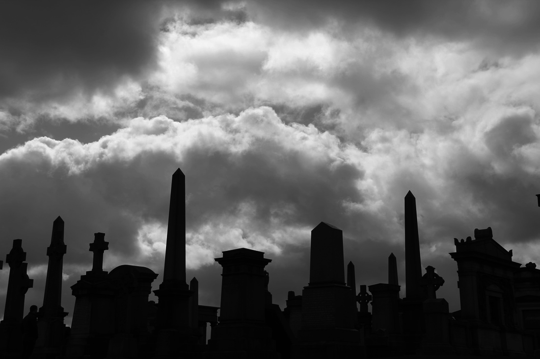
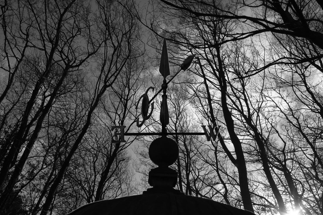
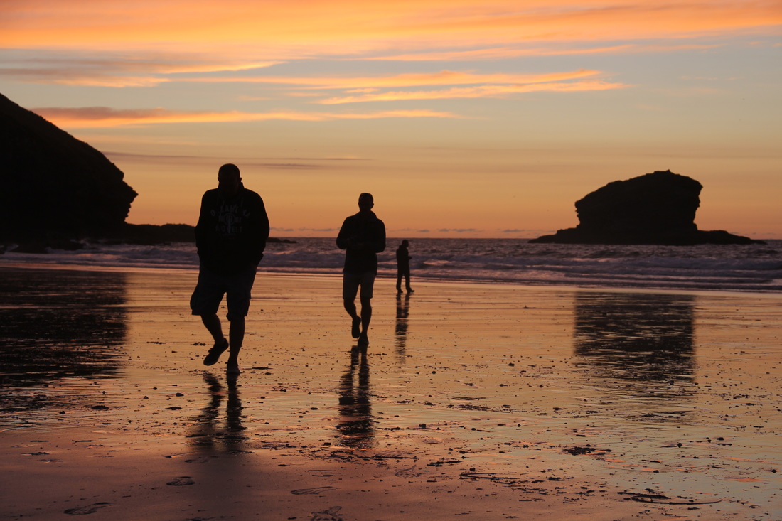
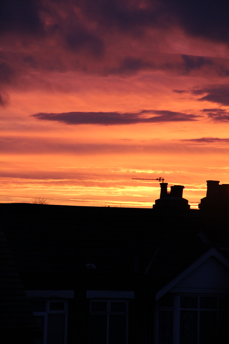
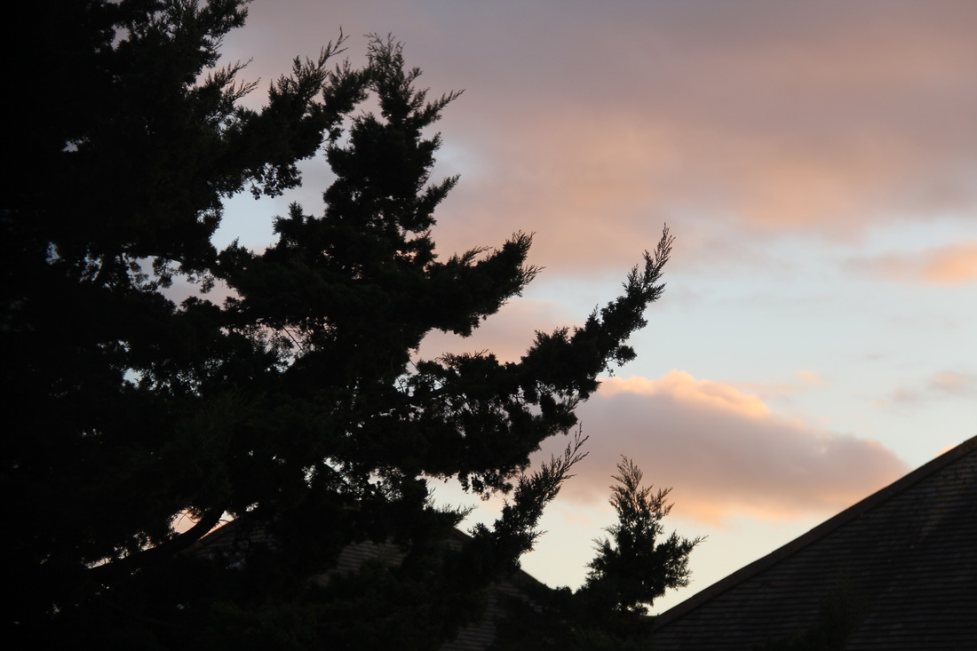
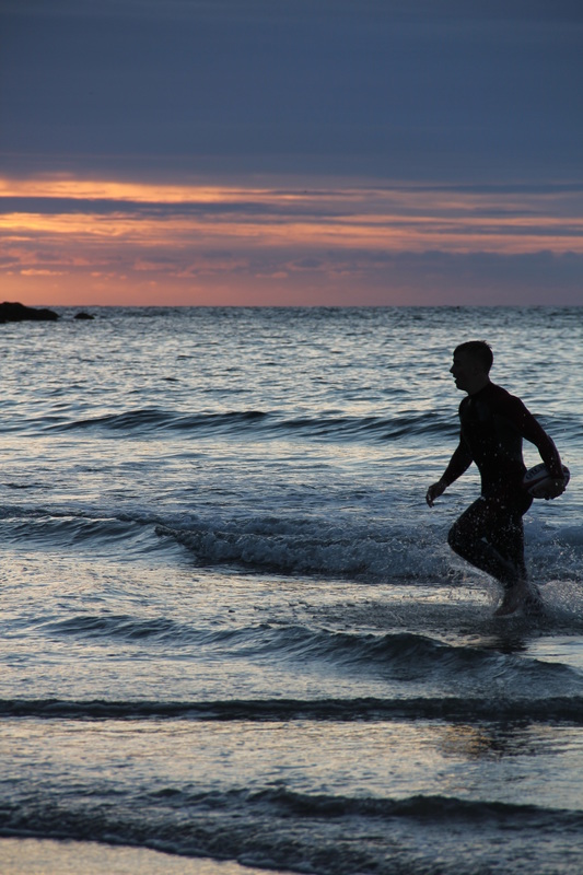
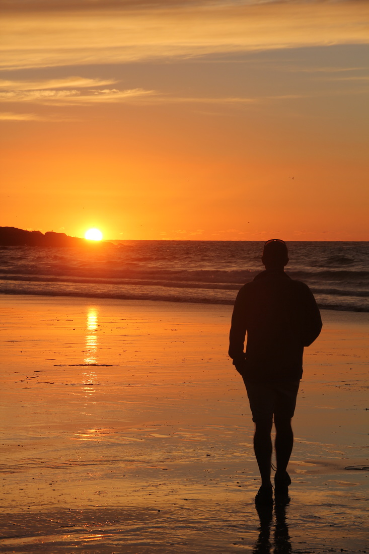
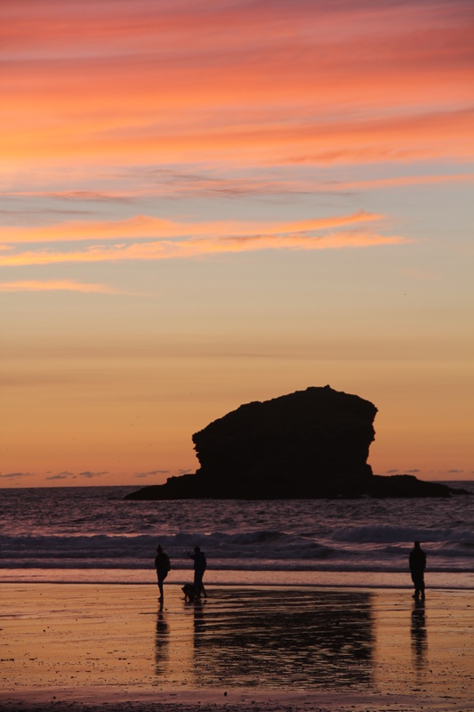
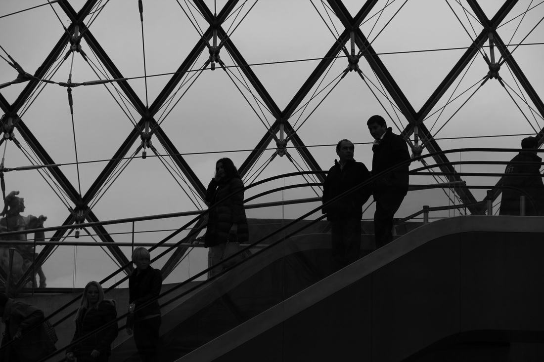
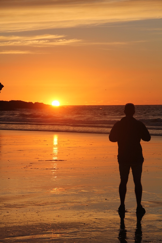
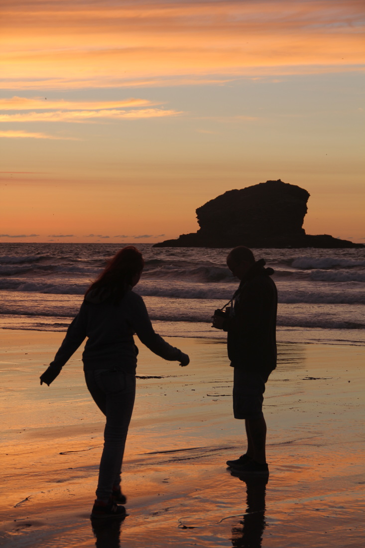
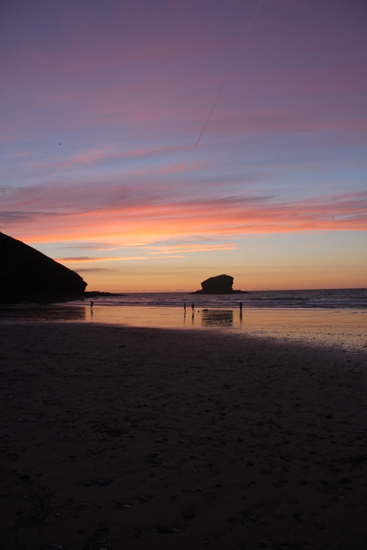
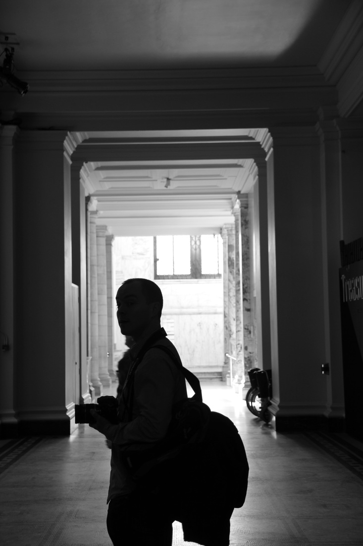
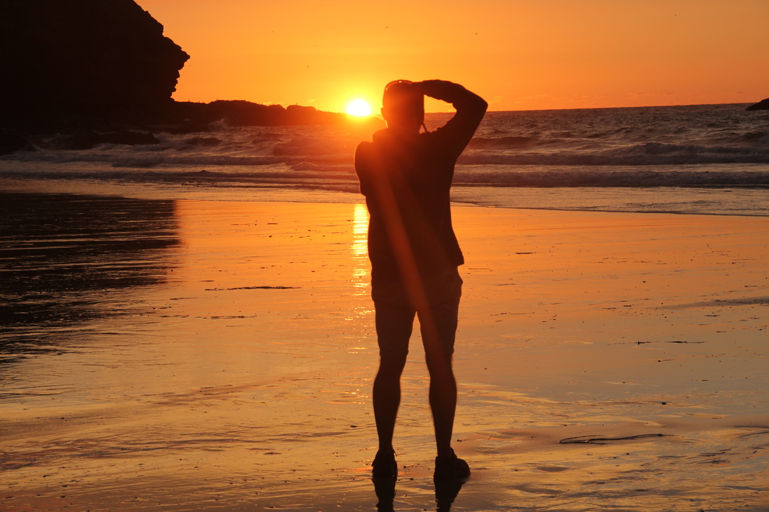
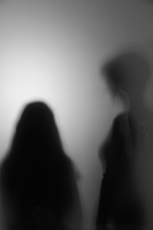
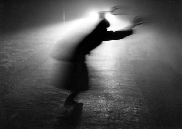
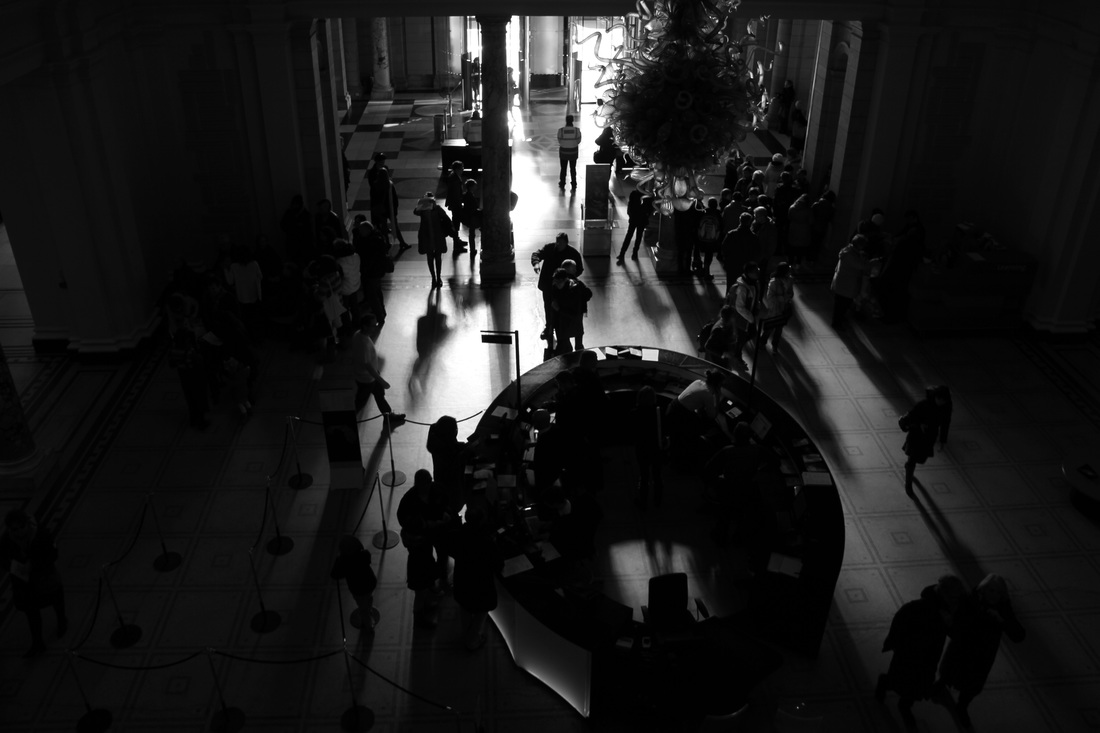
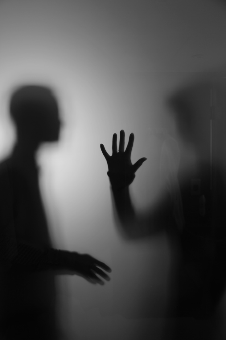
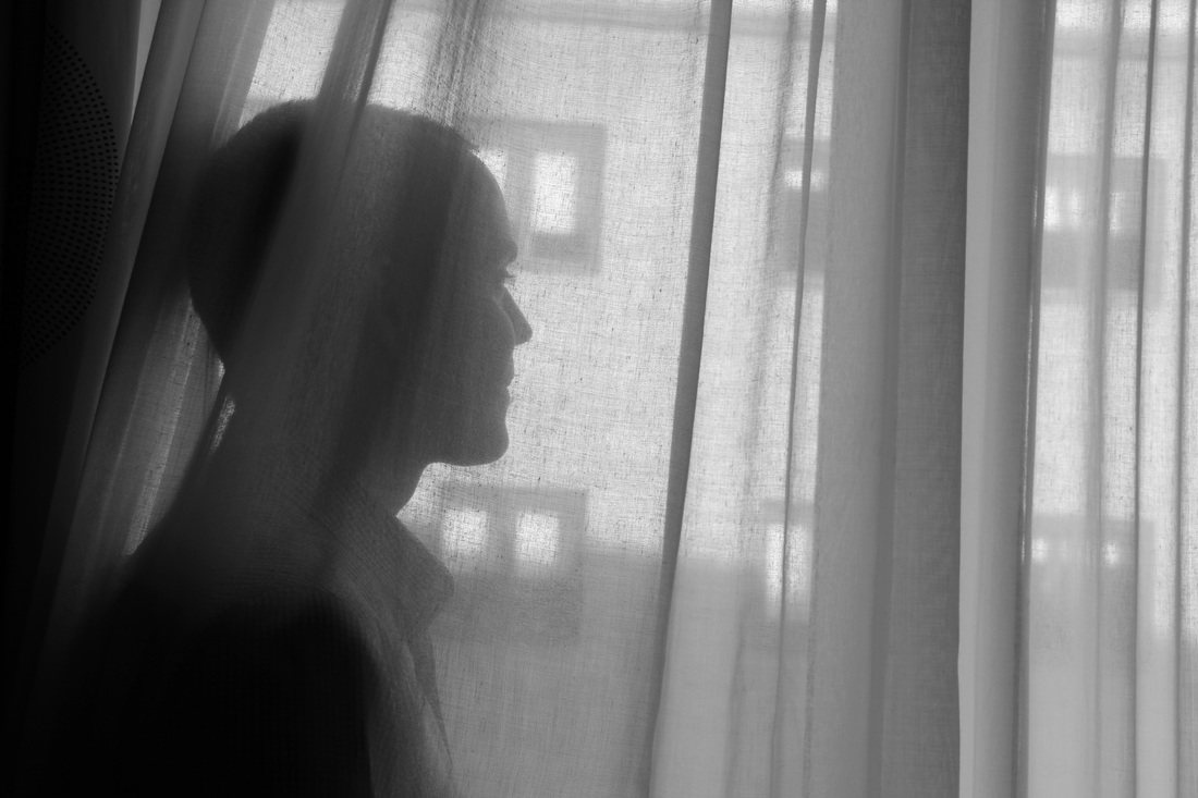
theme three - silhouettes
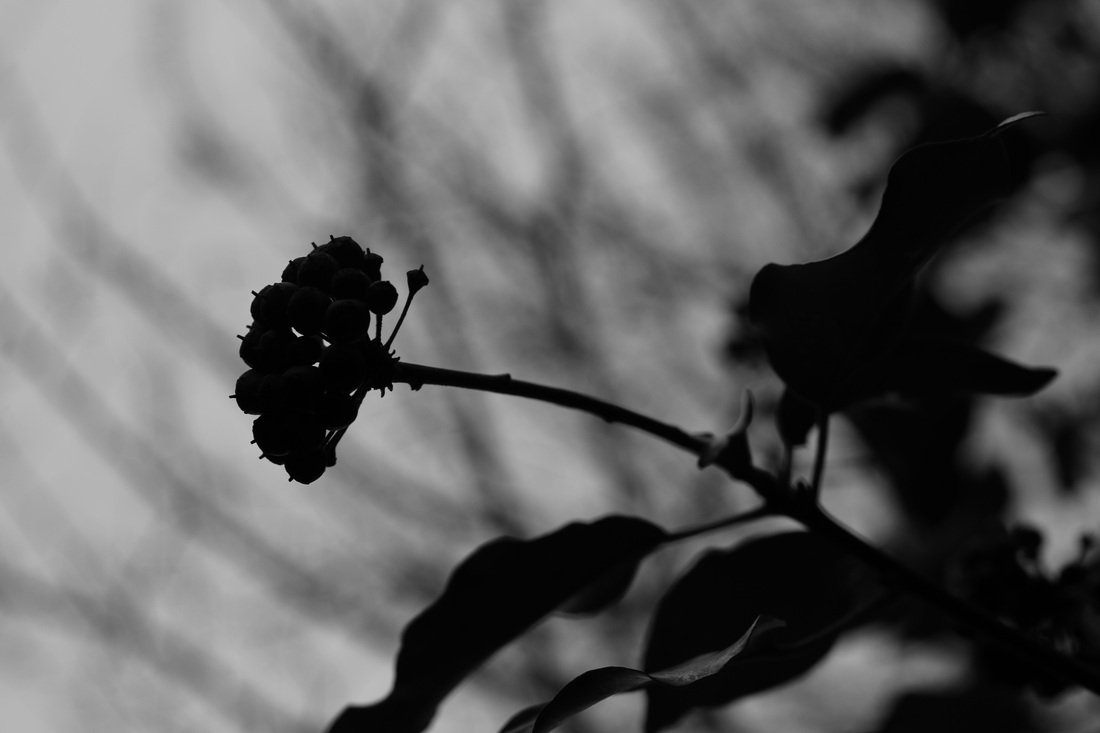
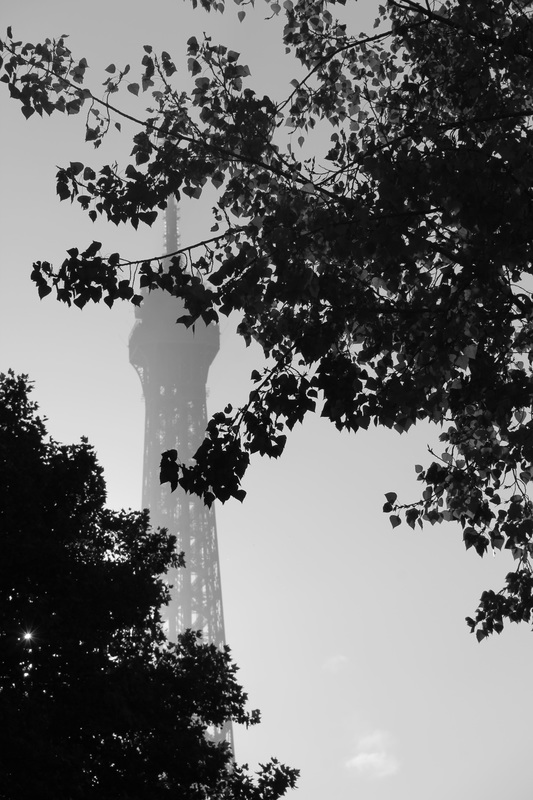
silhouettes are an aspect of photography which represents outline well due to the light and colour contrast between the silhouette itself and the usually colourful, or light background.
photoshoot three
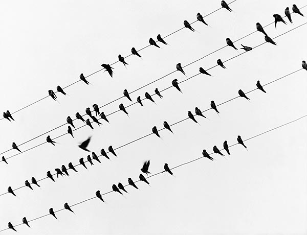
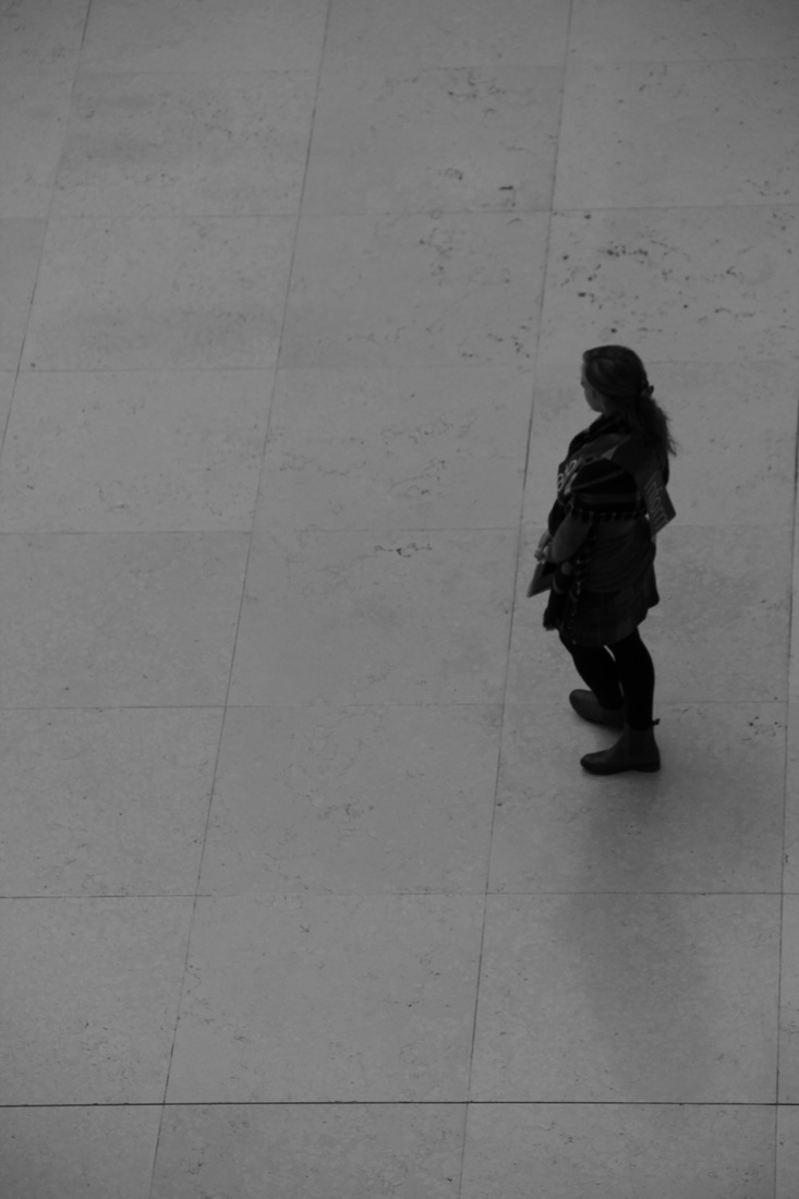
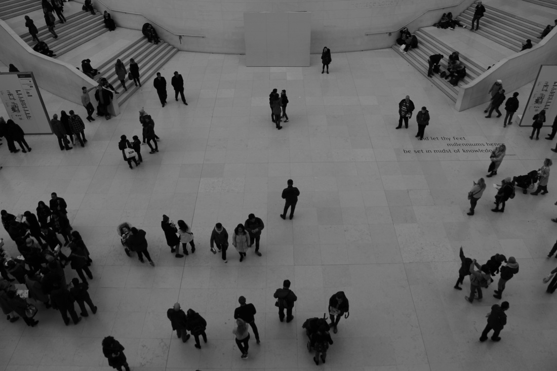
Peter Keetman
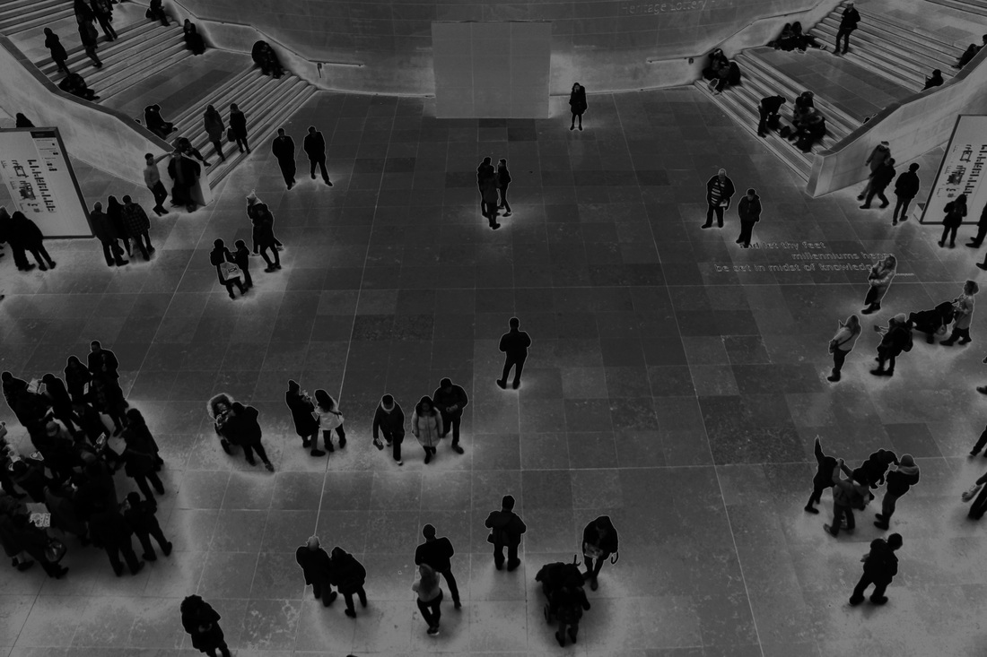
Peter Keetman was a German photographer. He took photos mainly from above which emphasise the outline of the object focusing on lines and viewpoints to create a defined edge. I will be attempting to replicate some of his work by focusing on shapes, and things from above. He uses lines in his image to define certain aspect of the photo and to sometimes create a viewpoint which adds depth and dimension to many of his photographs.

my photos in the style of peter keetman
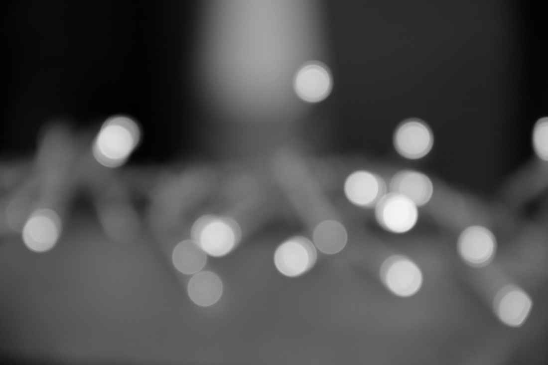
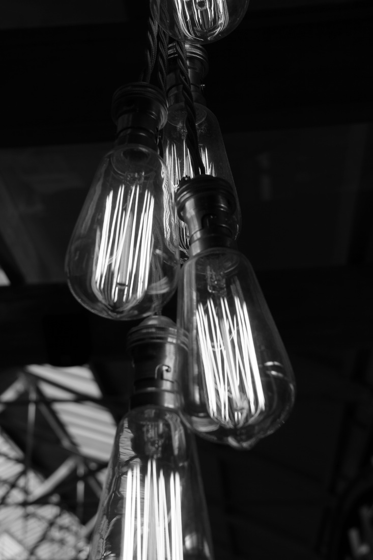
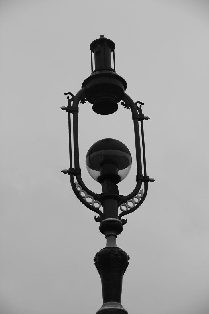
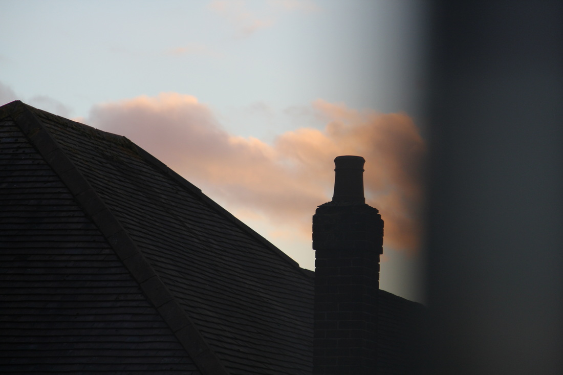
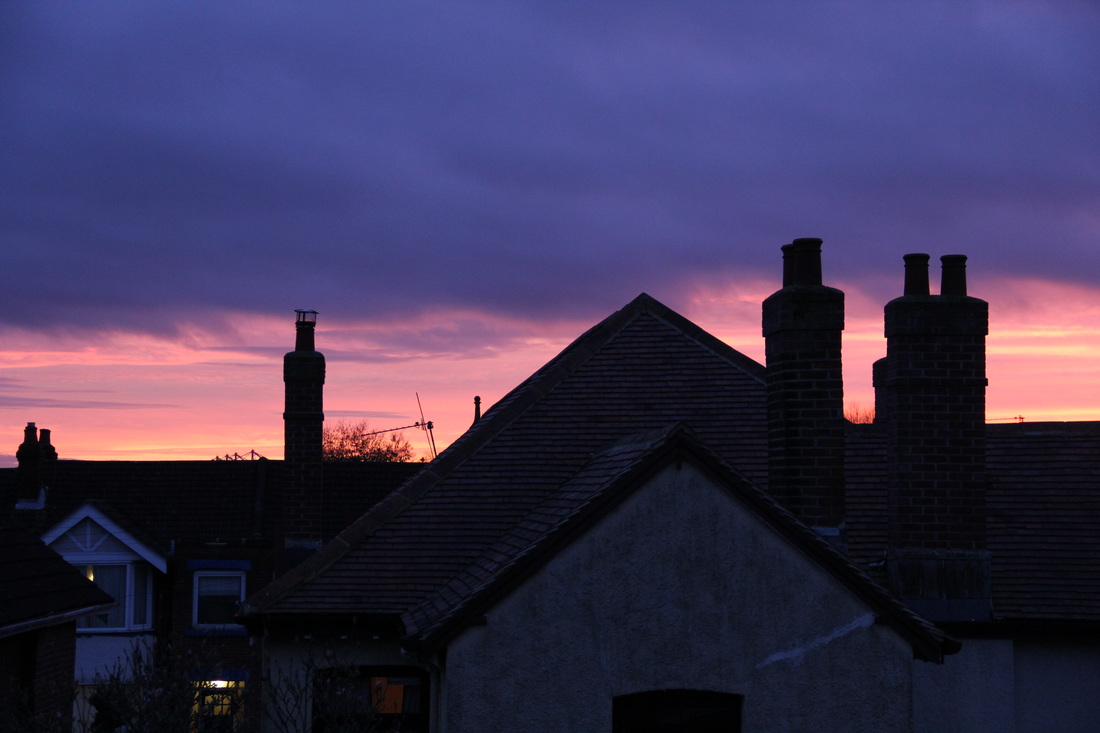
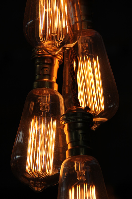
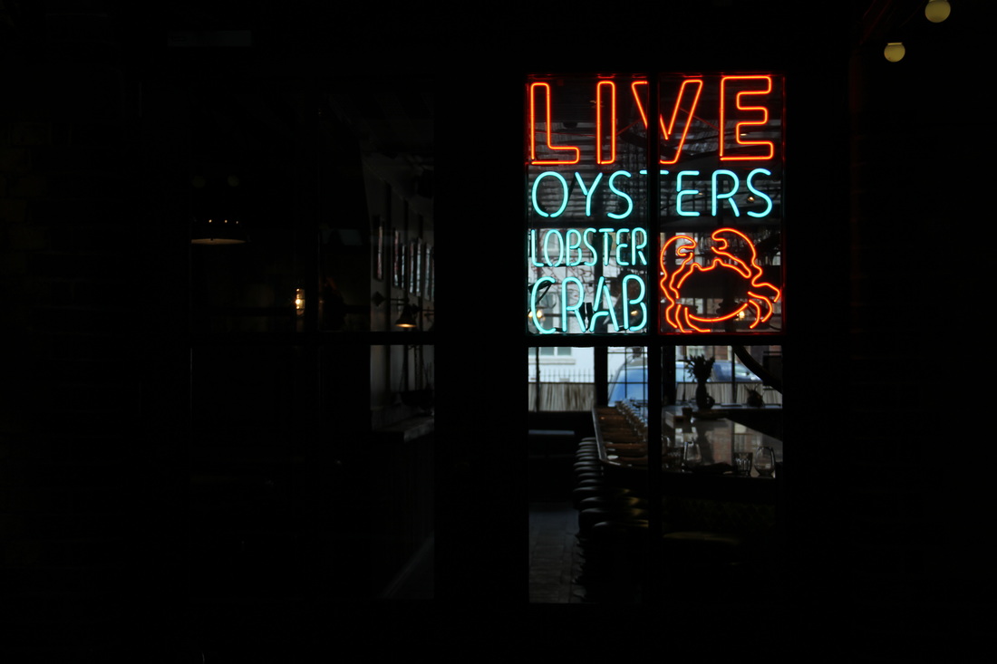
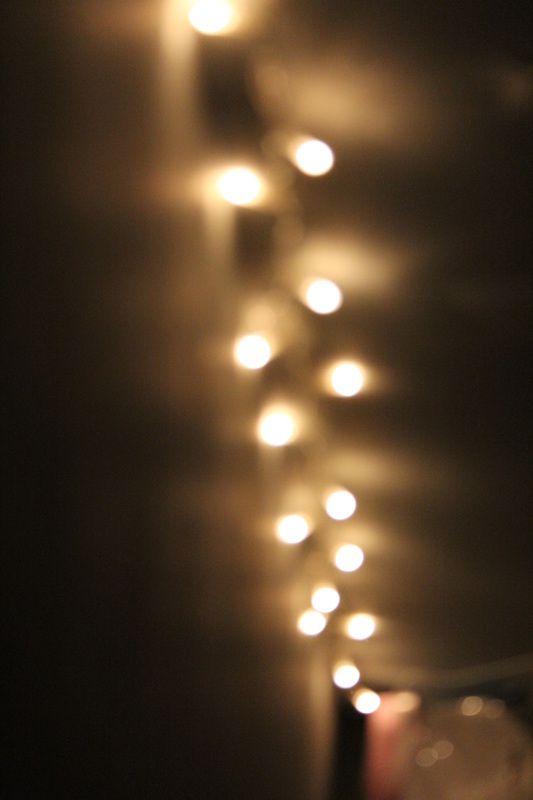
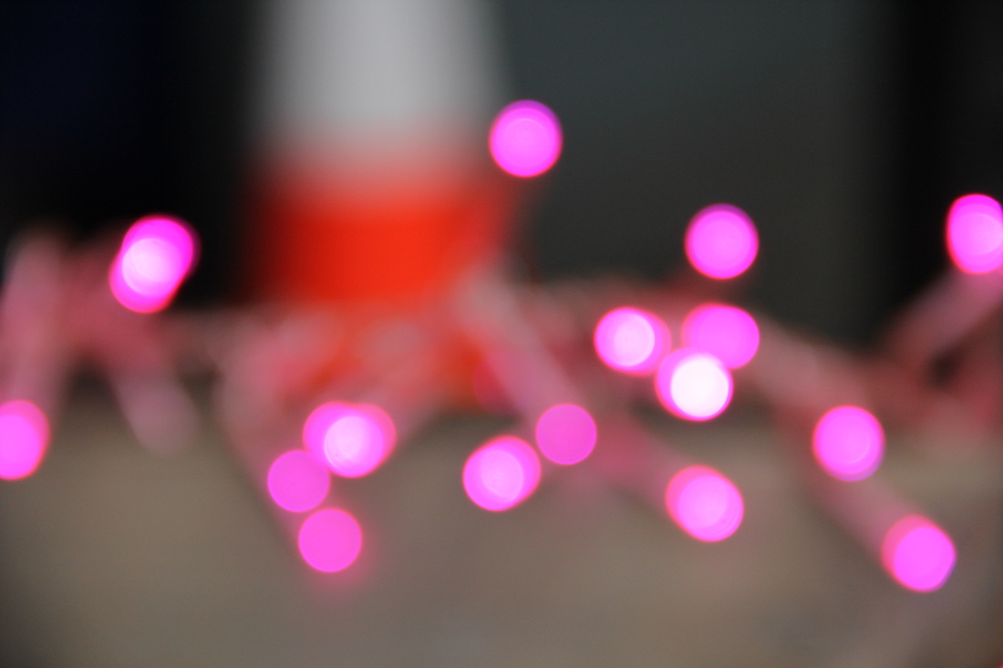
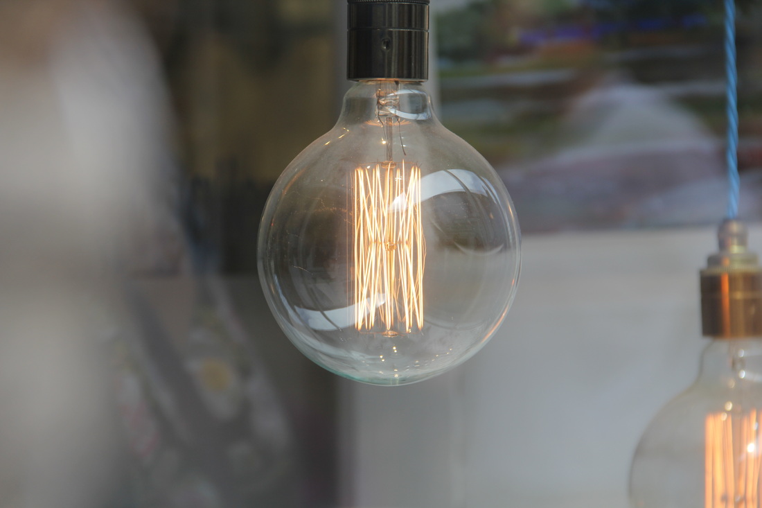
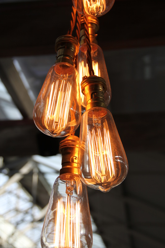
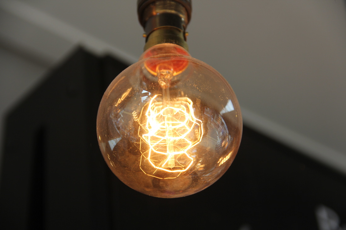
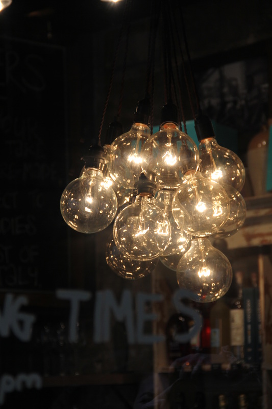
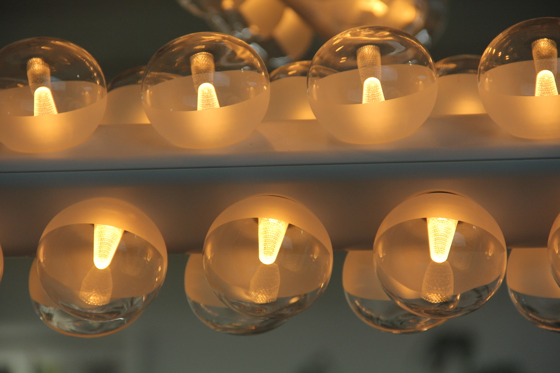
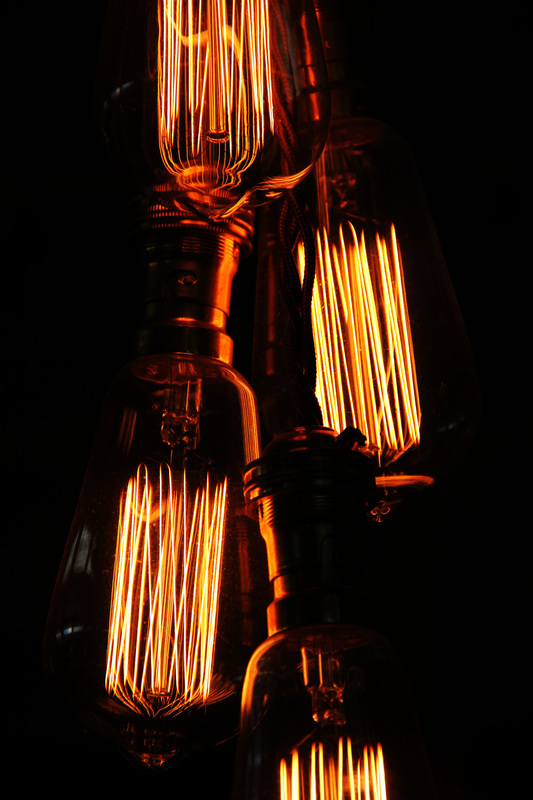
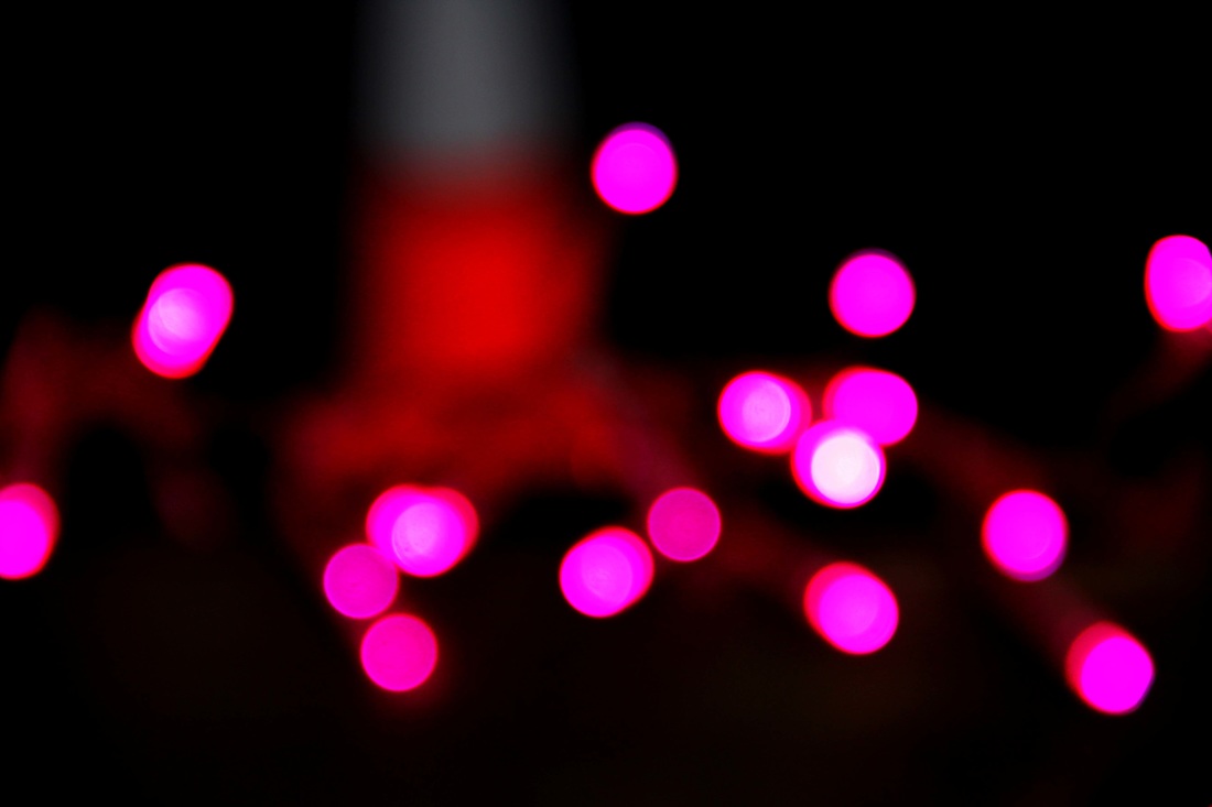
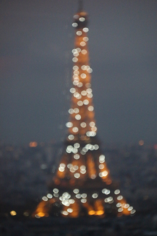
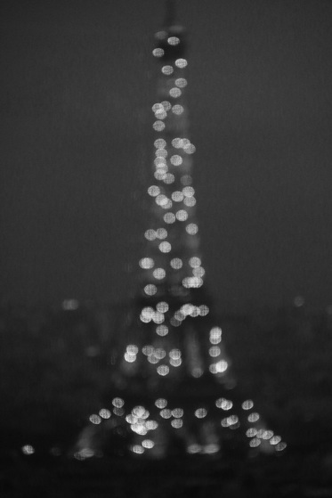
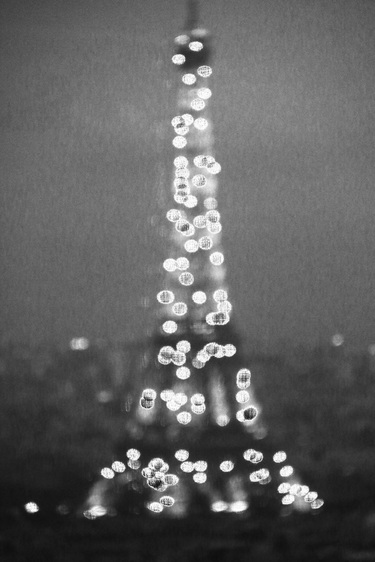
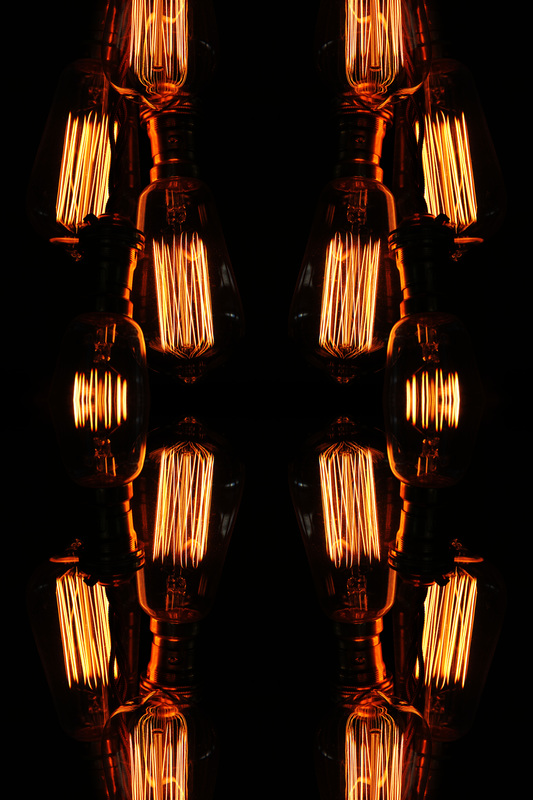
theme four - outline of light
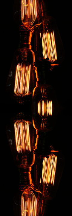
lights give defined outlines due to the colour contrast between them and their surroundings, and the difference in brightness.
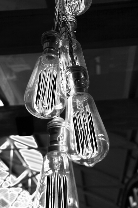
photoshoot four
refining my ideas
in this edit, I darkened the image and increased the vibrancy which enhances the bright orange outline of these lights.
here, i changed the curve levels to darken the image and increase contrast.
|
the darkness of the background of this image contrasts with the colourful lights.
i altered the background to black and white, and increased the vibrancy of only the lights. this creates a clear color contrast.
|
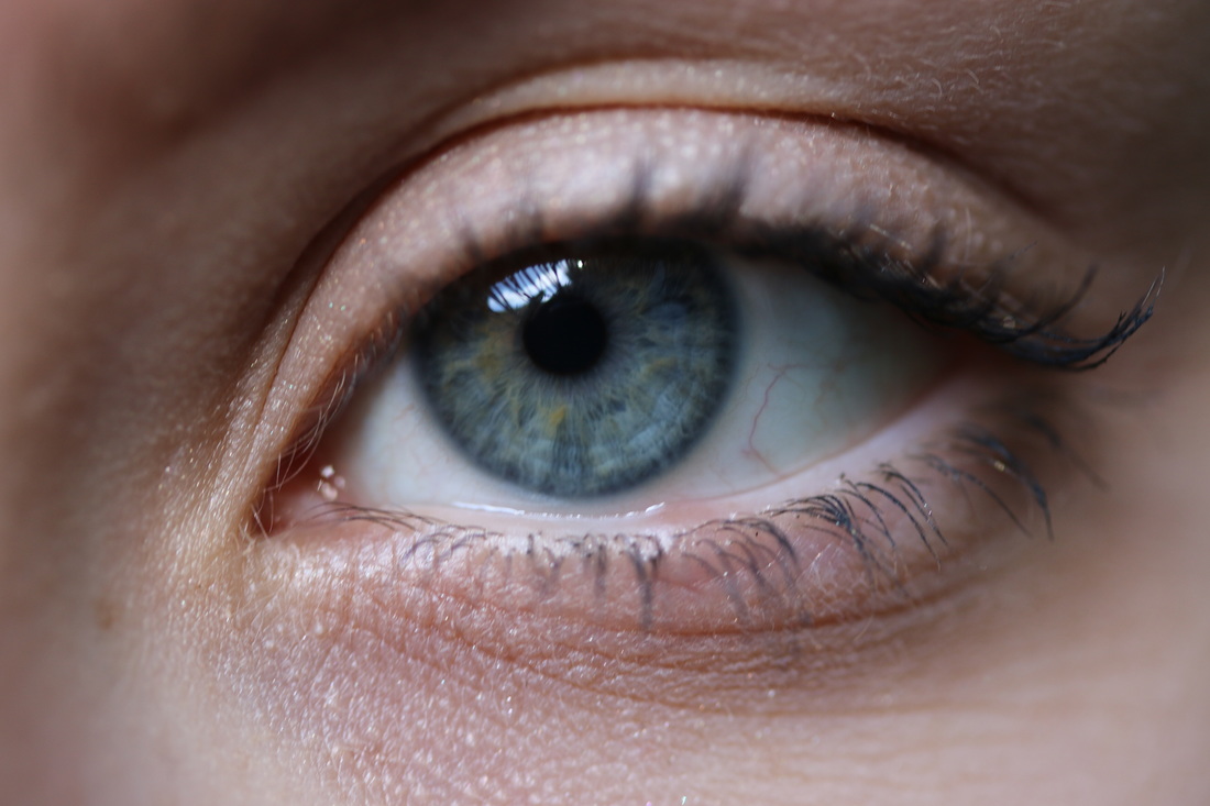
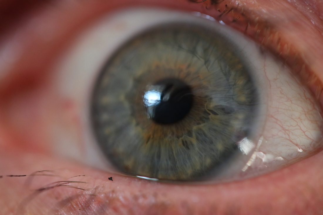
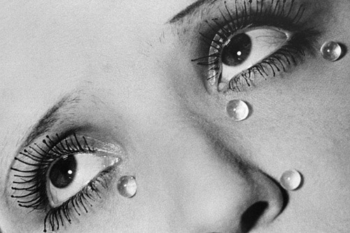
Rankin
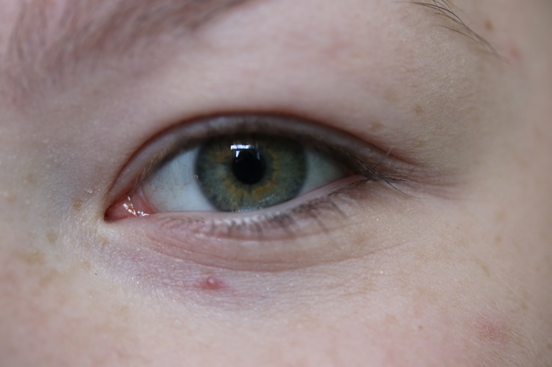
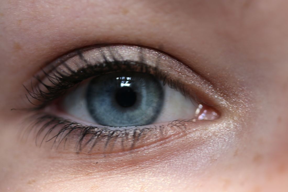
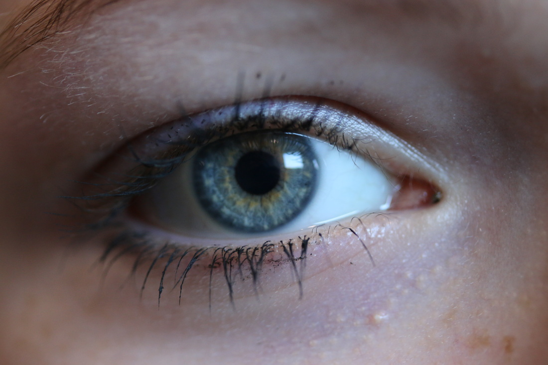
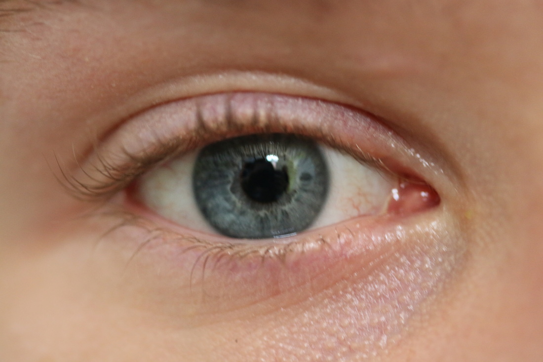
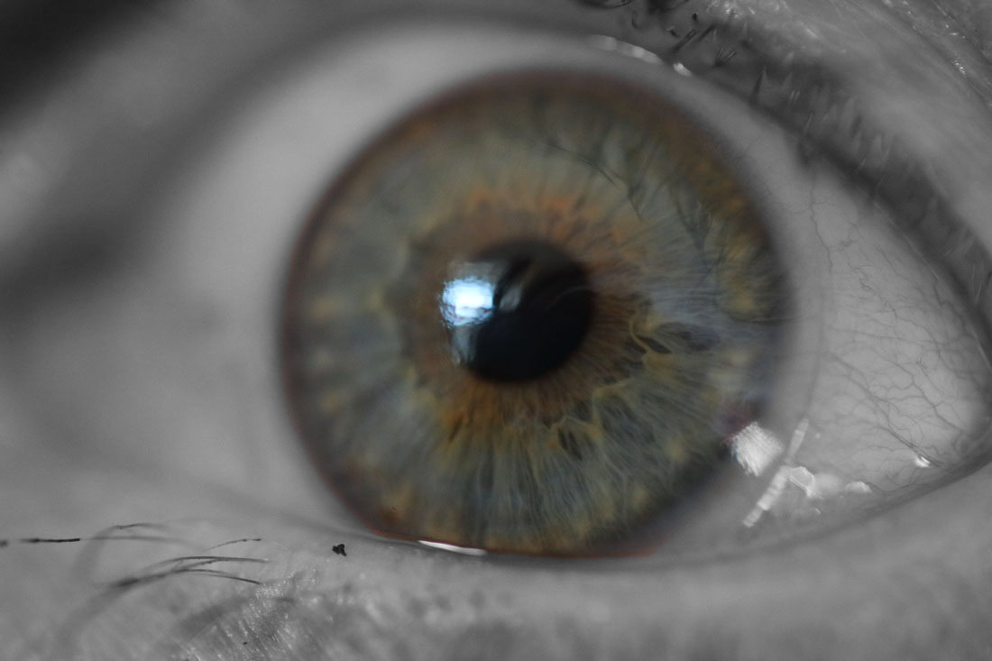
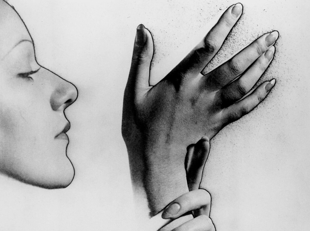
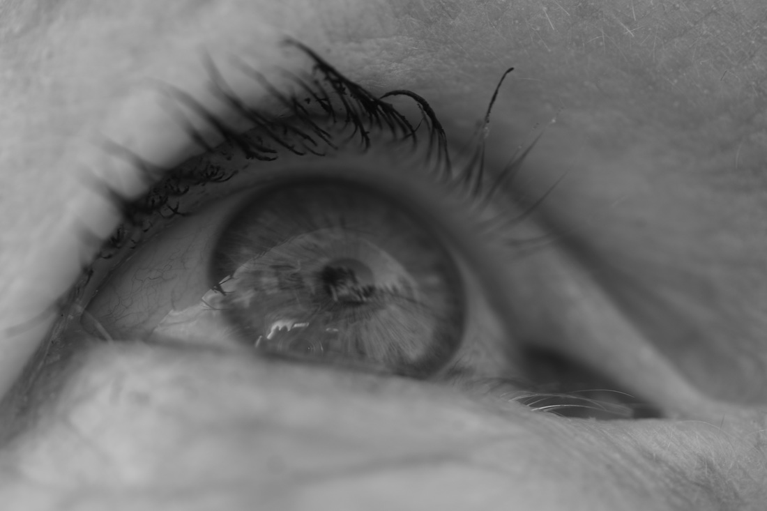
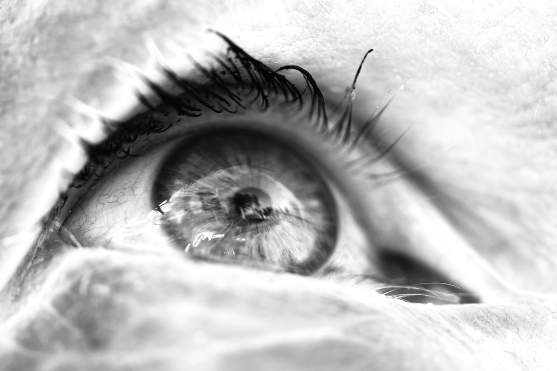
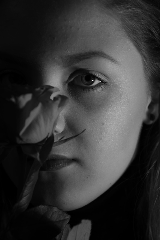
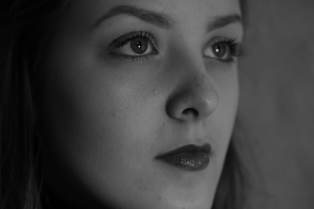
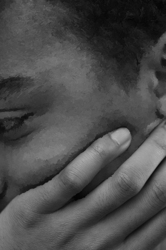
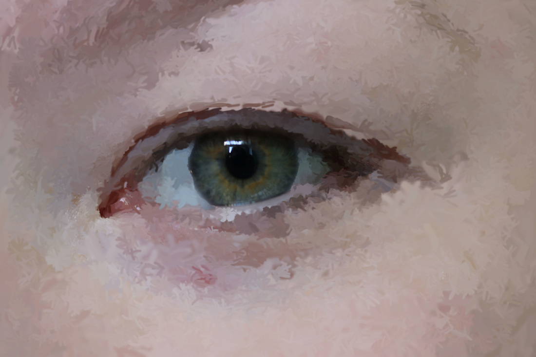
Rankin's eye project represents outline well due to the defined edges of the iris' and how they have been cut out and removed from their natural state. To achieve this it involves removing the rest of the eye, leaving only the iris. I will be attempting to replicate this idea with eyes, and other objects. This has inspired my work as it is very creative, and photographing this body part in such detail takes a lot of skill.
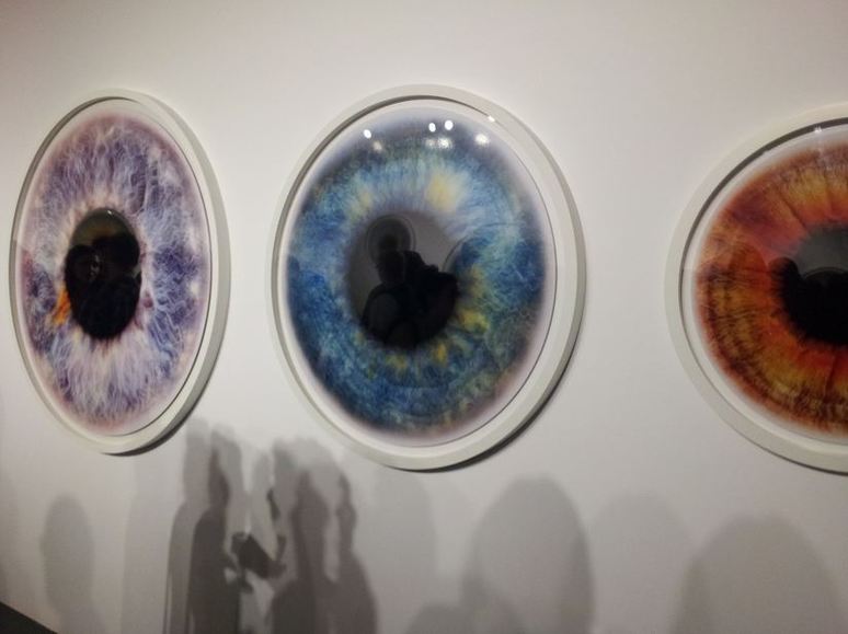
inspired by rankin's eye piece, I took close up photos of eyes in preparation for part of my final piece.
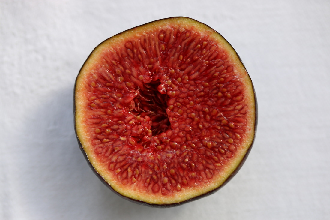
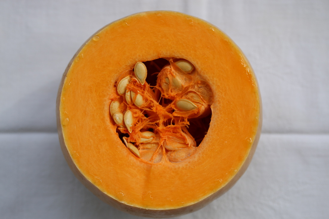
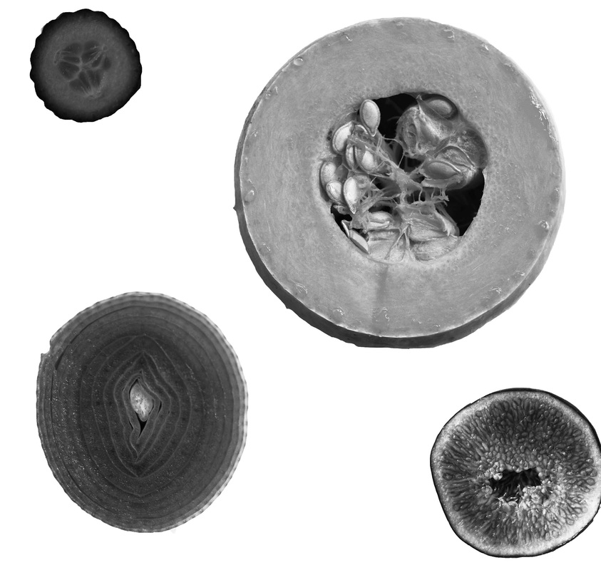
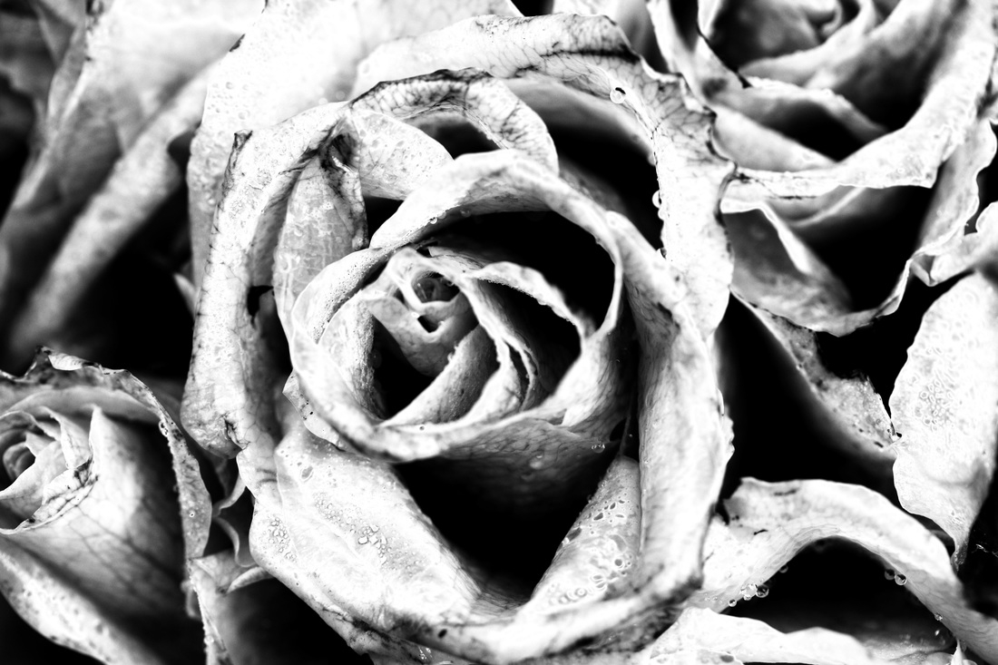
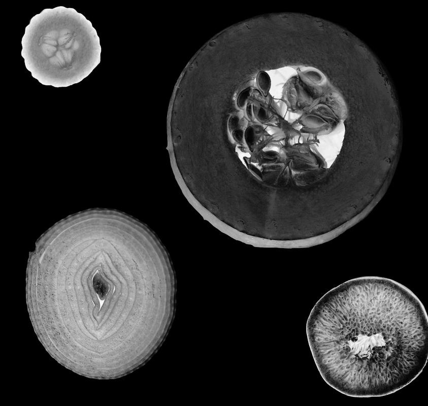
I also experimented with the inside of fruit and vegetables, as these have interesting structures and clear outlines.
refining my ideas
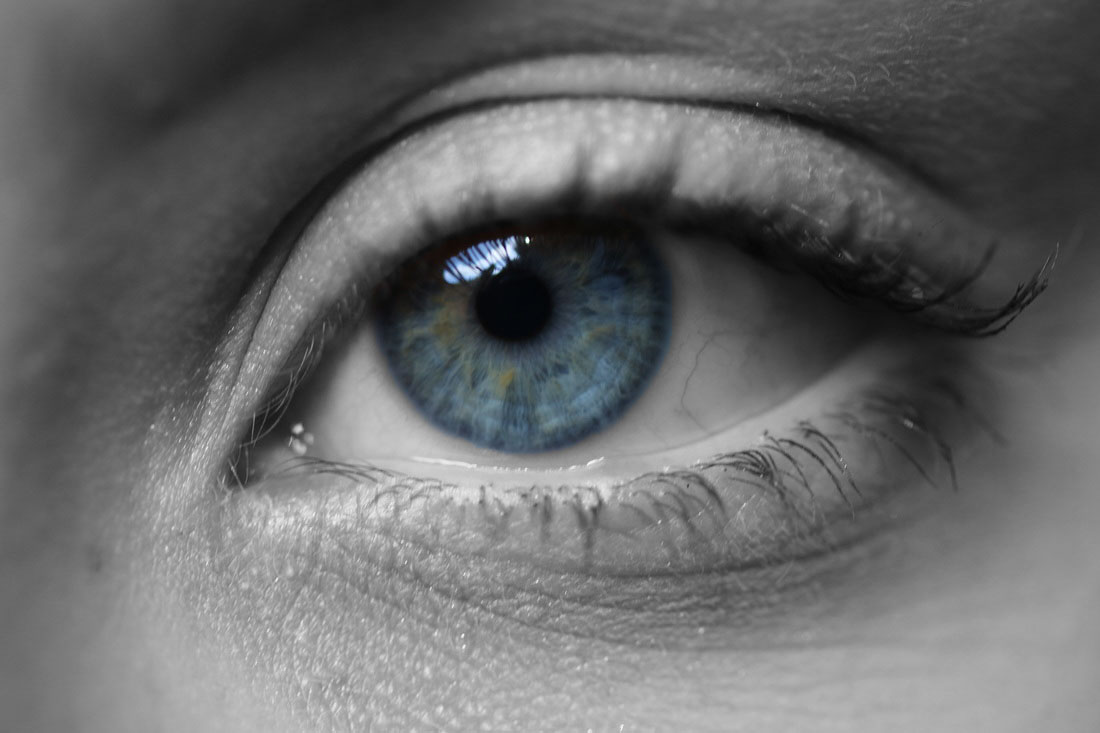
the colour contrast between the iris and surroundings creates a clear outline.
|
i altered this image in the same way, keeping the iris in color and changing the surroundings to black and white.
|
resolving my ideas
background contrast - inspired by Rankin's eye project
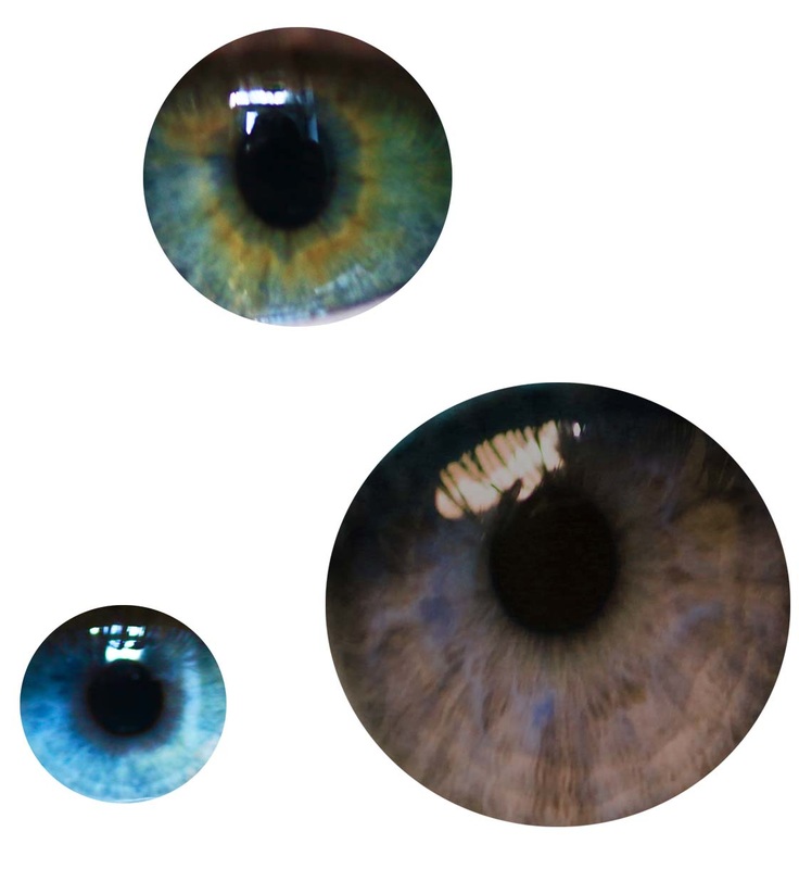
i cut out a selection of iris' and moved them onto a white background, i did this as the plain background contrasts with the colorful eyes, giving a clear outline.
i did the same here, however this time changing it to black and white to help the different images link together, i also increased the contrast to give a crisper and more defined outline to the objects.
i did the same, again, however with flowers. this is the final of my three edits in this style.
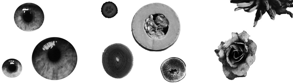
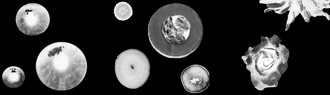
i proceeded to merge all three images together, creating a strip with a range of natural outlines, all linked together through the use of the black and white filter and the increase of contrast to define the images. the white background makes the outline of each aspect clear. on the image below, i inverted the colors to give a different effect, still enhancing the natural outlines.
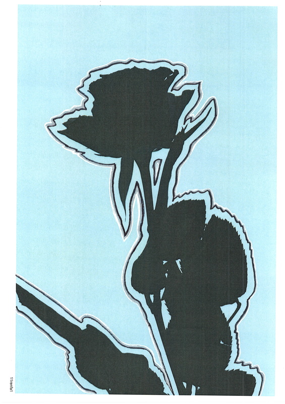
artificial outline
in these 3 images i printed out the photos and edited them by hand, aiming on enhancing the outlines in each.
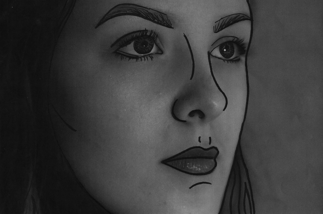
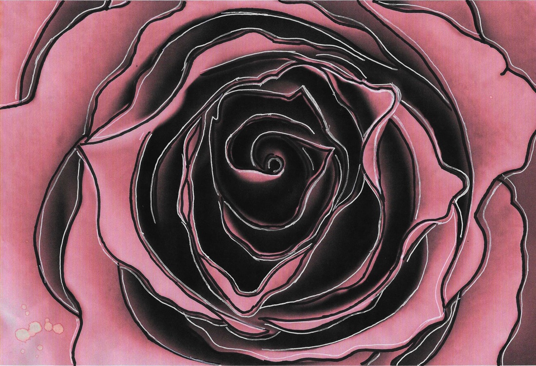
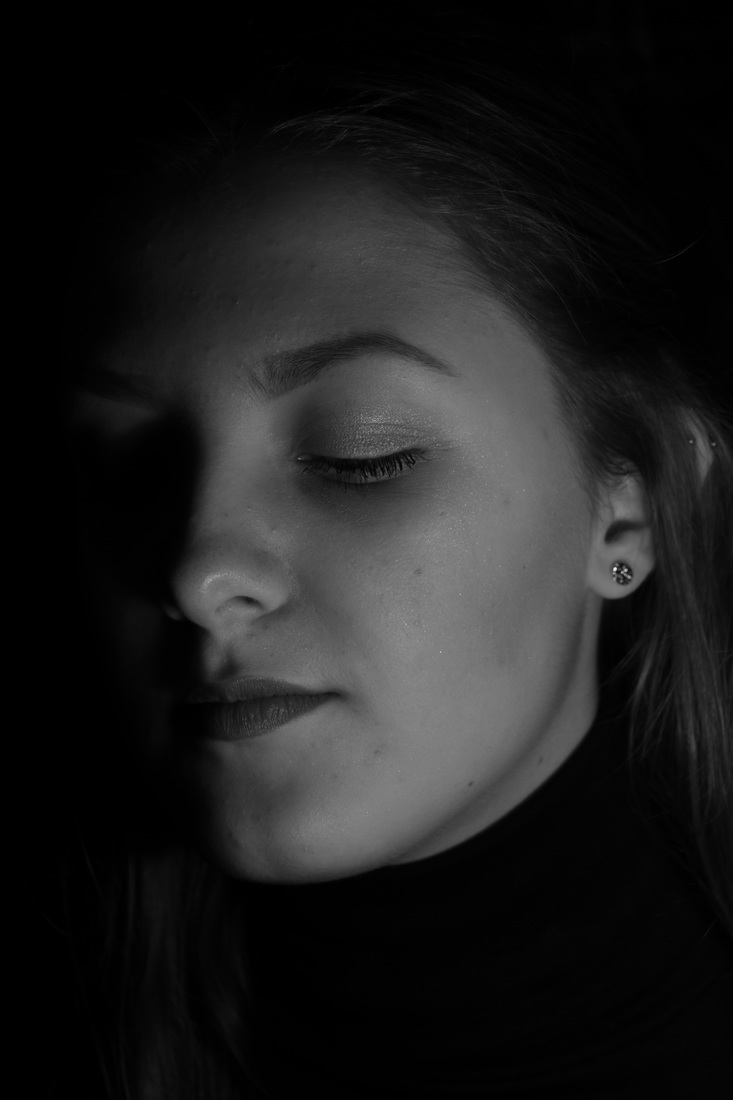
here, i outlined her features to add definition to her face,
giving an almost cartoon-like effect.
giving an almost cartoon-like effect.
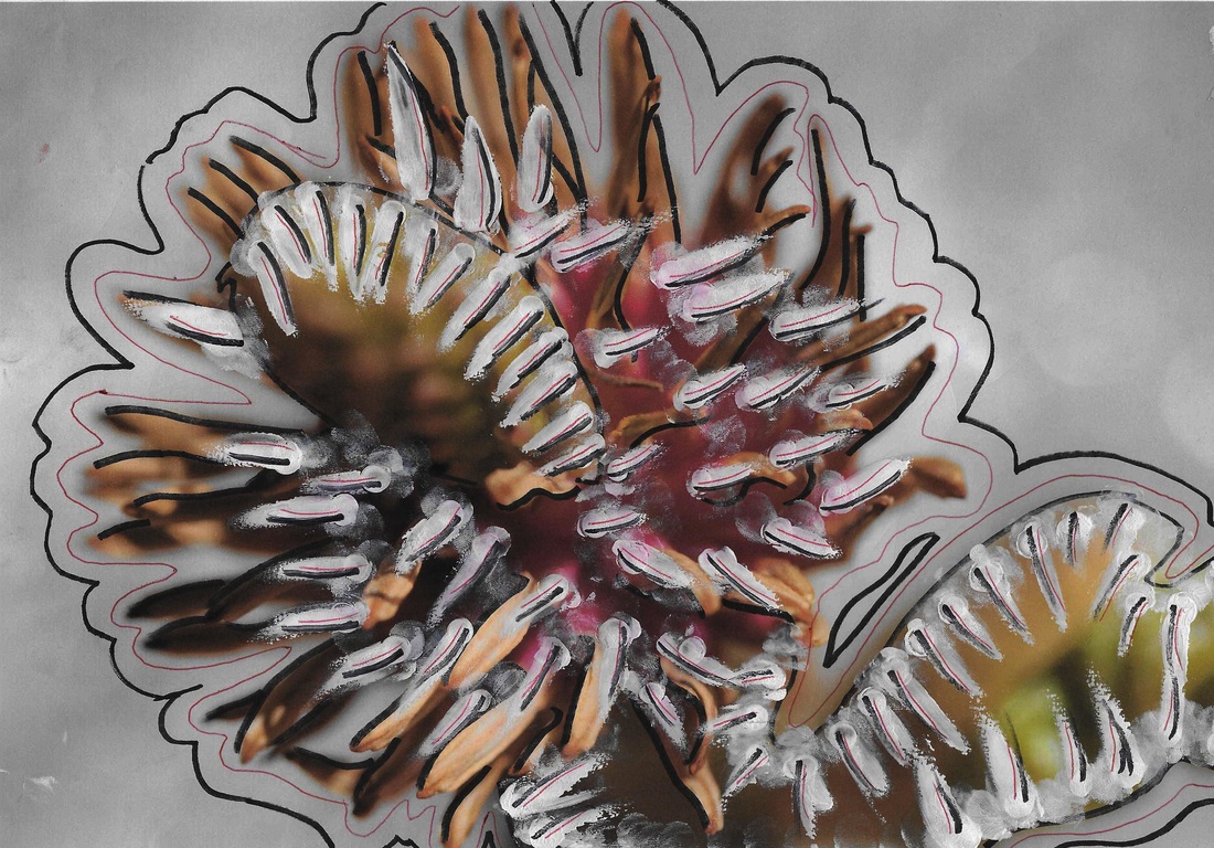
here, i added white streaks to the petals then added detail by giving them black and red streaks to outline them and add definition. i also outlined the exterior of the plant with these two colors again to add extra detail and artificial outlines.
i outlined the edges of the petals here with black and white pen to add detail and give a clear and defined outline to the image.
I outlined the edge of the flower with a black pen, and highlighted it with silver and white lines to create an outline around the image.
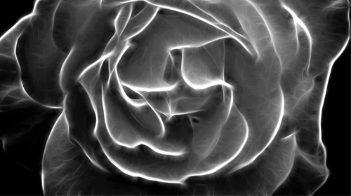
Man Ray
Man Ray's editing technique of solarisation greatly enhances outline, by giving the main aspects of the photograph a darkened or brightened edge. I will be replicating this technique of his in this section. This technique draws more attention to the focal point of the image it by defining it which links well with the theme of outline.
my response to Man Ray
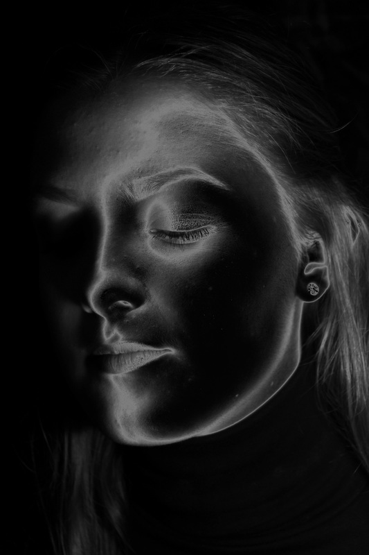
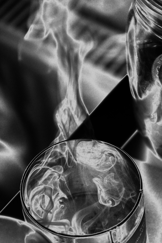
I will be using editing techniques which greatly define the outlines of an object. in this section, I will be exploring contrast.
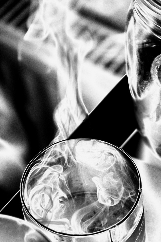
images i will be editing


i chose a range of photos, from portraits to urban shots as this will give a variation to the effect this editing technique gives.
refining my ideas
here, I decreased the saturation until the image was back and white, I then altered the curves to darken and define the image.
|
to give the 'solarised' effect, I changed the curve levels to achieve this, moving it to and upside down 'v' shape which changes the brightness and contrast levels and gives this effect. I will be doing this same technique with the rest of the following images.
|
|
|
I used the same technique as above with this image, however with the one on the right I used the 'solarisation' filter to create a different effect.
|
|
in these images I used the curves tool to give a drastic contrast, and in some the solarisation filter to give a defined effect.
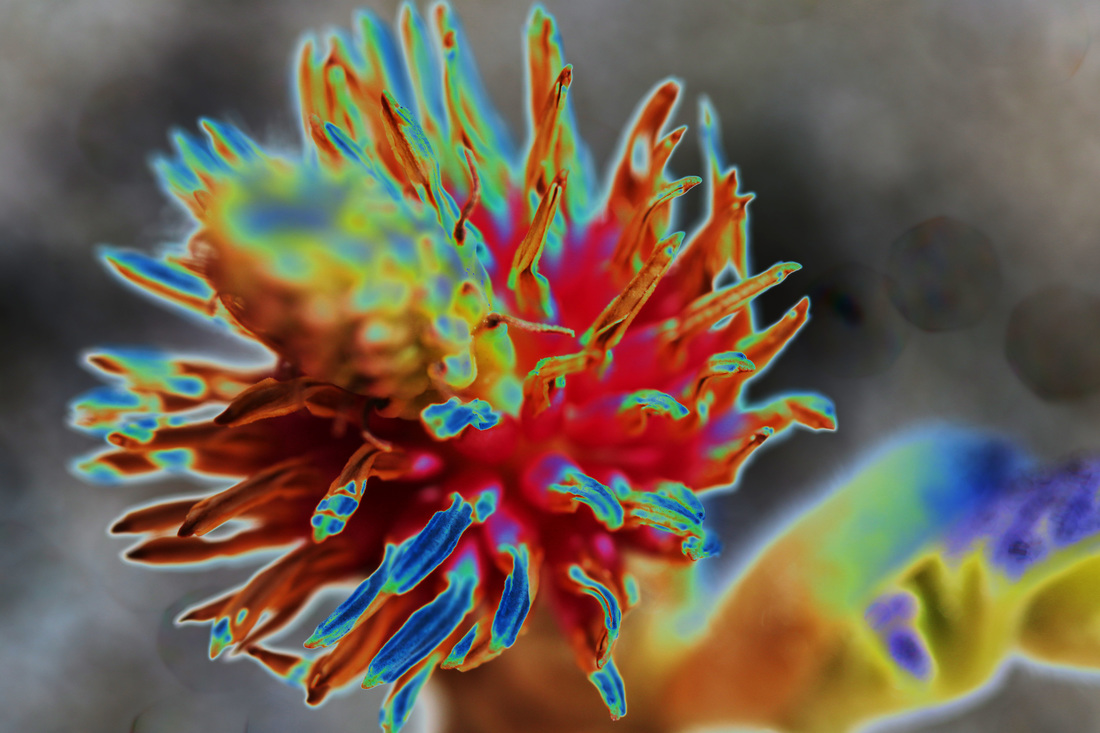
I used the solarisation filter on these coloured images to outline the plants and increate the vibrancy and contrast of the images.
here are the same images as above, however in black and white.
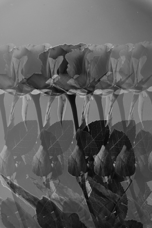
mirroring

I took this already edited image and duplicated it, increasing the canvas size by 200% vertically and flipping the bottom image vertically so the two merge together, creating a mirrored effect.
|
|
I then repeated this, duplicating the second image and increasing the canvas size by 200% horizontally, I flipped the left hand image horizontally to once again merge the two images together. this image gives a double mirrored effect and has a clear outline due to the contrast between the light and dark.
|
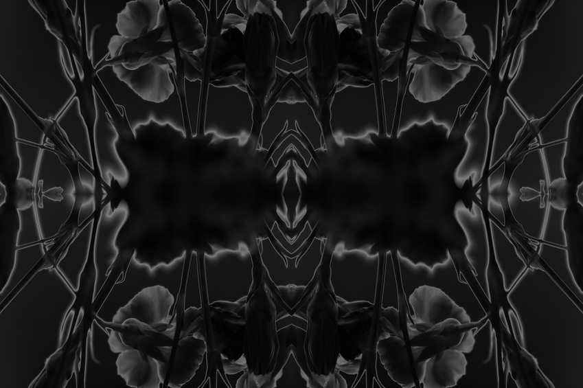
I repeated the same steps as above to create this image.
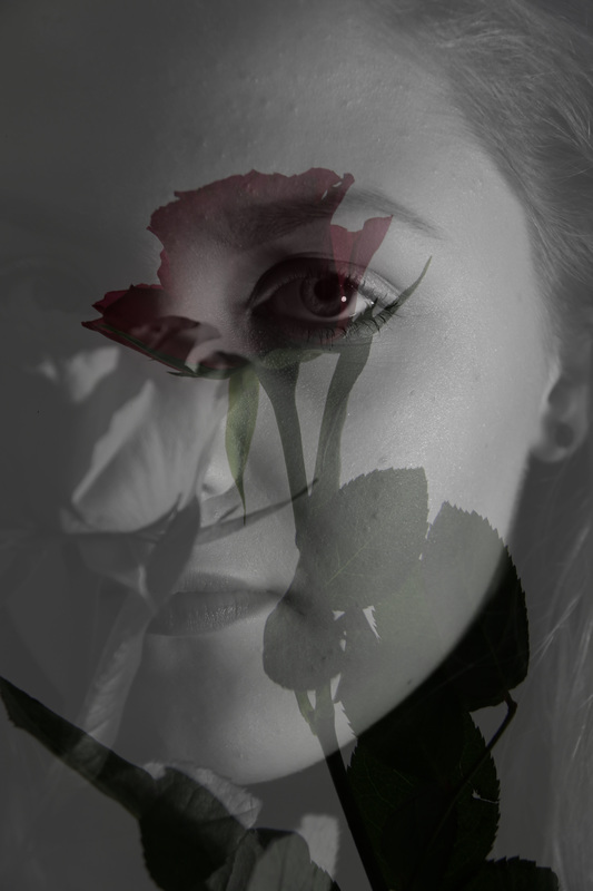
overlaying
I merged the image of the flower over the portrait and decreased the opacity. the dark, almost silhouette-like flower contrasts with the photo below creating a clear outline. it creates almost a shadow-like effect, which adds interest to the photo and defines outline well.
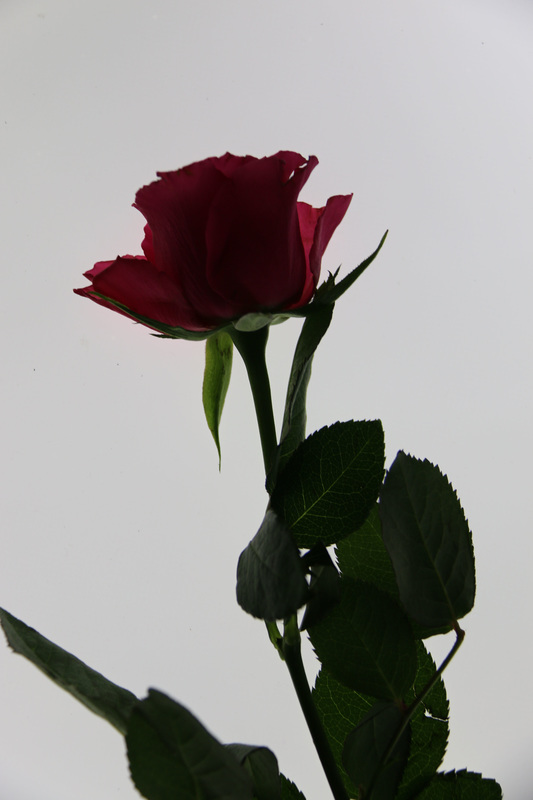
these are the second two photos I will be editing.
|
|

|
|
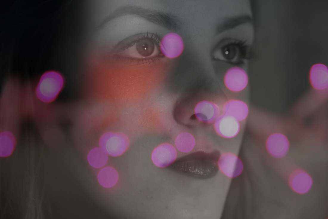
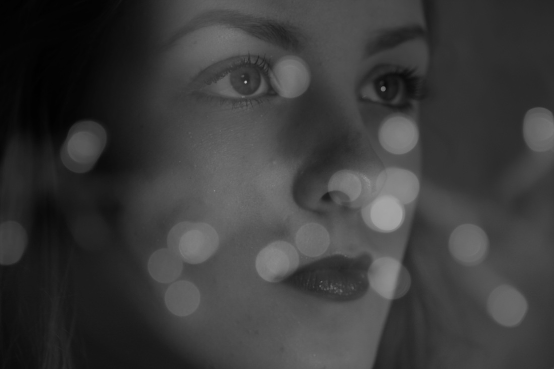
I moved the light image over the portrait and decreased the opacity. the colour contrast in the first edit and light contrast in the second show a clear outline.
posterising
I lightly posterised these 4 images, this gives depth to the photos in a cartoon-like way. defining the edges and increasing the contrast.
|
|
|
|
focus
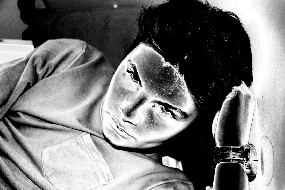
using the 'art history' brush tool on Photoshop, I kept certain aspects of each photo in focus while distorting the rest, to make the desired key aspects of the photo stand, be more defined and contrasts from the rest of the image.
|
|
opacity changes and highlights
firstly, I selected the flower and duplicated it multiple times, moving it across the image to different areas and decreasing the opacity. this somewhat distorts the outline, contrasting with the topic title.
|
to reinforce the outline, I highlighted 2 sections of the image to add contrast.
|
I did the same here, however with circular sections.
|
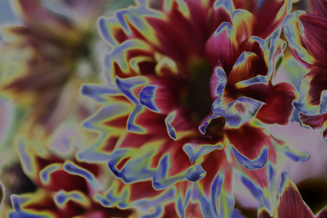
exploring techniques
Here, I will be exploring a range of techniques, each of which enhance the flower's natural outline.
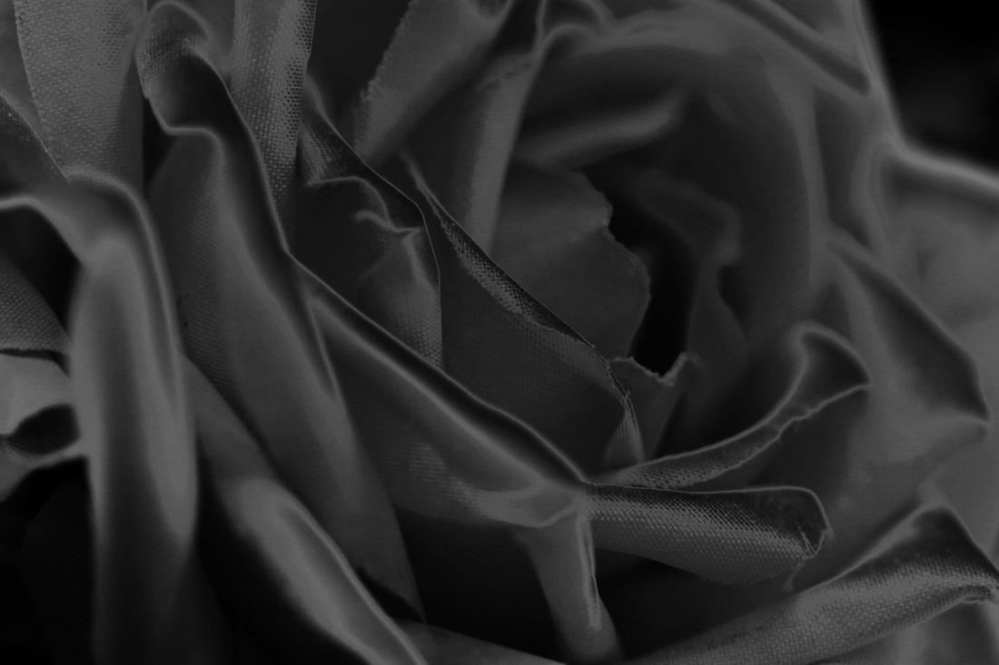
this is the original image.
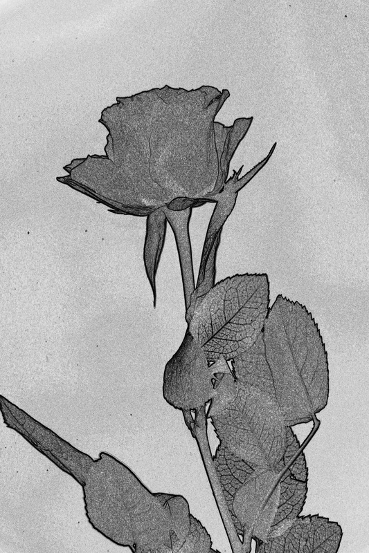
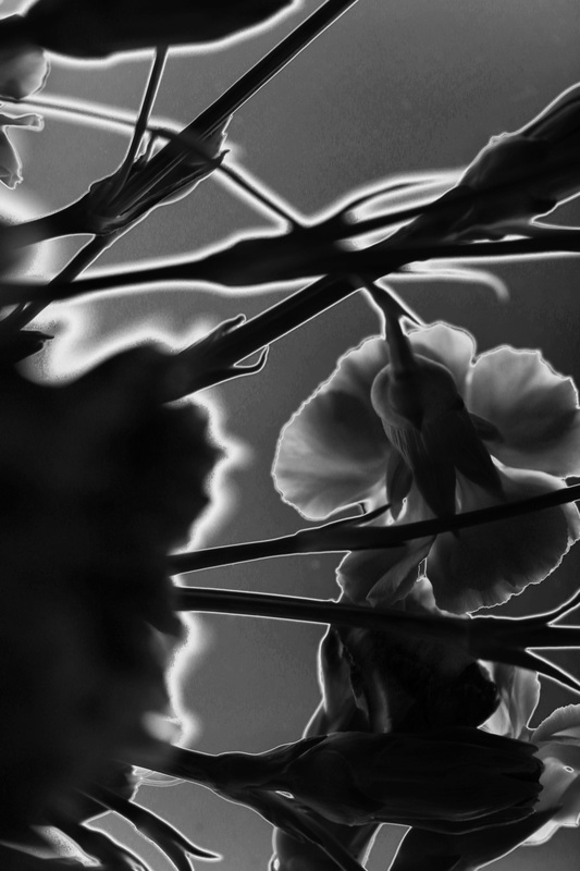
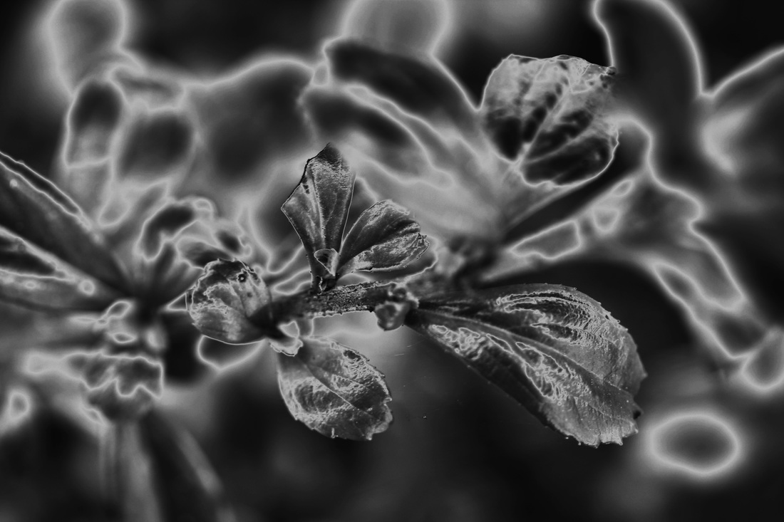
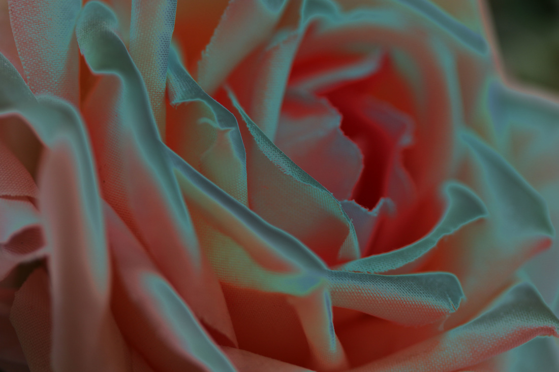
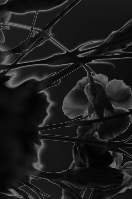
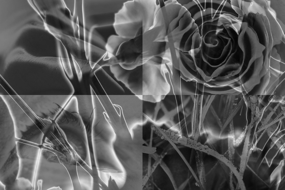
edit 3 - I used the 'find edges' tool which adds an outline to the main parts of the image. I then darkened it and increased the contrast to define it further.
|
edit 1 - I increased the saturation fully which gives a colourful background, contrasting with the dark outline of the flower.
edit 4 - I inverted the colours of the black and white image. the bright white flower contrasts with the black background.
|
edit 2 - here I decreased the saturation, making the image black and white. I also increased the contrast and altered the curves to lighten the background and darken the flower which gives a clear outline.
edit 5 I used the solarisation filter which darkens the background and outlines the flower.
|
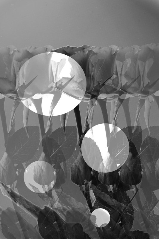
I proceeded to merge 4 of the images together on a single canvas.
|
I then moved the original image over the top, decreasing the opacity to give the effect of a shower however still keeping the clear outline. I did this because each of the images are well defined and shower clear outlines, and link together well as a whole image.
|
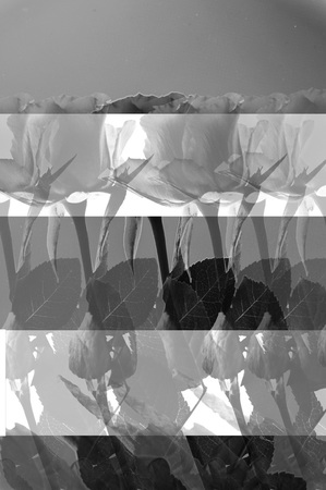
final piece 1
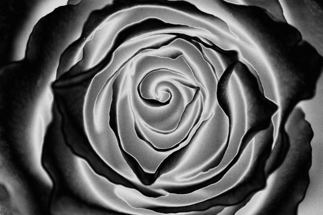
I merged together a variety of natural form images, each with a defined outline.
I chose this as the bright outlines define the overlaying image, and contrast with the collage of 4 images below. they are each edited in a similar way meaning they blend well together and show a range of outlines found on natural form. there is many different aspects to this image which makes gives it interest. the overlaying image also adds depth. although there is a lot going on in his image, each element is still clear and defined which is why I have chosen this as my first final piece. the black and white filter, high contrast and brightness link these photos together, meaning they flow well as a whole when being viewed.
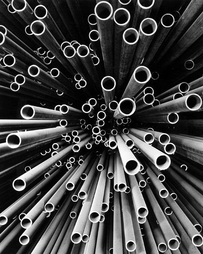
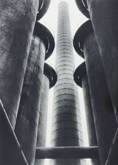
final piece 2
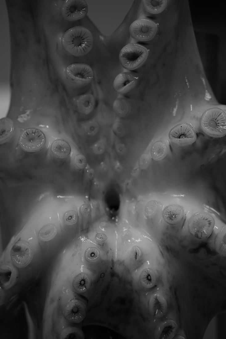
I have chosen this as my second final piece as there is a clear contrast between the light and dark areas of this image which shows and enhances the clear outline of the objects. the objects are very detailed with clear defined edges and shapes within them. the way it has been inverted enhances the outline further with the black and white colour contrast. it is something which you may not immediately associate with 'outline'. this huge contrast is why I have chosen this as my second final piece.
Evaluation
AO1: in this project, I have explored the theme of outline. I have enjoyed and worked well with this theme as there is a large range of things and editing techniques which you can associate with outline, keeping this topic open for interpretation. As I developed my work, I included new editing techniques such as solarisation, inspired by Man Ray. There are many photographers which I researched in this unit which inspired my work. For example, Rankin's eye piece inspired me to create something similar of my own with different objects, and Peter Keetman's work influenced many of my recent photographs. I found these photographers through researching outline and editing techniques, and also through the project brief which mentioned a few names. From studying their work I have learnt how to interpret a photographers work through editing, and how a viewpoint can give a huge amount of depth and dimension to a photo.
AO2: I explored editing and image by hand which is something I have not attempted previously. I printed out images and defined the outlines by drawing on the images in different ways. This is a technique which I learnt and enjoyed in this project. I discovered how well close up images show outline in my natural outline section. I found this difficult at first, getting the image right when it is that close up however I think that the images worked well in the end and represent outline well. When refining my work I used man Ray as one of my biggest influencers, by inverting and solarising a lot of my refined images. I also experimented with overlaying images.
AO4: i feel as though my final outcome's were successful. They represent outline well through the clear edges. My first final piece focuses on overlaying which creates a shadowed but still defined effect, and each of the images included have their own clear outline. My second final piece is one which shows contrast, through the dark, black background and bright, well defined objects. this clear definition between the background and the objects gives a strong and defined outline. I was hoping to create an image which represented outline well, and showed outline through natural objects, this worked well as both final pieces include natural forms which have been defined through editing. However, to improve I would have liked to include a less heavily refined and edited final piece which represents my true photography. What is personal about my work is the raw, unedited images which show my own style of photography, however in many of the edits you can clearly see my own taste and style which makes it personal. I believe I have successfully explored the theme as I have researched a range of photographers and included a range of different themes from silhouettes to urban photographs which all show outline well. I hope any viewers will be able to see how passionate I am about photography through my work, and be able to see a consistent outline throughout this topic.
